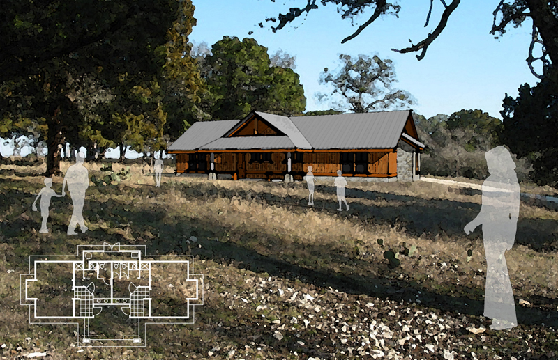
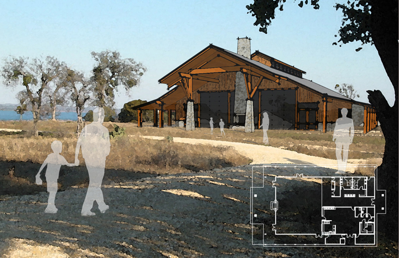
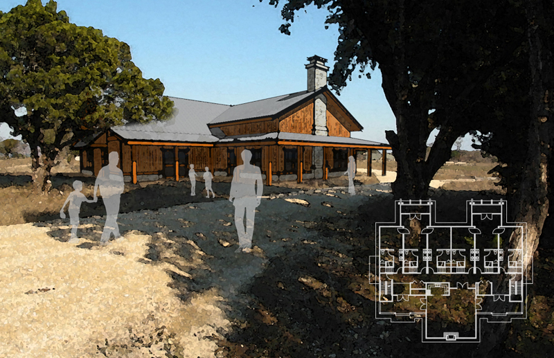
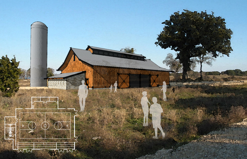
Some pre-SD sketches
-
some images created for a camp in texas to raise money for further design work- thanks to photomatch and watercolor filter in photoshop, it was really easy to get across the architectural style, materials, and textures in a site context


-
again


-
Really nice and well coordinated presentation!
-
I love the use of the people as well.
Nice work. -
Where did you get the shadow people, I like that
-
thanks for the comments! baker- as james said, just the 2d components you can find in sketchup, change the material to a transparent white and take edges off
Hello! It looks like you're interested in this conversation, but you don't have an account yet.
Getting fed up of having to scroll through the same posts each visit? When you register for an account, you'll always come back to exactly where you were before, and choose to be notified of new replies (either via email, or push notification). You'll also be able to save bookmarks and upvote posts to show your appreciation to other community members.
With your input, this post could be even better 💗
Register LoginAdvertisement


