Townhouse Project
-
Been lurking on here for a while now, figured I'd post some recent work to see what everyone thinks.
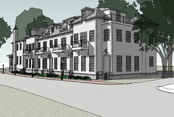
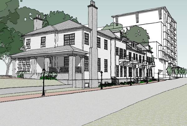
It's a townhouse project where the city is making us keep the original existing house (with the chimneys) and we're adding 4 additional units. Nothing too fancy, just had to show the development review committee something.
-
Very nice indeed, Peter! Glad to have you with us and hope to see more soon. Best, Tom.
-
Looks good Peter and I like the way you have chosen a colour scheme to present it. The greens and white seem to go very well.
Its a nice looking model.
-
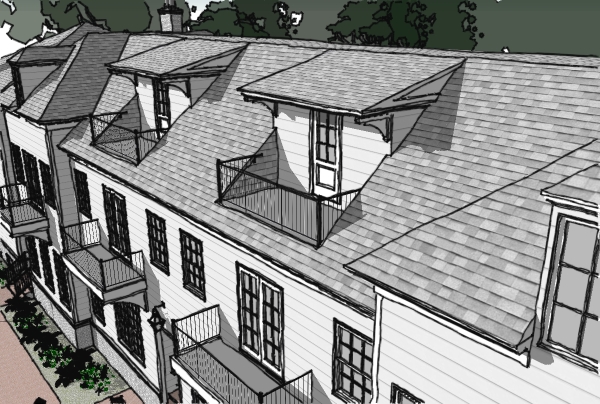
nice model, and a cool looking building as well. I especially like the look of the little balcony bits in the roof. And you should really do a render if you get time, it could be wicked!
-
Thanks for the comments guys. The color scheme derived from not wanting to show them definitive materials and get locked into anything just yet. It just sort of worked out that the white and greens complimented each other fairly well. As for a render, I hope to devote some time to that soon. I'm looking forward to trying out the new KT tomorrow, but I haven't spent much time in that area up to this point so it's going to be a trial & error process. I'll be sure to post my results when I do.
-
these are great.. .simple and to the point..what style did you use?
-
Thanks Jason, I started with the Sketchy Pen Black and added back in materials and tweaked the other settings to what looked good. Nothing special. I did recently try some of the custom styles that are posted around here and some of them looked very cool.
-
Those look great. The only thing I would suggest is adding some context (people, cars).
-
I like the presentation very much. The design looks in some odd way older than the existing building, and by introducing a symmetry of its own makes the old look like a slightly unsuitable addition. Just an uninformed opinion, though.
Anssi
-
Nice setup.
-
Peter - I very much enjoy the presentation and all the choices you made in putting it together -- ie the limited colours, the way the 'flat' trees relate, your choice of views etc. There's lots to learn from you!
Anssi's interesting comments really have me thinking... (ouch - thinking hurts).

regards, Ross
-
Thanks for the comments guys!
Anssi - I actually didn't have too much say in the design on this one, just did the model and some presentation work for it. I'm not sure I fully understand what you mean by the addition introducing it's own symmetry but I can sort of see what you're talking about. The original idea was to tear down the existing house which is really in poor shape. Due to the requirement of keeping it, there were a lot of additional factors that had to be taken into account.
Hello! It looks like you're interested in this conversation, but you don't have an account yet.
Getting fed up of having to scroll through the same posts each visit? When you register for an account, you'll always come back to exactly where you were before, and choose to be notified of new replies (either via email, or push notification). You'll also be able to save bookmarks and upvote posts to show your appreciation to other community members.
With your input, this post could be even better 💗
Register Login


Advertisement