Some helpful comments please...
-
Hey All...working on another bank project (not vetted by the architect yet so not yet a completed model). There will be an SU Viewer presentation of several concepts and then a rendering of the Chosen One (I'll probably get the CD's as well...yeah me!). Here's the first blush of the design rendered. I basically like the look and tech, but something is not there yet...can't put my finger on it? Some overall sameness to it...? Can you help, please...what bugs you? (Added the straight SU output for reference and in case the answer is there...?)
Best, Tom.
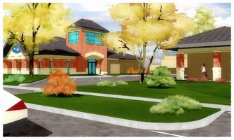
http://www.sketchucation.com/forums/scf/sas/Gallery/SITE2ArevFlesh-WCweb.jpg
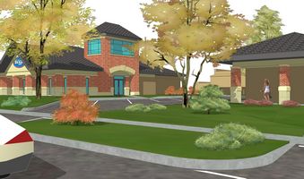
http://www.sketchucation.com/forums/scf/sas/Gallery/SITE2ArevFleshweb.jpgAlso, how do I get the image files here linked...clickable...either with or without the thumbnails? And why are the thumbnails clickable...they are smaller than others I've seen that don't click?
-
First impressions:
- Grass bugs me as the lines from SU are showing.
- The roof texture still looks to "tiled".
- There is not enough detial in the brick on the building beyond.
- The stone looks a little to "light washed" if that makes sense.
The overall atmosphere is great as always Tom. I love the trees and sky and the girl... man you get me everytime with the girl.

-
the grass and tree season throw me a bit... the grass is sooo lush as in spring but the tree looks like fall...
I would bring on to the other... either way... I know you might want the tree to be transparent... thus the fall use...
just my opinion... looks great though... the vantage point may be what's causing your delimia... no real focal point... that stands out and says I'm a picture of "this"
I think it looks very professional... and I didn't really notice the grass lines until Boo mentioned it...
-
For me the glass is too blue and the sun too high

cheers
john -
Okay business first:
I guess I've been visiting the CornerBar so much lately I turn that way even when I'm intending to go the SketchUp Gallery. If one of you blues in bold would move this thread there I'd be much obliged.
Also, I've cut my thumbnails down to 200 pixels high, smaller than some here that don't then link to another page, but mine still do...? I need some help fixing that to soften my load here, thanks.
And I'd really like to link to offsite storage by clicking the thumbnail like some others here, but can't seem to figure out how to do it...help please?!?
Now....thanks a bunch for your looksees. All points well taken and taken well! There will be a problem with presentation focus on this project 'cause it is one of those anomolies in commercial architecture where we are actually taking out parking to put in grass. But still, I agree I can do better once I have the final design.
Attached are two before's and the revised after based on your comments. Whadaya think?
Best, Tom.
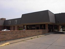
http://www.sketchucation.com/forums/scf/sas/Gallery/view1.jpg
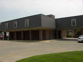
http://www.sketchucation.com/forums/scf/sas/Gallery/view2.jpg
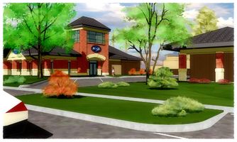
http://www.sketchucation.com/forums/scf/sas/Gallery/SITE2ArevFleshrev-WCweb.jpg -
Tom...
Moved the topic for you... and as far as the thumbnails that would be links... the image tag allows the use of the image to be shown here but loaded on your site.
select the entire link to your graphic, then click "img" above...
example... this link with the ()
http://www.aboveallhouseplans.com/Club_House_Elevation_small.gifbecomes this

this will not size it for thumbnail as you would like... but the image will show here with out this server...
further down the road when html is allowed in our posts... then we will revisit this and use thumbnail html tags to show one image and link to another.
-
That is looking better. I am still distracted by the roof texture for some reason. I am not sure why.
And the girl, she is always walking away from me.
-
Thanks Kris. Boo...me too! It was supposed to be a nice blue standing seam on the branch last year but during construction I was changing the model to this fake slate asphalt...just to see :`)
Here's another view that better says something about what it is saying...?
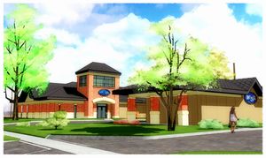
http://www.sketchucation.com/forums/scf/sas/Gallery/SketchUp/LCSBview2-WCweb.jpg(Kris...didn't work: said my image couldn't be larger than 800x800)
-
yes per request of Gaieus in another thread, he said it was screwing up the forum views for people when the image was too large... over 800 wide... so to insert it, it will have to be under 800 pixels... sorry...
like I said, sometime in the near future we may have html... then we can have some fun...
I like the roof slate... when I was younger, 12 to be precise... I lived in a concrete roofing tile factory, yes lived in... but anyway, the shapes and styles of the roof remind me of that material...
this kind of stuff http://www.nps.gov/history/hps/tps/roofingexhibit/asbestos4a.htm
Hello! It looks like you're interested in this conversation, but you don't have an account yet.
Getting fed up of having to scroll through the same posts each visit? When you register for an account, you'll always come back to exactly where you were before, and choose to be notified of new replies (either via email, or push notification). You'll also be able to save bookmarks and upvote posts to show your appreciation to other community members.
With your input, this post could be even better 💗
Register LoginAdvertisement


