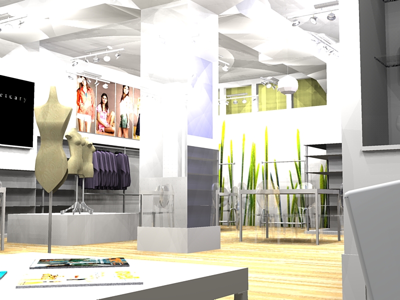
Podium Render - Interior
-
Thanks to Remus for the Starke chair...
Comments? This is the first pass on a WIP...

-
My initial thoughts are: tone down the lighing a bit, it looks washed out and make the chairs slightly less transparent! i couldnt see them untill i opened the file up!
Loks like a fun project btw.
-
Hi Shoreline, nice work and I agree with Remus, just tone it
down ever so little as I think the brightness of the render
suits this kind of shop.BTW, I'm playing with Podium in Parellels and having great fun.
It is a gem of a program to work with and even a total render novice
like me can get half decent results.Hopefully the Mac version will be available soon to ease the
workflow
Mike
Hello! It looks like you're interested in this conversation, but you don't have an account yet.
Getting fed up of having to scroll through the same posts each visit? When you register for an account, you'll always come back to exactly where you were before, and choose to be notified of new replies (either via email, or push notification). You'll also be able to save bookmarks and upvote posts to show your appreciation to other community members.
With your input, this post could be even better 💗
Register LoginAdvertisement


