'nuther church.
-
I get a lot of these... but I am not complaiing

Not my design I might add.And as always... thanks for them trees Tom

Exteriors:
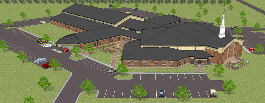
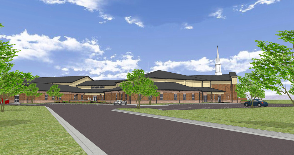
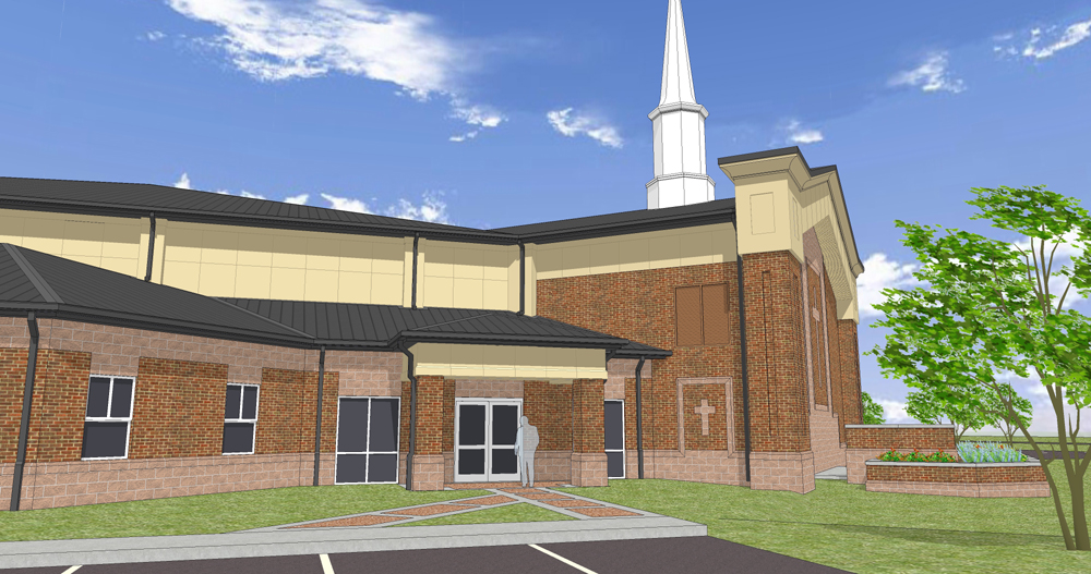
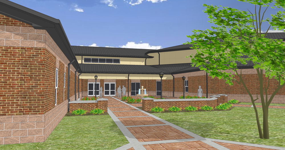
-
Interiors:
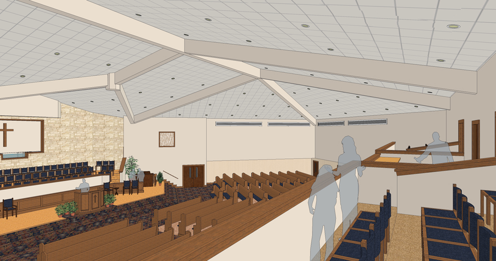
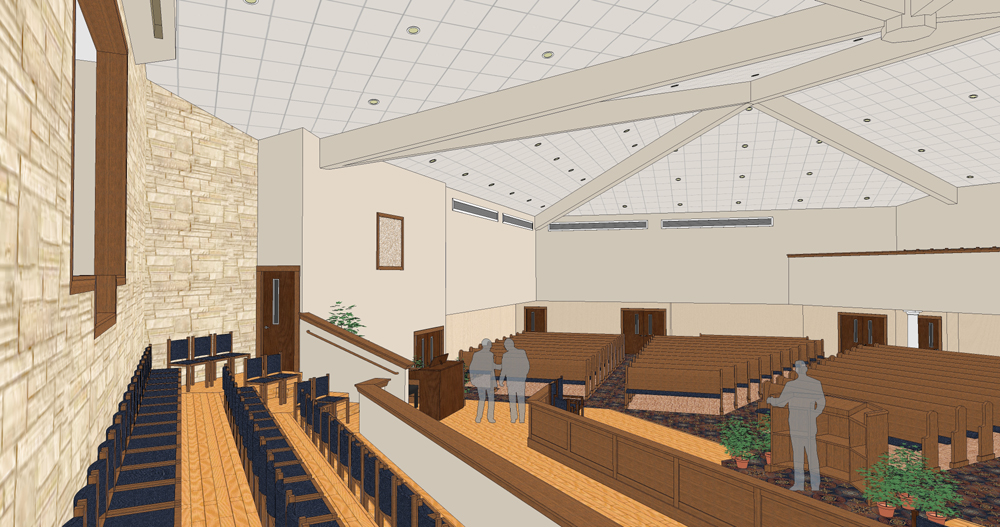
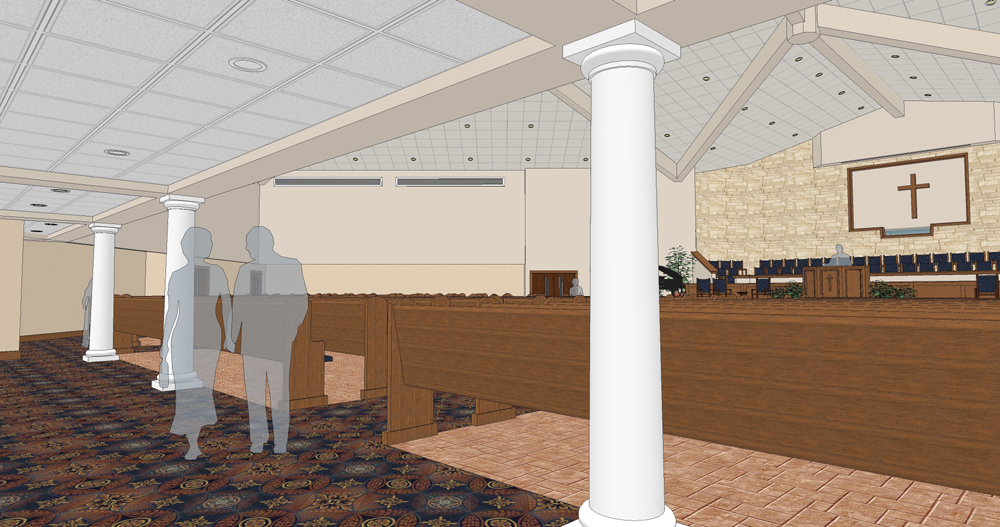
-
Eric,
Nice clean design. There is a texture issue on the ceiling in the first interior shot. The carpet is terrible though.
Scott
-
Thanks, yes and I agree.
The ceiling... I exported many times at many different resolutions but got the same result. Oh well. luckily that was the only spot.
The job was a rush to begin with and is now on display for fund raising.The carpet was hand picked by the pastor, scanned in pieces and sent to me. I patched it together and used it. They love it so it is a success.
-
awesome work man! despite being a "rush" job, looking very very good.
-
That ceiling is odd. That is not the typical pixels out of synch with the texture kind of look.
--Strange -
Nice model Eric
-
@roger said:
That ceiling is odd. That is not the typical pixels out of synch with the texture kind of look.
--StrangeYes it is odd and I probably could have fixed it in Photoshop if I wanted to but I really did not want to

Funny thing is while in the model itself you don't see that at all. Must be the angle of the texture or something.And thanks Jon
-
Really nice presentation Eric. I like the interior shots, really helps get the feel for the place... makes me want to sing all my favorite hymns

Hello! It looks like you're interested in this conversation, but you don't have an account yet.
Getting fed up of having to scroll through the same posts each visit? When you register for an account, you'll always come back to exactly where you were before, and choose to be notified of new replies (either via email, or push notification). You'll also be able to save bookmarks and upvote posts to show your appreciation to other community members.
With your input, this post could be even better 💗
Register LoginAdvertisement


