Work in progress
-
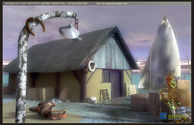
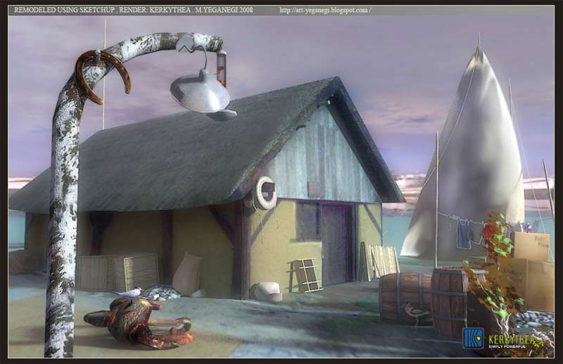
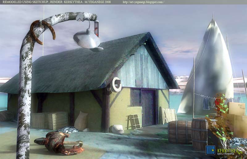
hi folk . here is my last work , using a model from 3dwarehouse ( Middeleeuws huisje deel 1.skb ) , re textured , pupulated and rendered using kt . and then retuchinf whit PS.
which color set , light , attention point is your desired?


-
Hi Majid,
The 3rd one looks best to me .... reason contrast Roof / Sky.
Mike
-
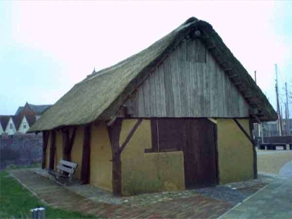
here is the original picture:

-
nice to see something different, personally id go for the 2nd one, i just prefer he colours of it.
-
there are different problems , first of all : when i changed the sky color all the acene was too cool colored... !!!
2nd: the light is not as the real world and i dont know what is the problem
3 the boat cloth is not real at all ( i'm working on it)
and especial thanks to frederik ( kt team member) who improved me alot
Hello! It looks like you're interested in this conversation, but you don't have an account yet.
Getting fed up of having to scroll through the same posts each visit? When you register for an account, you'll always come back to exactly where you were before, and choose to be notified of new replies (either via email, or push notification). You'll also be able to save bookmarks and upvote posts to show your appreciation to other community members.
With your input, this post could be even better 💗
Register LoginAdvertisement


