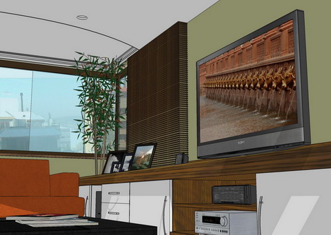
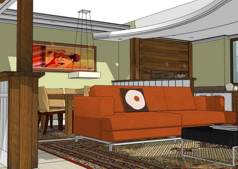
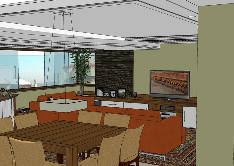
Living room
-
Hi all
These images are of a recent work of architecture of interiors in a new apartment. They were projected and performed in the room, the removal of a picture window that separated the room of the balcony, extending the spaces, being able to acclimatize to be, has dinner, churrasquiera (existing). They were put news coverings in the based on floors porcelanato. Colors in tones of green and gray. were reprojetados logical, hydraulic, and electric systems. projects of made-to-measure furniture in all of the environments (dormitories, kitchen, baths and office). The contemporary proposal is part of my style of work, with straight furniture and curves with big rays. I expect that they like.
Look the forum in Portuguese for more images.
cheers
arqpadao


-
Very nice... very clean.
-
i like it but what detracts fron the greatness is the rug and tv bitmap. I think we can enjoy the design more if these are toned down / omitted.
incidently - is there some why of creating depth with tone and line strength in SU. Your above work and all mine so far could do with this feature.
-
Hi syburn
You are right.
I need to soften these elements.
Thank you by the hint.
And
Boofredlay
Thank you to
arqpadao
Hello! It looks like you're interested in this conversation, but you don't have an account yet.
Getting fed up of having to scroll through the same posts each visit? When you register for an account, you'll always come back to exactly where you were before, and choose to be notified of new replies (either via email, or push notification). You'll also be able to save bookmarks and upvote posts to show your appreciation to other community members.
With your input, this post could be even better 💗
Register LoginAdvertisement


