SU+KT
-
Hi new here!
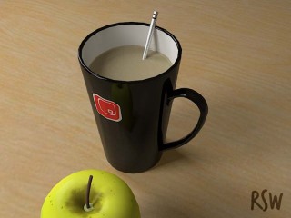
I have been using SU for a while now - mainly for external views of buildings for work. I recently came across Kerkythea, and thought i'd give it a go - although I thought I'd try something a bit different to what i'm used to.
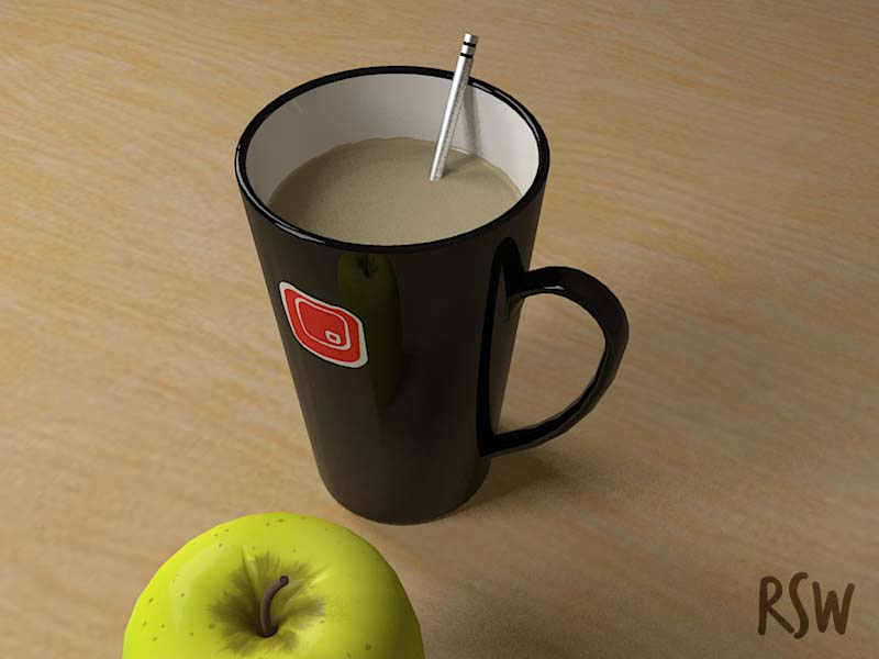
I've posted this on the KT forum as well, and as I said there I'm pleased with the results so far, although I know there's a lot that could be improved. This was really just for myself to test out SU2KT and experiment with materials, lighting etc and get used to KT rather than produce a finished piece of work, but c+c are welcome!
All modelled in SU and rendered in Kerkythea
Richard

-
Man, that apple! (I also like the cup though) but the apple!
-
looks great
well doneSU - KT ----great combination + you can't beat the price!
nice work -
Nice work Rich.
-
Nice render Richard! Good light, nice reflection!
@unknownuser said:
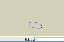
Only thing for next time would be to change the side count for the Circle tool
...that way you'd get a smoother line around the cup's edge. To change this, click on the Circle tool (you'll see the VCB display the number of sides. *See attached), then just type a higher number in, like 60, and then draw your circle. More sides obviously means shorter straight lines to create the circle and thus a smoother arc! Experiment until you have the correct detail to file size ratio.Very nice render all in all!
Cheers,
- CraigD
You do not have the required permissions to view the files attached to this post.

-
@unknownuser said:
CraigD wrote:
Only thing for next time would be to change the side count for the Circle tool...Noticed that after my first test render, but at the time didn't want to go back to change the geometry of the mug, but I have done this now, as well as some adjustments to the geometry of the apple.
Thanks for the comments so far.
Richard

-
Beautiful.
-
Love it, great render,
The only thing that I could suggest to make this any better, would be to add just the tiniest bit of translucency and reflection to the coffee. and maybe an HDRI map, just to get a couple more reflections in that beautiful coffee cup.
not sure if you know how to do it, but if you don't mind me being so bold, I'll tell it here for those that don't know.
In the material editor.
add a specular value to the coffee, maybe like .1 or somewhere in there... and then add a translucency colour that is the same as the coffee colour, but much darker.
you'll then have to turn on pseudo translucency by going settings>advanced>direct light estimators>refraction enhanced> then double click 'pseudotranslucencies' and type 'on' in the box.as for an HDRI map, there are a ton of free ones out there, you just need to find one that suits and pop it in under the sun and sky settings (make sure you use a spherical map)
great stuff!
-
@unknownuser said:
Will03 wrote:
The only thing that I could suggest to make this any better, would be to add just the tiniest bit of translucency and reflection to the coffee. and maybe an HDRI map, just to get a couple more reflections in that beautiful coffee cup.thanks for the suggestions, tried adding the translucency to the coffee, but it didn't seem to make much difference that I could see, but will give it another go later, as you are right it would help - I'm also wondering what it would look like with a 'swirling' effect to give the impression it has just been stirred.
As for the HDRI maps, could you suggest a good source for free ones?
thanks
Richard
-
theres a bunch of sky ones here:
http://www.evermotion.org/index.php?unf%20...%20=exclusive
and there are a couple good interior ones here:
http://www.hdrimaps.com/downloads.html
should be enough to get you started!
Report this post
Hello! It looks like you're interested in this conversation, but you don't have an account yet.
Getting fed up of having to scroll through the same posts each visit? When you register for an account, you'll always come back to exactly where you were before, and choose to be notified of new replies (either via email, or push notification). You'll also be able to save bookmarks and upvote posts to show your appreciation to other community members.
With your input, this post could be even better 💗
Register LoginAdvertisement


