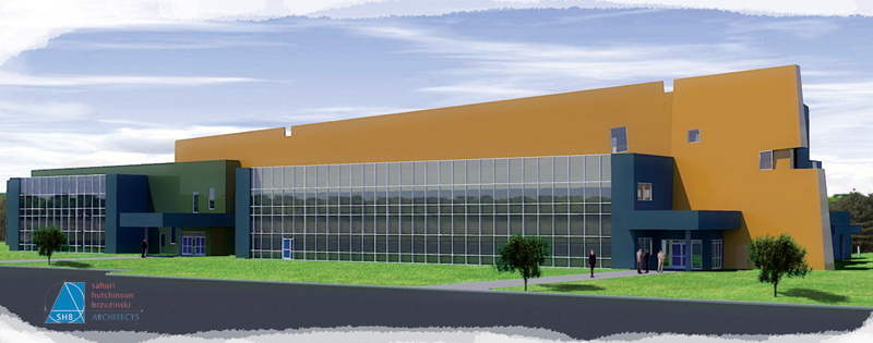
New Building from me! Kerkythea + SU + Photoshop
-
Hey guys and gals, check it out, comments and critiques more than welcome! thanks!
EDIT:
Fixed the image, hopefully this works!
-
ahem
Bump!
is it really that bad that no one wants to comment?! I want to hear everything good and bad!
-
Now we can see, Will. Yes, you're right; it's awful!
Edit:
Ahm... my poor English, I guess... So what I was going to mean above:
It's awesome!
I especially like the flowless background reflected in the windows - though the PS "cut-out" in the front would suggest that the image ends there...
Very Happy
Gai... | Email
"Γνώθι σεαυτόν"Dear Members, have you read the announcement?
-
yeah its really good,just a small thing about the trees... were they put in with photoshop im not completely convinced about the shadow positioning on them, also a shadow on the man would be nice...
otherwise its pretty impressive! how long did it take (SU, kerk, PS)? -
THe enormouas expanse of pristine gold colour behind the glass is grabbing all the attention. It is too smooth and too bright and too large an expanse not broken up by anything. It would help to exagerrate the colour fade as it recedes in perspective. It would help to place some trees in front of the building that are taller than the building to cut the long straight lines a bit. Also the trees could cast shadows on the expanse of gold and cut it up a bit and add a little respite from the huge expanse. A lot of watercolor artists would place all manner of shadows on that expanse from things just out of eyeshot: clouds,foreground trees that are not visible.
Don't just go and do it, I haven't checked to see if the time of day would reasonably allow for that sort of shadow in the current view, it's just a good gimmick when it is possible to use.
Susan Sorger
XMAS 10% Discount Entourage & Piranesi
http://www.entouragearts.com -
Will03,
As a matter of composition, I like the sky but find the brightness and colour saturation of the lawn distracting. Moreover, since the front portion of the building is dark, the black foreground, road I presume, is denying the building the prominence it deserves save for the gold blank wall. I believe subdued tones in the lawn and road would help.
Guite
-
Thanks for the comments guys and gals!
They are all taken much into appreciation.
I had one day to do this image, the model was mostly done for me in CAD (just an import and cleanup in SU) I think it may have taken me 6 hours start to finish? (this is mostly Photoshop) also due to the time constraint, that is why there is no detail to the materials on the building. I needed the render in a matter of minutes, so kept the KT work to a minimum.
regarding the trees... I got in trouble for this one. There are actually no trees on site. There is nothing there but concrete and an oil refinery, but I thought I would slip those in and try to get away with that, because I find landscaping much easier on the eyes than dump trucks the size of houses filled with oilsand...
anyways, thank you everyone!
Hello! It looks like you're interested in this conversation, but you don't have an account yet.
Getting fed up of having to scroll through the same posts each visit? When you register for an account, you'll always come back to exactly where you were before, and choose to be notified of new replies (either via email, or push notification). You'll also be able to save bookmarks and upvote posts to show your appreciation to other community members.
With your input, this post could be even better 💗
Register LoginAdvertisement


