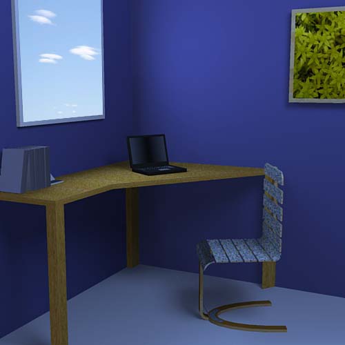
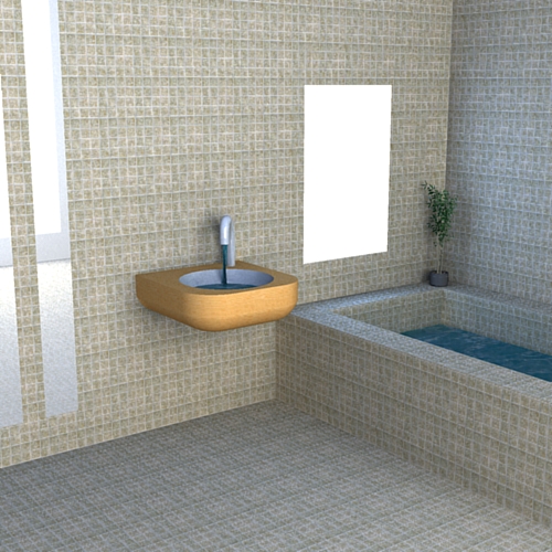
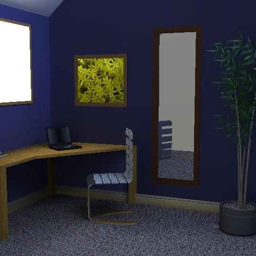
Just a bit of messing around
-
first time i've tried rendering something, just tohught it might be good to get an idea of how it works.
did it with podium and ps.
comments/critiques gladly accepted


-
Nice first post. Keep them comming.
-
I agree.
Simple and nice at the same time.
The strong blue creates a nice athmosphere.(Something looks odd about the window though...it looks more like a poster.
Maybe you could put more detail in to the window framing)Cheers,
Kiwstenbiebel -
well heres another one, complete rip off of yours biebel (gotta start being more imaginative!)
plus a slight variation on the first one.


-
...and now you're hooked!
Good start, now you will be digging up all your old models to render them.
Have fun (best way to learn)
-
Remus, just push the window in and create reveals so the frame is sat further back, it will look much more like a window then and should help with the light/shadow on that wall.
Hello! It looks like you're interested in this conversation, but you don't have an account yet.
Getting fed up of having to scroll through the same posts each visit? When you register for an account, you'll always come back to exactly where you were before, and choose to be notified of new replies (either via email, or push notification). You'll also be able to save bookmarks and upvote posts to show your appreciation to other community members.
With your input, this post could be even better 💗
Register LoginAdvertisement


