Fire Station
-
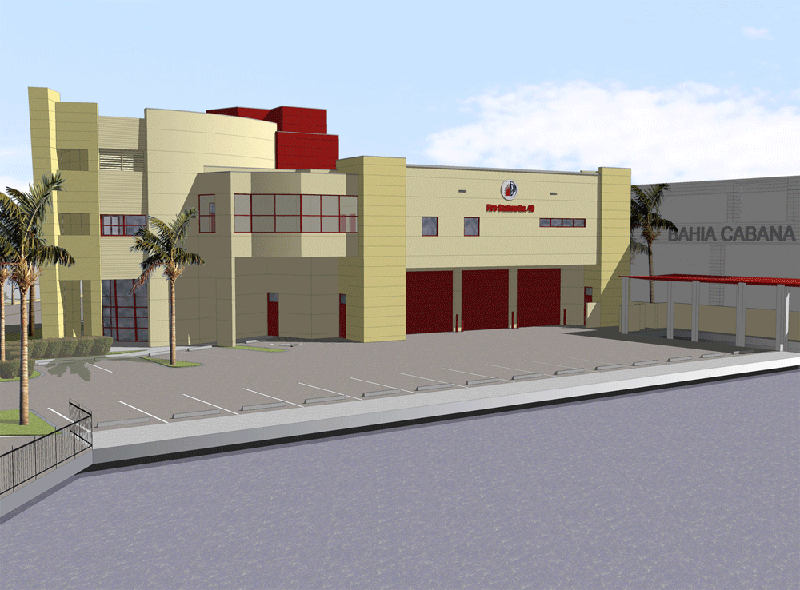
Here is a view of a station i did several months ago. I do not think I ever posted it. I came across it because we are redesigning the building -ie value engineer. I'll post the finished redeisgn when I get it done. There is a front view I have posted elsewhere. If you want I can post it here too.
Joe

-
Looks great, Joe. Would love to see more of it. What's the dark gray line running across the pavement?
The only thing I wonder about (concerning the design) is the use of colors. Since red is the only strong color used, I would think you'd want it to highlight a more visually prominant or important element, rather than what appears to be a minor element set back on the roof.
-
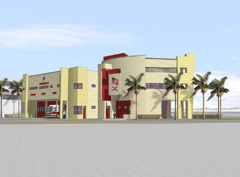
Here is the front view you were looking for. The dark line is actually a shadow, the station site on a body of water. The deploy their rescue divers & fire boats from this site.
The color is set by the client with red bing the accent. There is a bit more on the front.

-
Joe, this looks great! I remember seeing it on the google forums. You should make a tutorial on how you made it look that way in photoshop.
-
I actually posted a very brief lesson on the previous forum. See below. I also posted this same view there as well which I forgot about so now it's on the web at least three times. Guess I like it. Anyway, here is the method...
...If you have photoshop, here is a trick that I use on all of my drawings. First, export the image as a line drawing with shadows on. Second, export the the image in color without the lines and with shadows. Open the two in PS and copy the B&W on top of the Color. Now, change the layer blending setting of the B&W layer to multiply and reduce the opacity to 33% (my personal favorite). The result is an image with a hint of edges but not the bold dark outlines SU alone produces.
-
Thanks for posting the front; the use of the red makes more sense to me. Looks great
Hello! It looks like you're interested in this conversation, but you don't have an account yet.
Getting fed up of having to scroll through the same posts each visit? When you register for an account, you'll always come back to exactly where you were before, and choose to be notified of new replies (either via email, or push notification). You'll also be able to save bookmarks and upvote posts to show your appreciation to other community members.
With your input, this post could be even better 💗
Register LoginAdvertisement


