Chanel Store Design
-
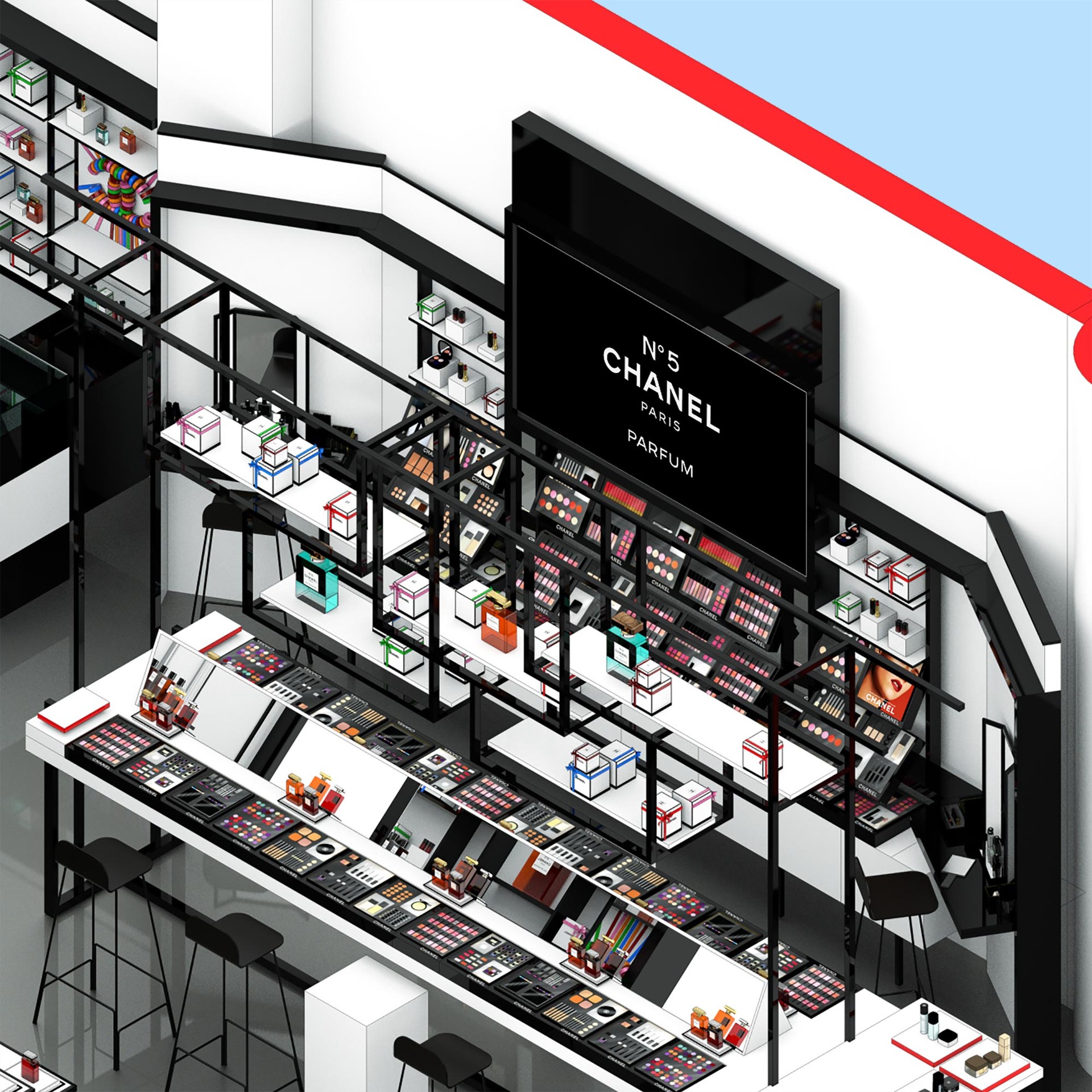
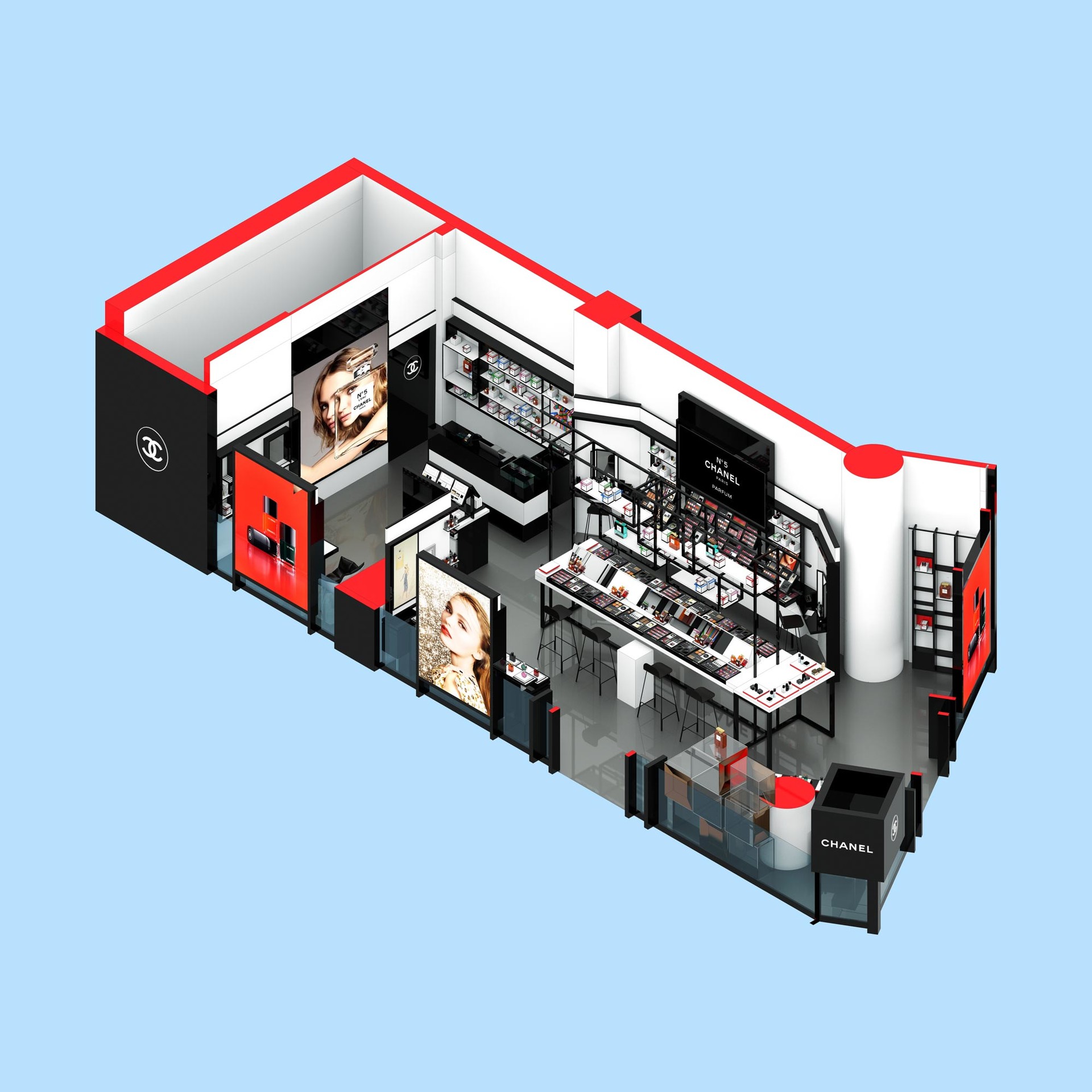
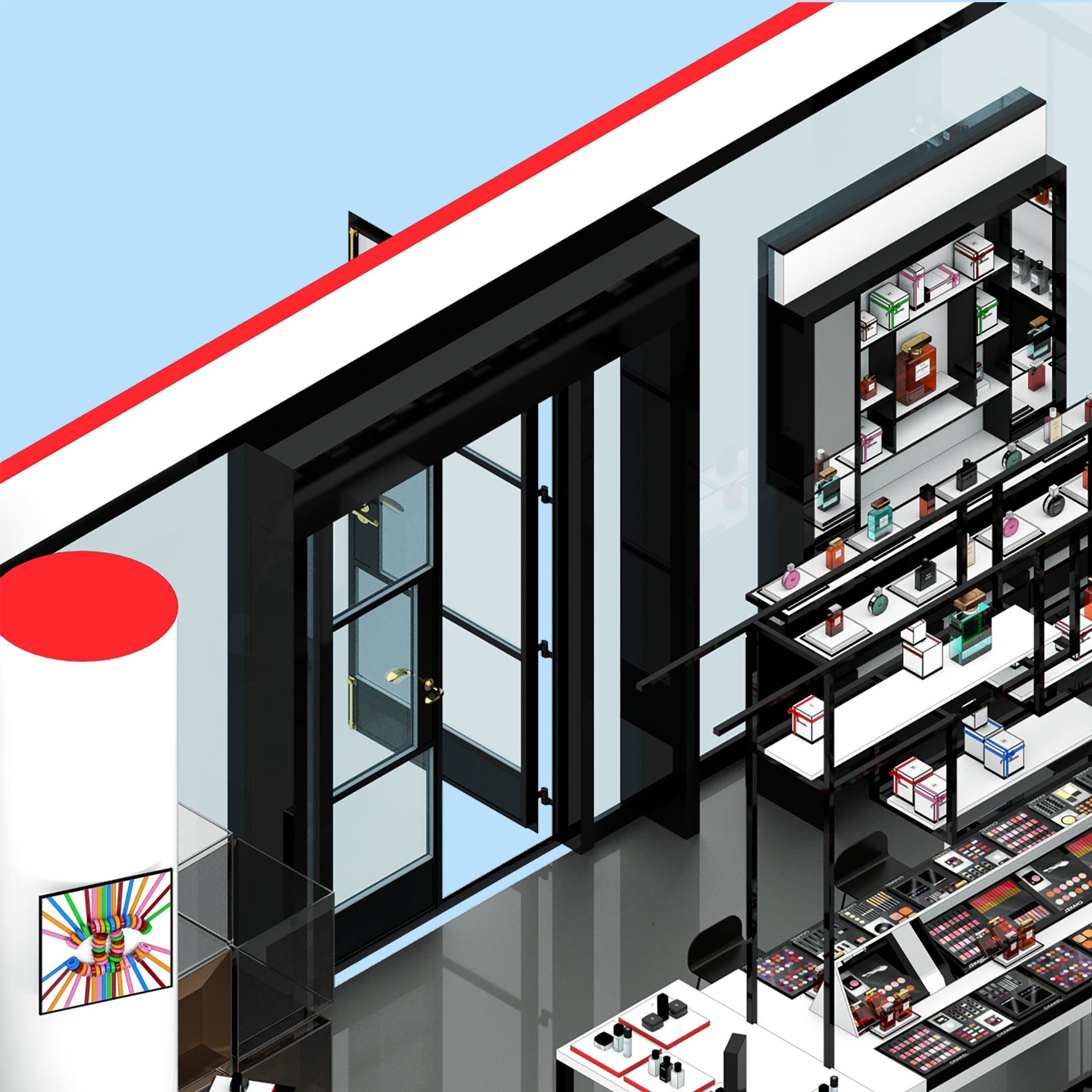
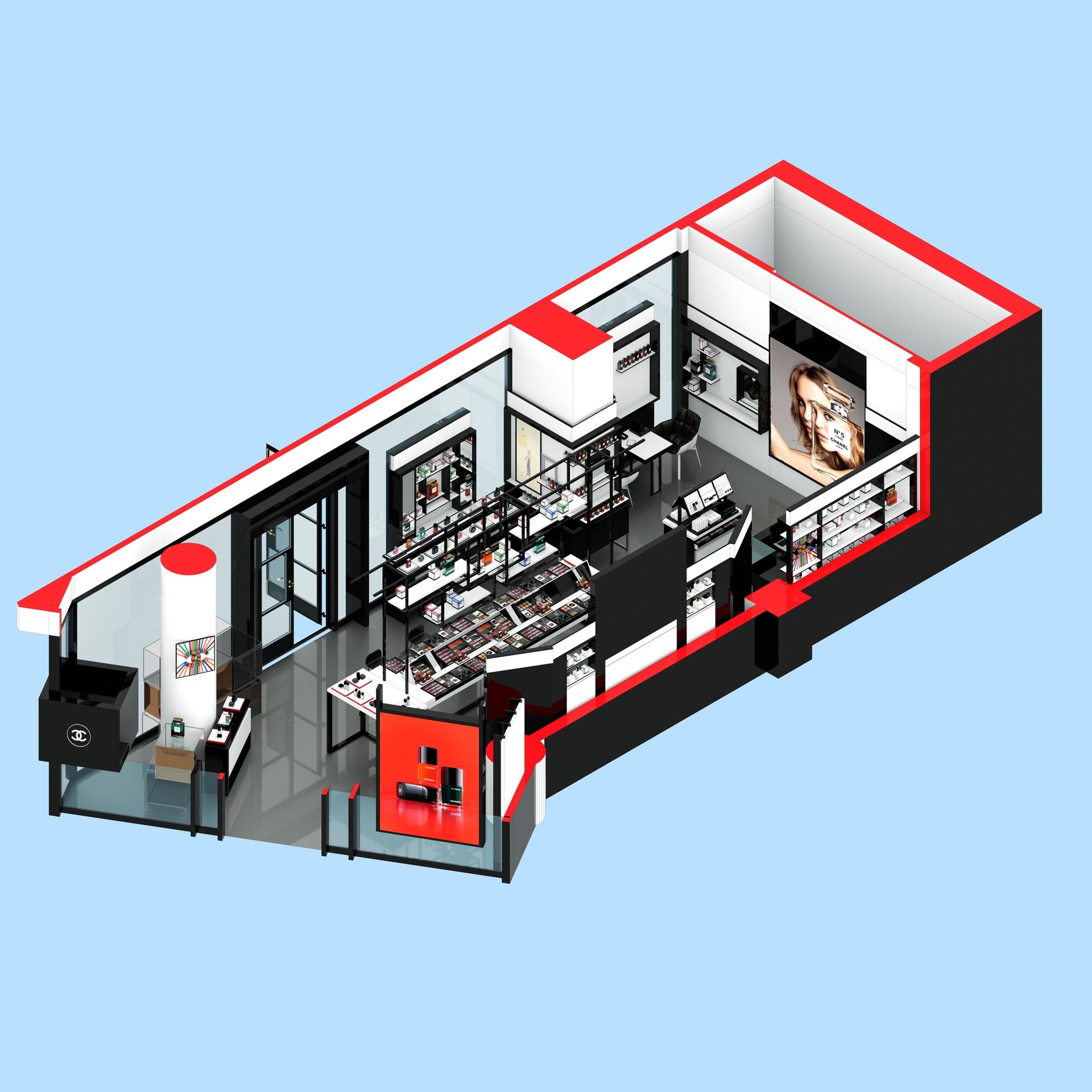
A little three day project I finished on Friday. Rendered in Thea, adjusted in Photoshop.


-
Nice job. My only critique is I find the bright red on the section cuts to be somewhat distracting. Draws my eye away from the floor layout..... All in all a good presentation though
 .
. -
Yes agreed, the deliverable for the client was just the model but I needed something poppy for my instagram, I found the red of the cut a good contrast to the red on the posters.
I also missed some of the section cuts by the doors, nooooo........ :0(
Hello! It looks like you're interested in this conversation, but you don't have an account yet.
Getting fed up of having to scroll through the same posts each visit? When you register for an account, you'll always come back to exactly where you were before, and choose to be notified of new replies (either via email, or push notification). You'll also be able to save bookmarks and upvote posts to show your appreciation to other community members.
With your input, this post could be even better 💗
Register LoginAdvertisement


