Please tweak the new Board's design.
-
With all my respect to the talent, taste and efforts of the Sketchucation Team, some things I'd like to be tweaked (IMHO, of course)
- The topic titles are hardly distinguishable from the it's auxiliary lines.
and it's hard to visually isolate one topic from another. - Why I can't see my current page location among pages squares (those blue guys).
- Too much 'emptiness' between the topics, really..
I attached some food for thought- comparison of CGArchitect vs Skethucation layouts.
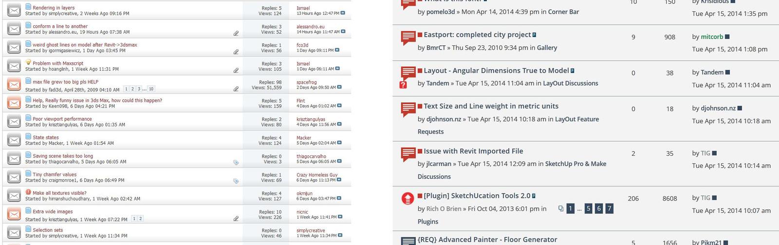
- The topic titles are hardly distinguishable from the it's auxiliary lines.
-
@unknownuser said:
- Too much 'emptiness' between the topics, really..
This is what's make this forum pleasant to read, (IMHO, of course).
-
Some hint for you
 By pressing Cnrl+T the tons of pure pleasure will be delivered.
Pure Zen
Hello! It looks like you're interested in this conversation, but you don't have an account yet.
Getting fed up of having to scroll through the same posts each visit? When you register for an account, you'll always come back to exactly where you were before, and choose to be notified of new replies (either via email, or push notification). You'll also be able to save bookmarks and upvote posts to show your appreciation to other community members.
With your input, this post could be even better 💗
Register Login


Advertisement