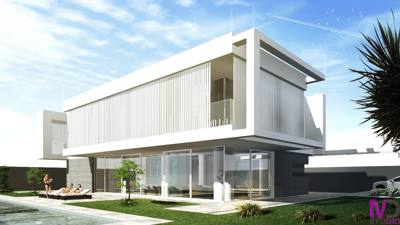
My first post- house rendering
-
Hello every one! I'm quite new on this forum and this is my first post. Some old model witch I rerender and postproducte some days ago when I'm doing on new portfolio. Any comments/suggestions are welcome.

-
Overall, nice rendering. A few points (IMHO):
- The people appear to have a white halo around them, and comparing them to the materials and the car, they look out of scale (too small).
- The gray wall in the background looks flat, devoid of any texture - doesn't look realistic.
- You have some light rays projecting from some of the top corners - why? It seems out of place in what looks like an otherwise photorealistic approach. If your going for a more mannerist style that emphasizes the form, you should use that approach on the whole form you want to emphasize.
- Water seems a bit too agitated for a swimming pool.
Hello! It looks like you're interested in this conversation, but you don't have an account yet.
Getting fed up of having to scroll through the same posts each visit? When you register for an account, you'll always come back to exactly where you were before, and choose to be notified of new replies (either via email, or push notification). You'll also be able to save bookmarks and upvote posts to show your appreciation to other community members.
With your input, this post could be even better 💗
Register LoginAdvertisement


