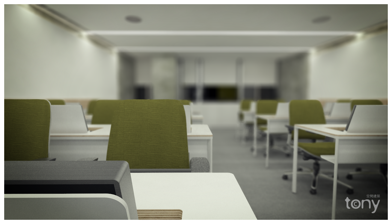
My recent try with sketchup and vray
-
a classroom

-
Very nice job. Materials and choice of colors are great. But that blur seems a bit too intense, especially with nothing extremely obvious in the foreground.
-
Lz, thank you for your comment
-
@lz said:
Very nice job. Materials and choice of colors are great. But that blur seems a bit too intense, especially with nothing extremely obvious in the foreground.
I agree, I think the DOF needs to be on the extreme foreground as well. That should balance the image a bit more
Apart from that great work

Hello! It looks like you're interested in this conversation, but you don't have an account yet.
Getting fed up of having to scroll through the same posts each visit? When you register for an account, you'll always come back to exactly where you were before, and choose to be notified of new replies (either via email, or push notification). You'll also be able to save bookmarks and upvote posts to show your appreciation to other community members.
With your input, this post could be even better 💗
Register LoginAdvertisement


