Earth tones house finished
-
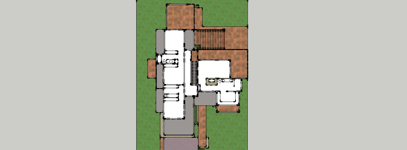
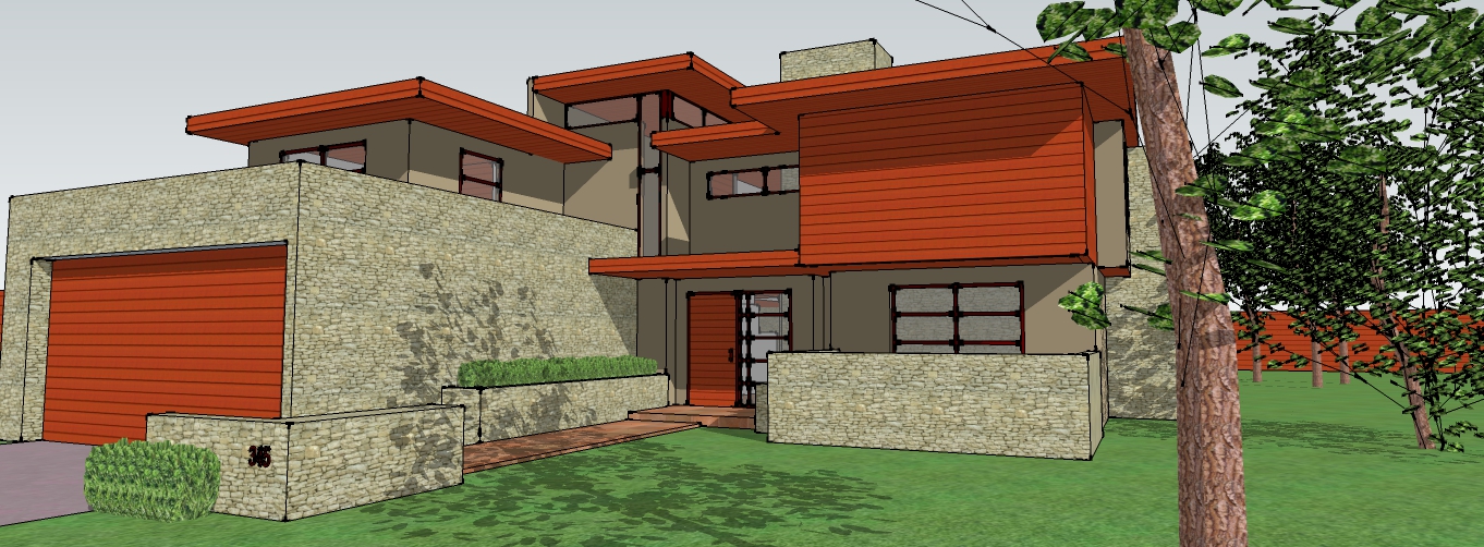
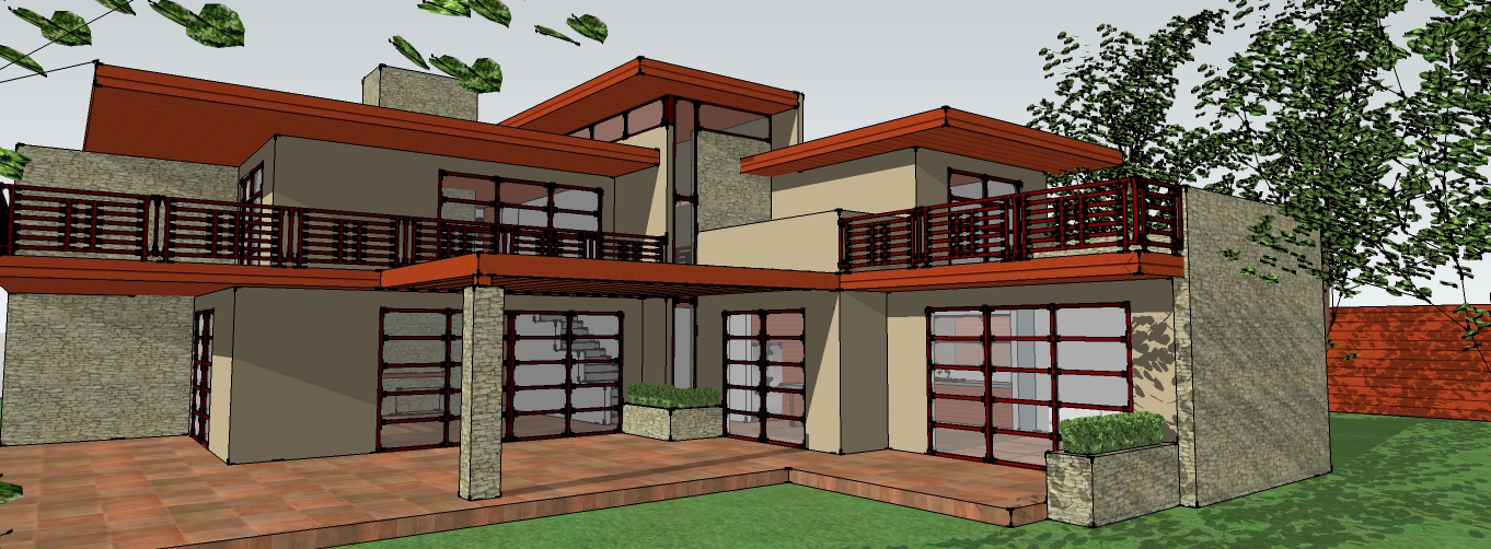
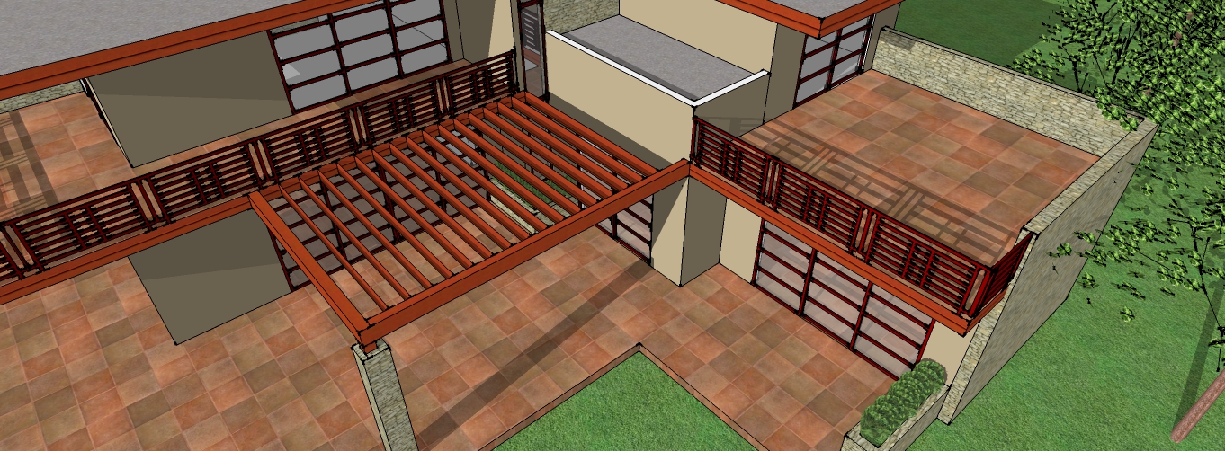
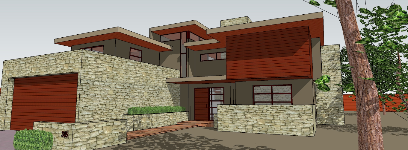
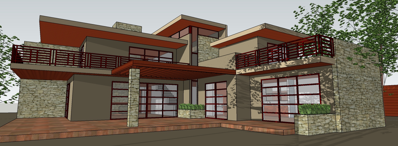
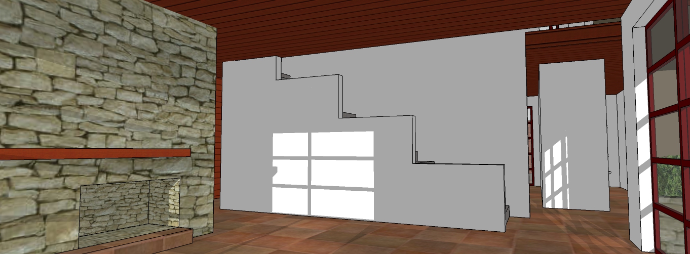
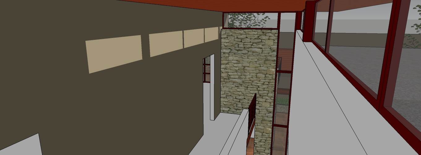
My aim was to make a not so new looking new house modern but in warm colors rather than the popular stark whites. I also decided to place less glass and in a more traditional fashion to give the house a feeling of privacy.
Coments on the colors, yey or ney.
thanks

-
Looks great, Serrot. I think (IMHO) it would be better if the stucco (smooth) material wasn't the same hue as the stone. Maybe a bit darker. So the two materials are better differentiated. Also, I think your plans would read better if endpoints were turned off on your style settings.
-
@daniel said:
Looks great, Serrot. I think (IMHO) it would be better if the stucco (smooth) material wasn't the same hue as the stone. Maybe a bit darker. So the two materials are better differentiated. Also, I think your plans would read better if endpoints were turned off on your style settings.
Thanks for the heads up on the endpoints, I didn't know where to go to turn them off. I am having trouble with the way the color reads, it reads darker than the stone with the shadows off but lighter with them on.
-
You turn on and off the endpoints in the edge settings of the Styles dialog.
-
Nice!
My comments".what you will.
The orange overpowers the green. More balance? The stone is too small.. How about a light soffit color?
Interesting things going on.
-
Looks good but isn't the garage door much too close to the edge of the wall?
Hello! It looks like you're interested in this conversation, but you don't have an account yet.
Getting fed up of having to scroll through the same posts each visit? When you register for an account, you'll always come back to exactly where you were before, and choose to be notified of new replies (either via email, or push notification). You'll also be able to save bookmarks and upvote posts to show your appreciation to other community members.
With your input, this post could be even better 💗
Register LoginAdvertisement


