Home office/studio-update living/dining
-
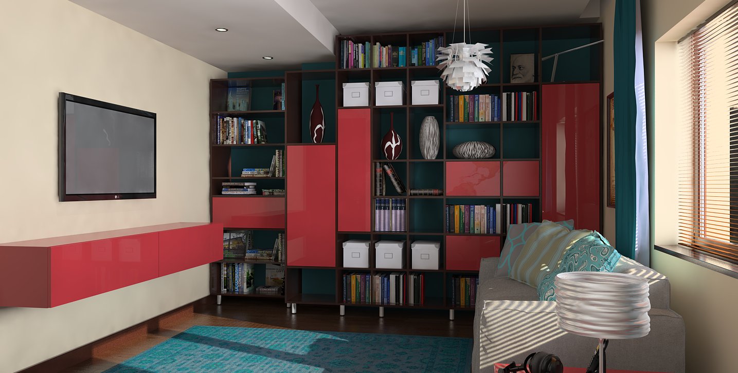
Hello everyone, I'm having a new project, after a very long time, so I'm very excited.
I had to follow some guide lines, like dark wood furniture, and turquoise as a predominant colour. Not too sure about coral colour, but it was the obvious choice for me. I'm not very good with colours, so I'll guess there are some others that will compliment turquoise better. I'll love to hear some c&c.
Regards,
Stefan
-
Very nice Stefan, the render is very good especially the color combinations...
allanx
-
Looking good. TV screen should be black.
-
Thank you!
-
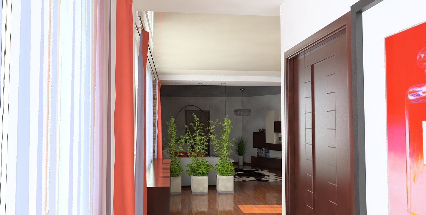
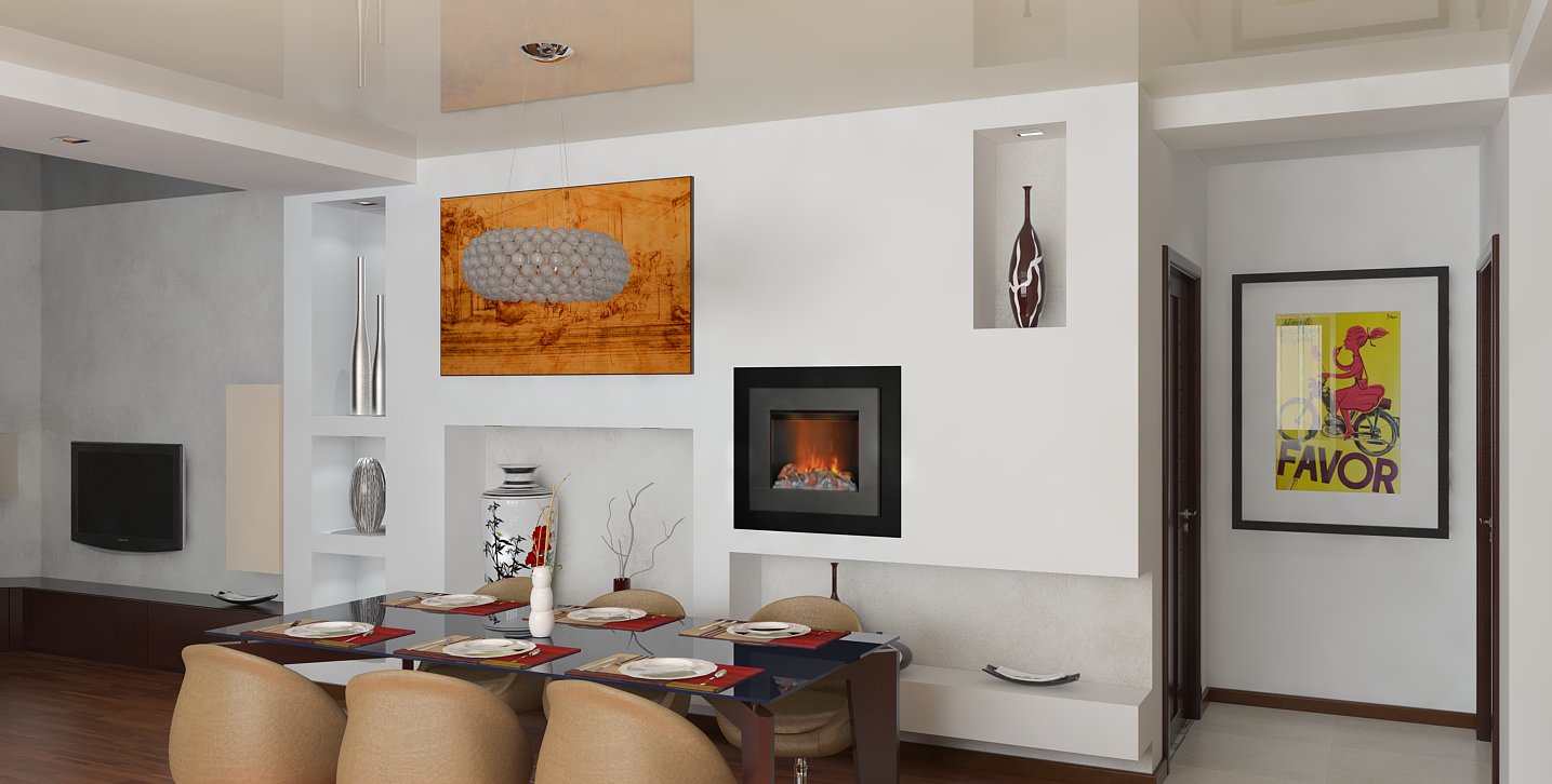
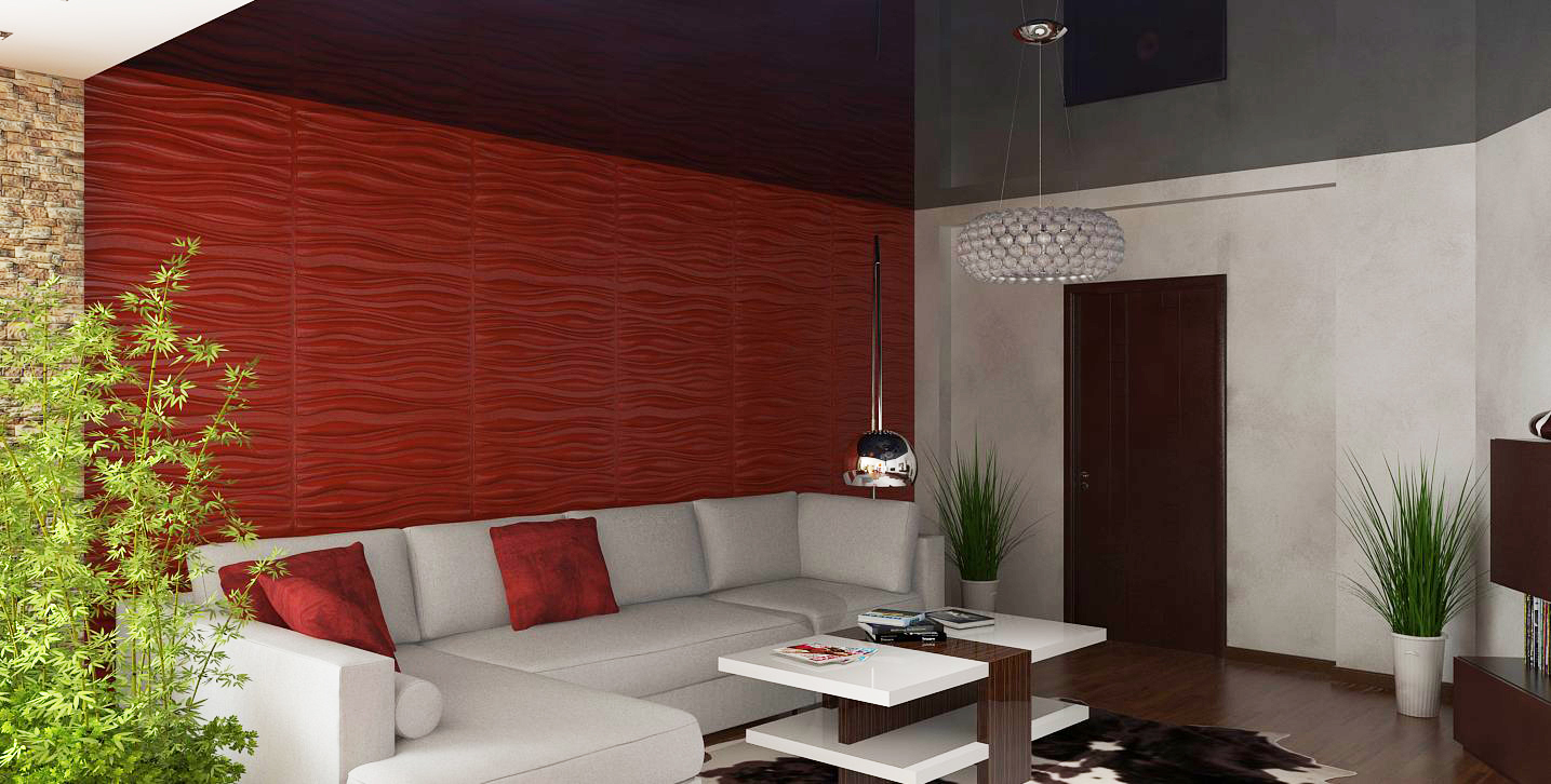
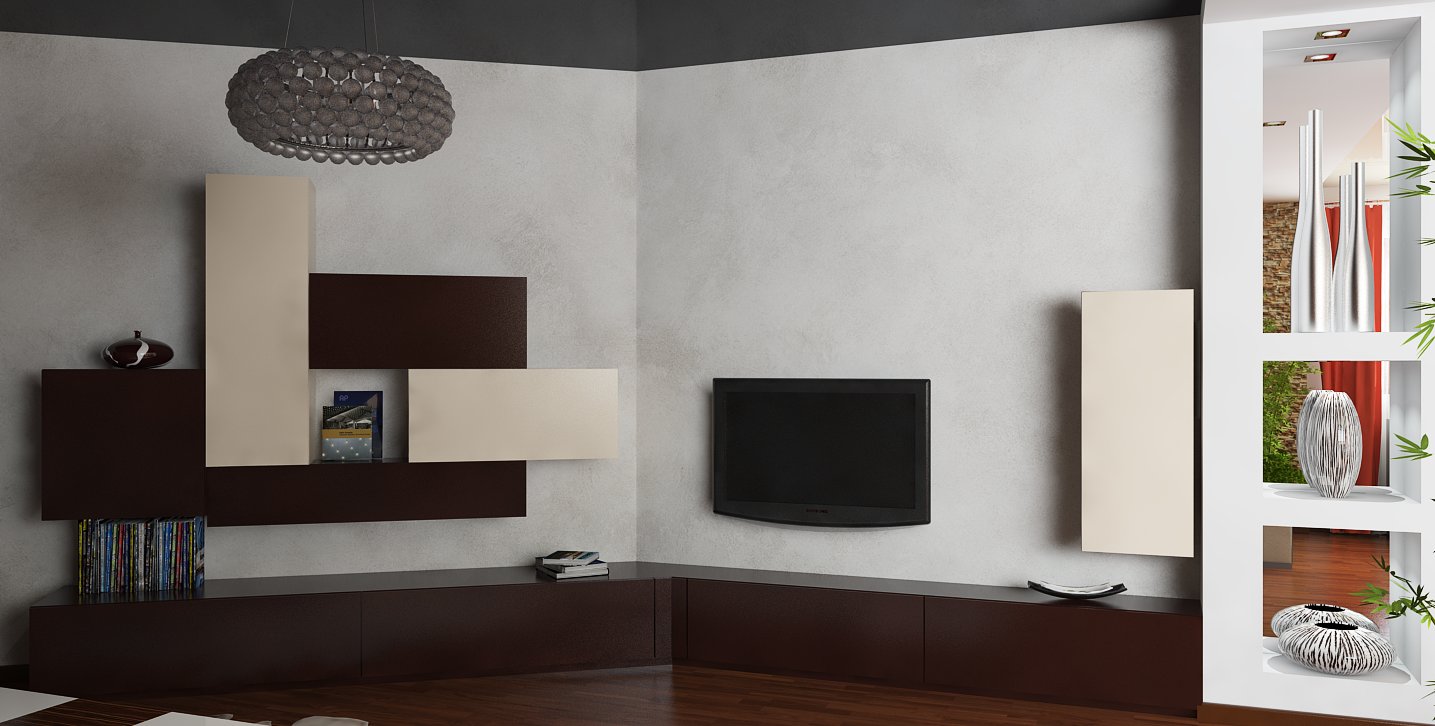
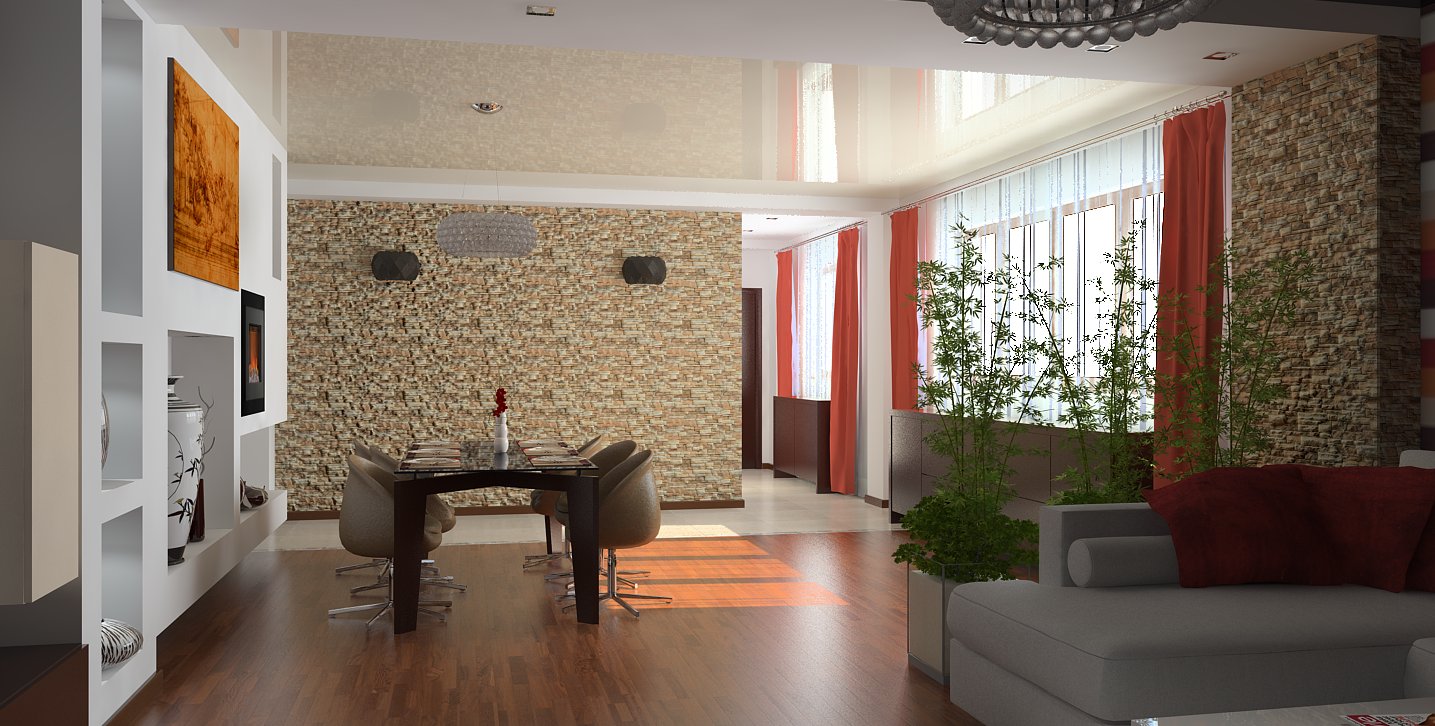
Same project, different area. Thanks to many users who shared models over time, I managed to put the scene in place really fast.Some models from the warehouse ware used as well.
Andeciula's plant is fantastic!
Regards,
Stefan
-
very nice lighting in these! great job
-
Thank you, Jason!
-
Very real Stefan, great job Congrats...
allanx
-
They all look great especially the first of the new series. The lighting dof & colour palette are excellent.
-
Thanks guys, I can't take credits for the colour scheme, because I got "hints" from a professional person. I got some freedom, like how much or where to put colours, but I followed a specific colour palette.
Regarding lighting, I'm using more and more a technique that I've picked up following some tutorials. It belongs to Fernando, and basically, is the use of the GI, with a big multiplier, without any map (sky) applied. V-ray users know, that if the light coming from the sun is not enough, sky portals in windows should be used. It's a shame I can't try the beta version, because I have no time lately, and it doesn't sound right to me to install it, and not to give proper feedback.
Cheers,
Stefan
Hello! It looks like you're interested in this conversation, but you don't have an account yet.
Getting fed up of having to scroll through the same posts each visit? When you register for an account, you'll always come back to exactly where you were before, and choose to be notified of new replies (either via email, or push notification). You'll also be able to save bookmarks and upvote posts to show your appreciation to other community members.
With your input, this post could be even better 💗
Register LoginAdvertisement


