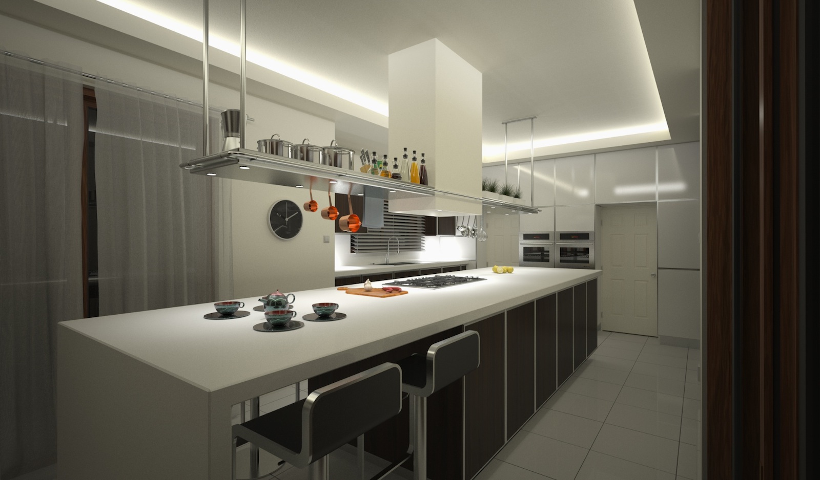
Kitchen Island Storage
-
This is one of my latest images. The room is difficult because it has limited wall space, behind the camera three walls have patio doors. C&C is welcome sketchup & maxwell render.

-
Nice one Chedda. Finally I get to see what a descent Maxwell for Sketchup post looks like. Beautiful lighting job. Are these all native Maxwell textures or are these Sketchup textures edited in Maxwell? By the way... Turning in soon. I am in eastern standard time.
-
Some are textures applied in sketchup & edited in the plugin most are maxwell materials from the nextlimit site. I have a ton of threads in the gallery have a search. Glad you liked the image and Maxwell.
-
Nice render and good use of the space. On a design note however, might I suggest that the extractor over the hob is a little low for a gas appliance? Although I suppose it depends on the regulations in your country.
-
Beautiful design and rendering. Style-wise, I have a problem with that traditional 6-panel door in a contemporary design. I assume the door is existing; maybe put a panel over it so it complements the kitchen? Composition-wise the image is unnaturally rigidly ordered. Even the tea cups are arranged as if someone measured them out with a ruler. Introduce some disorder. Re-arrange the tea cups, rotate one of the stools slightly, push one of those canisters back a bit.
-
I think the hood is a bit low but it's a huge island so the perspective may be deceptive. Regarding too straight i think your right, some things need to be re-arranged just slightly, tidy but not perfect ! The doors yes look out of place something odd with the style.Thanks for the feedback.
-
Really beautiful rendering. My only suggestion is that it seems so dark? I tried to imagine myself cooking cookies at midnight for my daughters class the next morning. I would be worried that I might need a flashlight to prepare something.
I love the shelf over the island. I wish I had one of those!
-
Thanks for the comment Tinanne, i wanted some contrast in the image to give it depth. I didn't consider it dark though perhaps our screens differ.
Hello! It looks like you're interested in this conversation, but you don't have an account yet.
Getting fed up of having to scroll through the same posts each visit? When you register for an account, you'll always come back to exactly where you were before, and choose to be notified of new replies (either via email, or push notification). You'll also be able to save bookmarks and upvote posts to show your appreciation to other community members.
With your input, this post could be even better 💗
Register LoginAdvertisement


