Post Title Text Size
-
I noticed this right off but tried to see if I'd get used to it...didn't

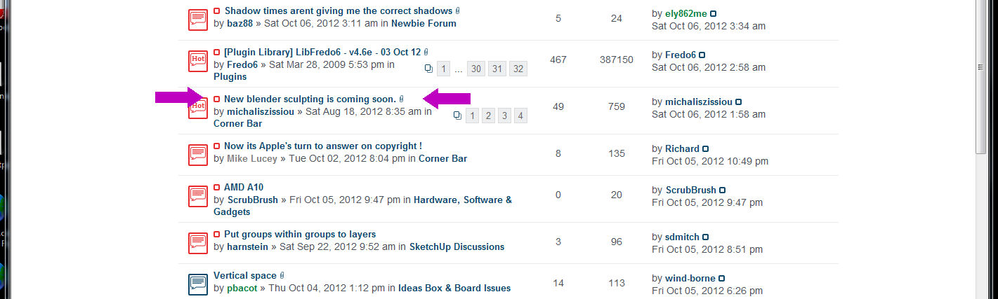
I think the list of topics would be much easier to scan if the Post Title Text was just a bit larger than the other blue text...whadaya think?
-
Like now? Is it better for others, too? (Refresh the page if you cannot see)
-
Yes, now it's better
Charly
-
Wow! Thanks, Gai...very good!
-

-
Hi,
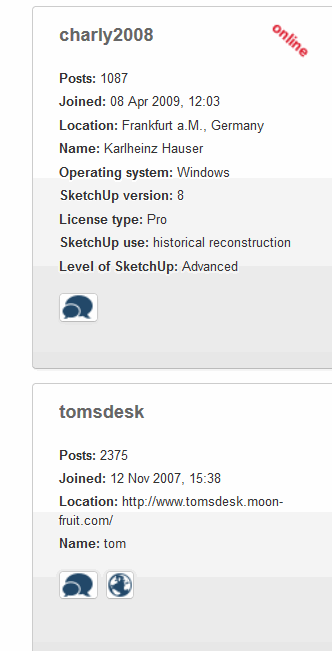
why sometimes the avatars are gone?
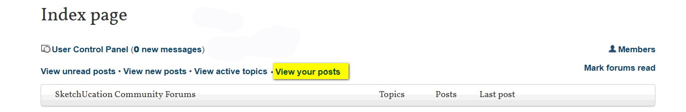
Could the "View your own posts" set again in a row?
Charly
Hello! It looks like you're interested in this conversation, but you don't have an account yet.
Getting fed up of having to scroll through the same posts each visit? When you register for an account, you'll always come back to exactly where you were before, and choose to be notified of new replies (either via email, or push notification). You'll also be able to save bookmarks and upvote posts to show your appreciation to other community members.
With your input, this post could be even better 💗
Register Login


Advertisement