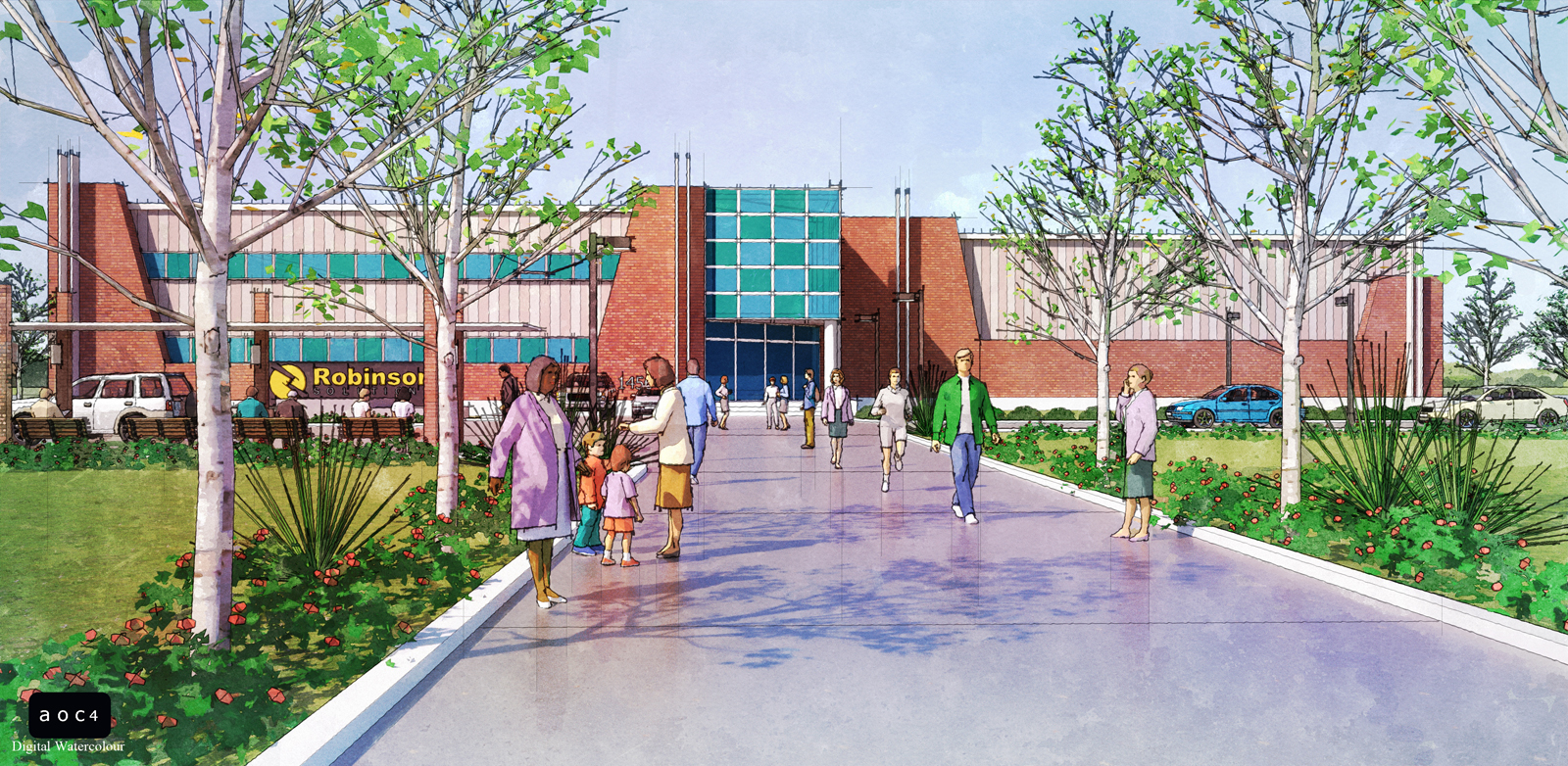
NPR Kingston Building Render
-
Here is another NPR render I did in Digital Watercolour style...Kingston Building
Thanks,
allanx

-
Allanx you really have found the formula for NPR. I like the palette of colours in this image. Good work !
-
Thank you chedda...
allanx
-
Allen, I agree with Chedda, but why is the pavement so reflective?
-
very lovely work!
 Do you do this all from sketchup output or do you use a rendered output as well? lol on the purple robed formfonts woman - I was just using her in a scene recently
-
Thanks guys,
Ben, the reflective floor adds color in the image just like in real watercolor paintings...
Andy, I do this to all my 3D work but I also have a rendered image and is one of the major component of this composition.
allanx
-
Vivide colors

-
Thanks Pilou...
allanx
-
@allanx said:
I also have a rendered image and is one of the major component of this composition.
Thanks, that's what I was guessing. It looks like there is some global illumination and reflections, but it's blended in so nicely to get a convincing overall effect. I just ask because I find it hard to achieve the right balance of using a render in NPR, so that most of the time, I just use straight sketchup layers and don't use a rendering at all. What blending mode and what percentage do you use for the render layer in your image?
-
I was using the same thing with just sketchup layer but cannot achieve the right look, the opacity depends on the scene and different every time. But I dont go over 50% with Multiply layer.
allanx
-
Mate I'd love to say this is another great work, but your work is SO GOOD you've set yourself a standard and to me this one isn't achieving that same high level. Sorry but can't let you slip!
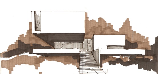
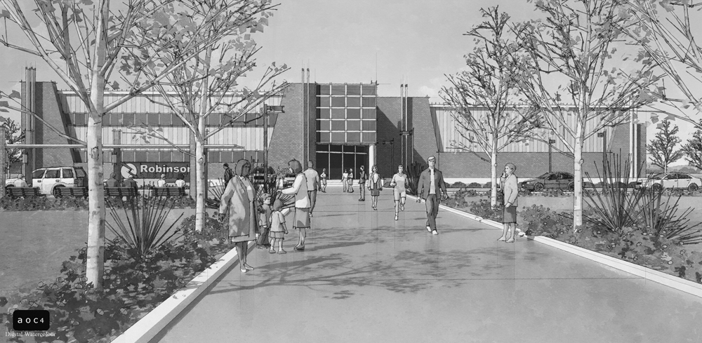
Actually mate I came across this image on pinterest the other day and thought of you, I figured you could actually improve on this - I like the monotonal effect and how they have drawn out the architecture! Well suited to your own workflow!

-
Don't be sorry Richard
 , not my favorite image actually I should have tried a different approach on this one....honestly I have problems with orange and brick colors/materials...
The monochrome is a good idea, haven'try that approach but I will..for renders that are not that exciting I usually make a black and white version just for fun..
Thanks
allanx

-
I really like your NPRs .. great work ,, like alwase

.. They're much better than real paintings , because they could easily be backed up and copied

-
You are right pejman about digital art, thanks...
allanx
Hello! It looks like you're interested in this conversation, but you don't have an account yet.
Getting fed up of having to scroll through the same posts each visit? When you register for an account, you'll always come back to exactly where you were before, and choose to be notified of new replies (either via email, or push notification). You'll also be able to save bookmarks and upvote posts to show your appreciation to other community members.
With your input, this post could be even better 💗
Register LoginAdvertisement


