Student Housing Entry
-
-
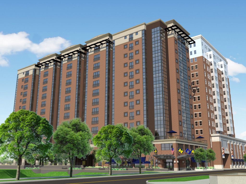
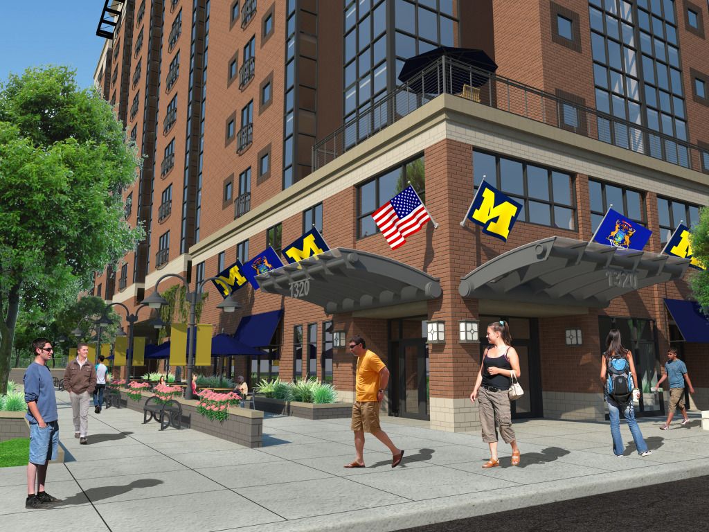
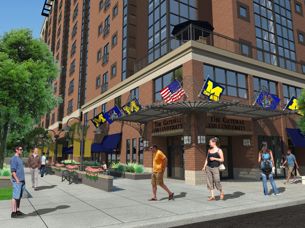
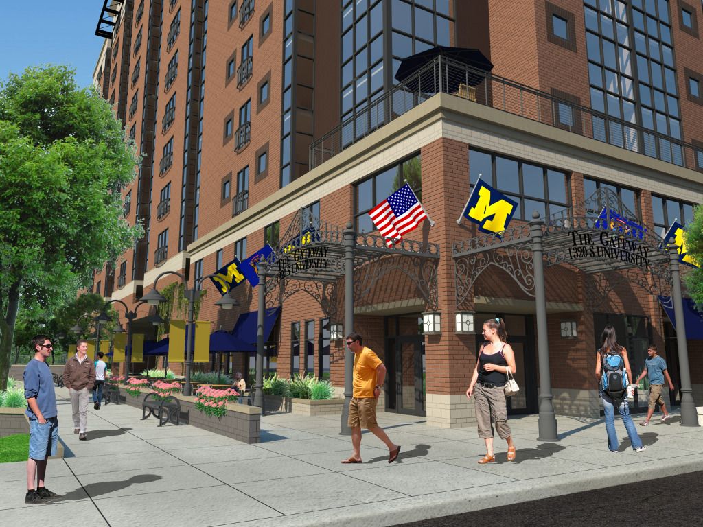
Nice. As far as the three canopy designs, in my opinion the first one is more in keeping with the building's design - the other two are too retro. You need to watch your brick coursing - you have half a course above the stone base, and at the top a sliver of a course.
Why is the one guy wearing a jacket, but everyone else is dressed for warm weather? (funny the things people notice, huh?)
-
@daniel said:
Nice.
Why is the one guy wearing a jacket, but everyone else is dressed for warm weather? (funny the things people notice, huh?)I agree, and why throw everyone a shadow but one person not?

-
Hi seabass84,
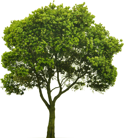
One comment about trees - before you use the bitmap in SU remove the white pixels around them.
In Photoshop go to Layer > Matting > Defringe
It would look much more better in SU


-
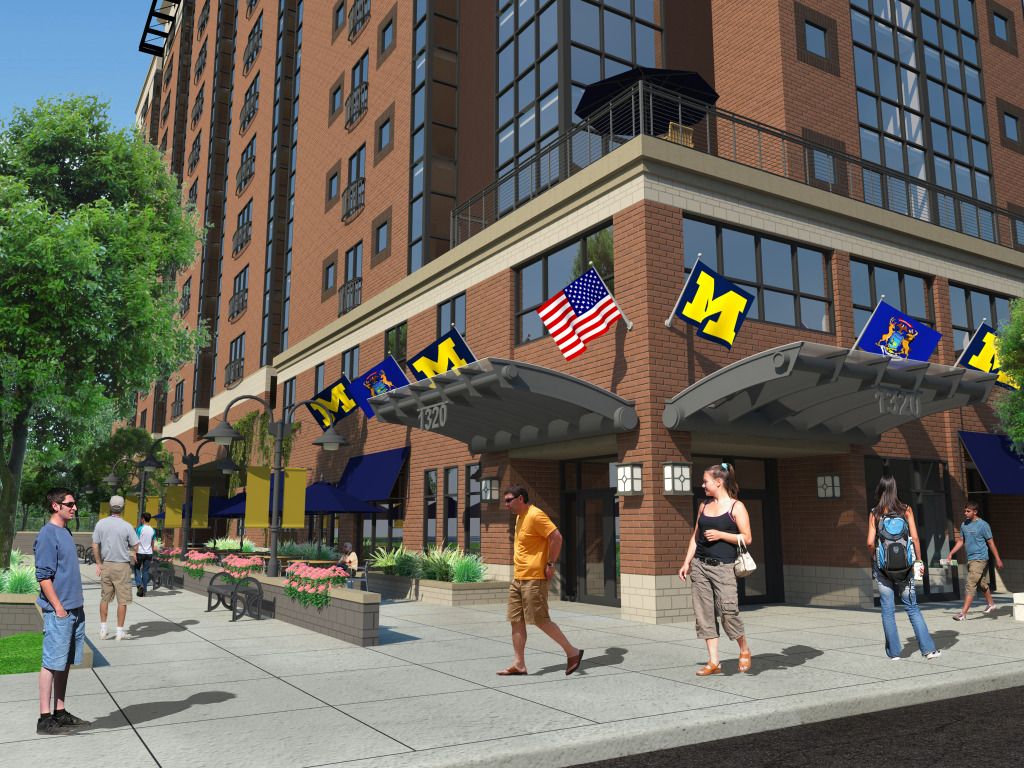
Fixed the brick coursing and I think it looks much better.
Tried the Defringe option and it works fantastically. Thank you for the photoshop lesson!
-
And I see that guy changed into warm weather attire, too.


Hello! It looks like you're interested in this conversation, but you don't have an account yet.
Getting fed up of having to scroll through the same posts each visit? When you register for an account, you'll always come back to exactly where you were before, and choose to be notified of new replies (either via email, or push notification). You'll also be able to save bookmarks and upvote posts to show your appreciation to other community members.
With your input, this post could be even better 💗
Register LoginAdvertisement


