:Ballroom:
-
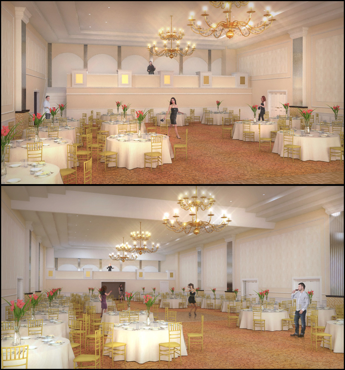
Here is a ballroom renovation I did a couple of images for.. SketchUp/Twilight/Pshop/Magic Bullet Looks
The owner was more or less just updating the finishes along with a few minor archiectural changes to the space. Cheffey was kind enough to model this up for me when I was crazy busy. I know the people are kind of weak, but I obviously can't fill it with people.. I personally think there should be no people, but the client wanted a few.

-
Looks great,I like the style also.
The guy in jeans drinking wine is so out of place

-
Very nice mate!!!! May be though just a bit too bright for the lights to be so bloomy!
-
Nice images Jason, I like the mood...

-
yeah I agree the people are kind of distraction especially the guy in jeans...the render is very good without the people IMHO...
allanx
-
so what you guys are saying in a roundabout way is.... that the people are no good? haha.... I'll take them out.. I've been waiting to see what my client has to say about it.
thanks for the comments... and richard, i couldnt control myself on the bloom on the lights
 but yeah, you're right..
 -
quick "curves" adjustment
-
Nice renderings, as usual, Jason.
I've always been an advocate of including entourage in architectural renderings; in this case I think the problem is with these particular people - they don't seem to fit the scene of a practically empty ballroom. maybe a few wait staff setting tables. -
That's genius, Daniel.. that would be the only time there would be a few people in the space. I think my client wants to leave people out altogether, but if I can dig up some cut-out people that look like wait staff, I'm going to give that a try.
Thanks for the adjustment, Richard..that does look better. the Curves adjustment still proves difficult for me to master!
-
Mate I don't understand curves adjustment either!!!!

I read a small section in a book whilst at a book shop once that just had simple steps to improve an image - it suggested "curves" as a quick and easy "do all" for improving images when converting from RGB to CYMK as images tend to dull the contrast. It suggested to open the curves editor and move the top of the curve (third way down) > left and the bottom (third way up) > right - both by just a bit. This works well for most images.
However, with your's I just moved both these new points to the right a bit (below mean) so the curve sagged! Very basic edit but big plus for the result!
-
@daniel said:
Nice renderings, as usual, Jason.
I've always been an advocate of including entourage in architectural renderings; in this case I think the problem is with these particular people - they don't seem to fit the scene of a practically empty ballroom. maybe a few wait staff setting tables.Smart!!!!
Hello! It looks like you're interested in this conversation, but you don't have an account yet.
Getting fed up of having to scroll through the same posts each visit? When you register for an account, you'll always come back to exactly where you were before, and choose to be notified of new replies (either via email, or push notification). You'll also be able to save bookmarks and upvote posts to show your appreciation to other community members.
With your input, this post could be even better 💗
Register Login


Advertisement