Comic book style car renders
-
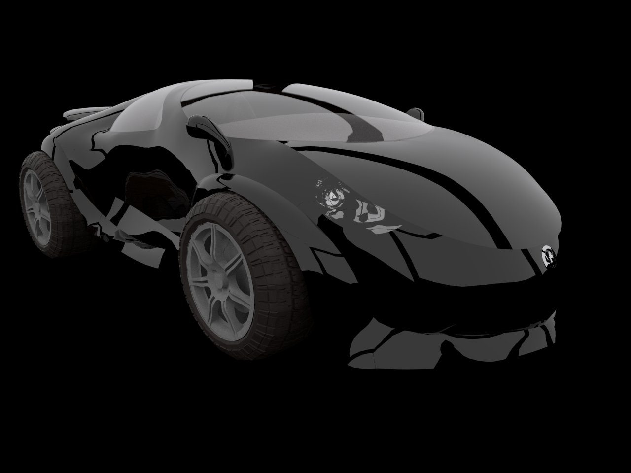
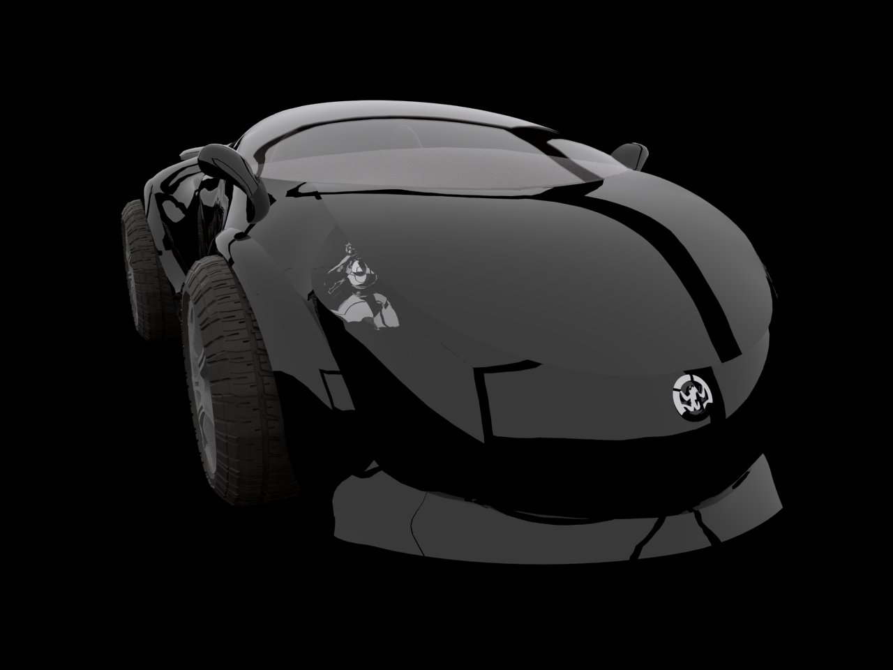
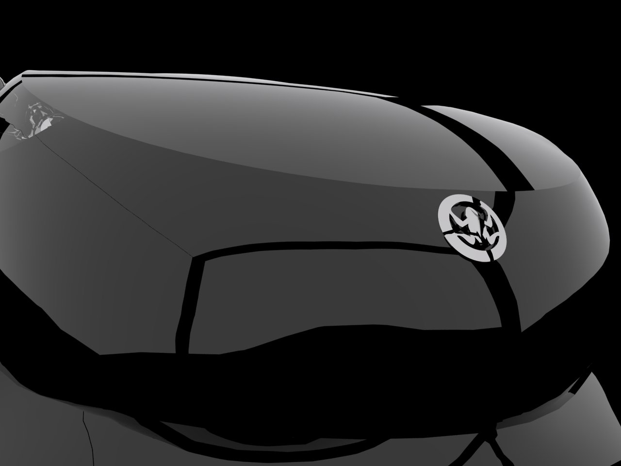
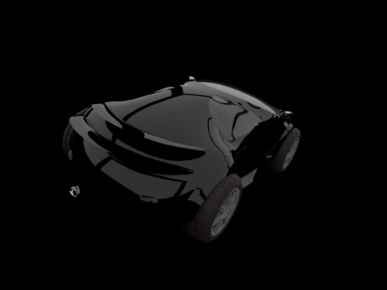
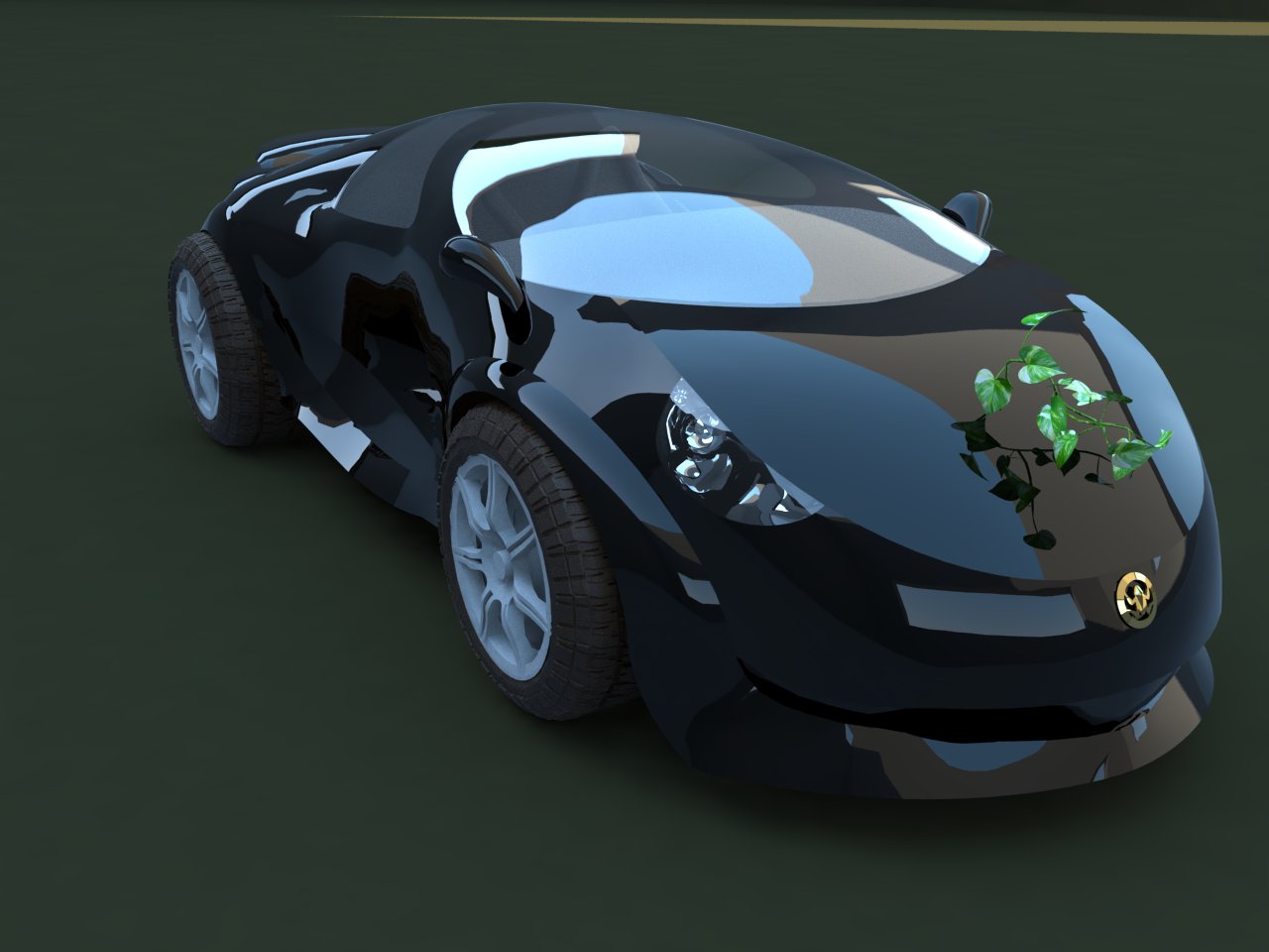
This is a concept sports car I have been playing with. Completely in Sketchup, rendered using vray. I tried to achieve a comic book style almost like sin city. Tires are loosely based on 3DWH models. Jpeg files are surprisingly small so I could post more than one renders without overloading users bandwidth or forum's storage.
cheers
-
That is truely amazing rendering and design.
-
Thanks.

-
The modeling is well done. The rendering is good but could be better. With the environment and background being black it give no shadow to the ground which makes the car look like it is floating. I understand the style you are after but even a slight ground shadow can make a huge difference.
-
Thanks, I am actually still trying to find a good ground.
-
These renders were very fast (about 30 seconds each) so I decided to make a short mock trailer of the car. I prepared a high definition stereoscopic 3D video but I had problems at youtube hence no 3D and no HD. The music is an original composition by me synthesized using MuseScore. Compared to many wonderful car models in the forum this one has a long way to go... but I am having so much fun.
[flash=600,465:2ioswcvw]http://www.youtube.com/v/2Aa3biIRSV8?fs=1&hl=en_US[/flash:2ioswcvw]
-
@scottpara: I had some of your models and renders too in my mind when I was talking about the wonderful models in the forum. This one is such a case.
Probably it was intentional in your render, I notice a lack of reflection on the headlights glass cover. It appears almost there is no glass in front.
For the background I even considered trying star-map images (say from hubble) but at the moment I do not know how to do it.
Panel gaps is a check. I was thinking also grills, window rubber seals, a proper wiper, radio antenna, signaling lights etc. I just spent my energy for this model trying to produce the animation (took several*several hours). I will come back to it later though.
-
Ogan,
Yep there is very little headlamp glass reflection. They changed the headlamp inners so much they actually wanted them seen very clearly (without much reflection) much to my disagreement

I would say you are well on your way and you know what needs to do done next. Looking forward to watching the progress of your work.
Scott
-
Something I notice your missing (that makes a big difference) is the panel gaps. Still not floor so the car still seems to float. I have attached one of my recent renders of the new 2012 SRT8 Jeep. I went for a dark environment but not black which helps to ground the vehicle.
Scott
-
@unknownuser said:
The modeling is well done. The rendering is good but could be better. With the environment and background being black it give no shadow to the ground which makes the car look like it is floating. I understand the style you are after but even a slight ground shadow can make a huge difference.
 thats the fact.
 -
This has been very instructive for me. The slight shadow does help a lot. The wine... its just experiment and fun.
Hello! It looks like you're interested in this conversation, but you don't have an account yet.
Getting fed up of having to scroll through the same posts each visit? When you register for an account, you'll always come back to exactly where you were before, and choose to be notified of new replies (either via email, or push notification). You'll also be able to save bookmarks and upvote posts to show your appreciation to other community members.
With your input, this post could be even better 💗
Register LoginAdvertisement


