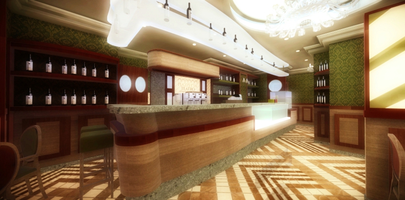
Internal pub classics.
-
SketchUp + LightUp + Gimp

-
Nice, I like it

-
Hi, martinvz:
This is a very fine image and concept! I like the colors and even the soft effect on the edges.
I note that there in the floor middleground is either a reflection or a ghost object. Not as noticeable, except on "superzoom", the texture matching especially in the wood grain at the curved end of the bar. However, this may be intentional as if matching panels. But matching seams on a curved surface would place extra stress on a veneer applique and would tend to delaminate in real world.
I appreciate the high level of lighting to bring out the darker elements in the space, but, on my screen, the detail of the light structure is somewhat ambiguous. -
Thanks for the comments, (I like LightUp, and I'm trying to use it)
-
@mitcorb said:
Hi, martinvz:
This is a very fine image and concept! I like the colors and even the soft effect on the edges.
I note that there in the floor middleground is either a reflection or a ghost object. Not as noticeable, except on "superzoom", the texture matching especially in the wood grain at the curved end of the bar. However, this may be intentional as if matching panels. But matching seams on a curved surface would place extra stress on a veneer applique and would tend to delaminate in real world.
I appreciate the high level of lighting to bring out the darker elements in the space, but, on my screen, the detail of the light structure is somewhat ambiguous.Of course you ment Natato.

-
Hi Natato--and martinvz:
Please excuse the mistaken identity. Clearly my fault.
Best wishes to you both,
mitcorb -
All o.k.

-
The image is nice but the lighting is completely blown out for me. I also get a feeling of a very closed in space. I am not sure if that is due to the camera angle or not. Overall it is a pretty good image.
Scott
-
Wow! Very nice image. Thank you for sharing!
-
Thanks, tinanne!
Hello! It looks like you're interested in this conversation, but you don't have an account yet.
Getting fed up of having to scroll through the same posts each visit? When you register for an account, you'll always come back to exactly where you were before, and choose to be notified of new replies (either via email, or push notification). You'll also be able to save bookmarks and upvote posts to show your appreciation to other community members.
With your input, this post could be even better 💗
Register LoginAdvertisement


