Kitchen design
-
Hi to you all.
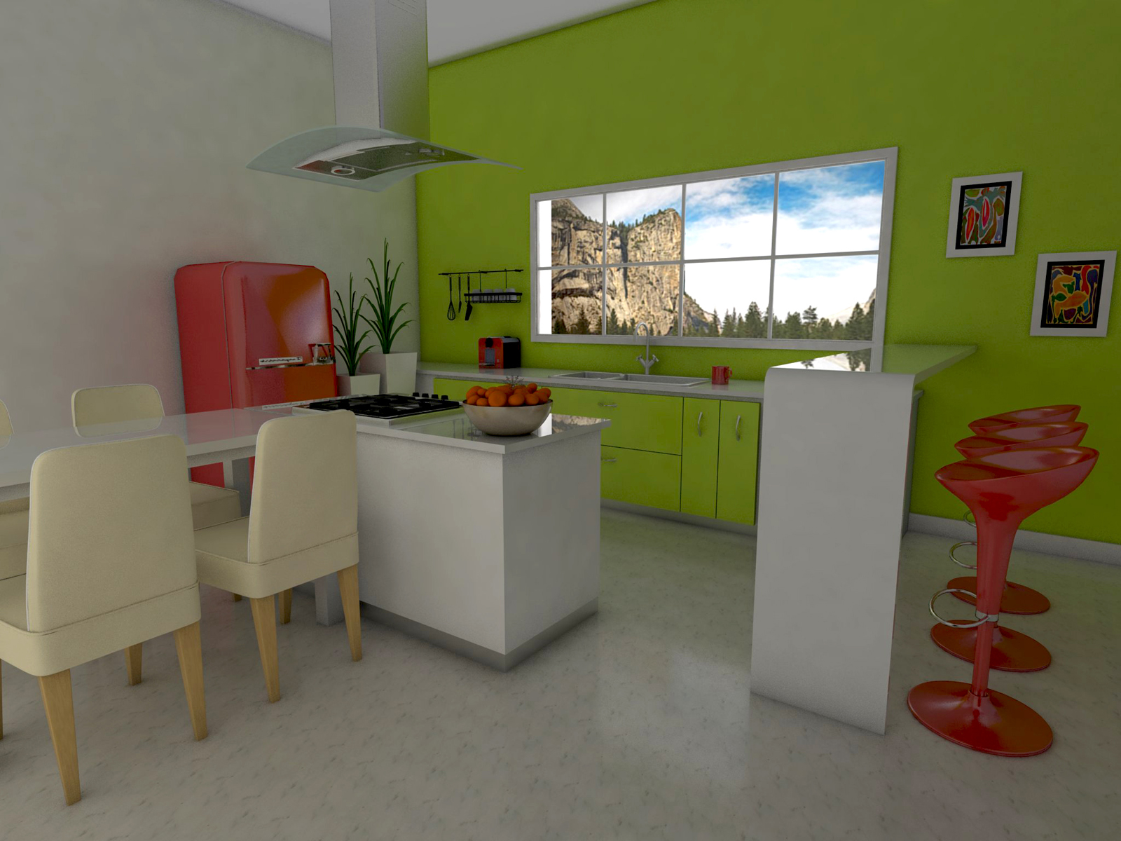
Well after designing a lot of "this and that" , this past months, and no render, I decided to give it a go! So I modelled this kitchen (and one sitting room that I ll post later some time when my render completes)! After a few attempts and a lot of tutorials about rendering, it all came down to this! Please comment freely, as always! Comments and critic are always welcome!!!

-
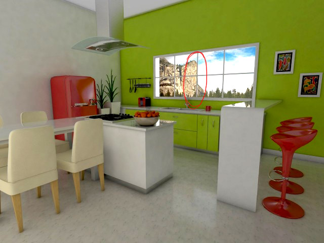
IMHO, I'd like to see a little more contrast, and something that always bothers me are "bad tangents" like the background mountain lining up with the slat on the window. I know, it's no big deal, maybe bkgd should be slightly out of focus. very nice oveall.

What render are you using?

-
I think that there is not enought light coming from the window. And why is that ceiling so high?
-
could mask out the window and easily brighten it....got a shaderlight feel to it, i'm probably wrong though.
-
@olishea said:
could mask out the window and easily brighten it....got a shaderlight feel to it, i'm probably wrong though.
Mask the window? How can I do that? Could you advise me on how to achieve that goal?
After my rendering completed there was NO postpro done on the scene!
Thanks for the comments -
@unknownuser said:
IMHO, I'd like to see a little more contrast, and something that always bothers me are "bad tangents" like the background mountain lining up with the slat on the window. I know, it's no big deal, maybe bkgd should be slightly out of focus. very nice oveall.

What render are you using?You really saw a detail there, I wouldn't have seen it! But I guess I don't really mind... after all it could happen, couldn't it? For the contrast, I think you are absolutely right, it is kind od low lighted isn t it?Like, more light should come from that window! And the renderer is Vray
Hello! It looks like you're interested in this conversation, but you don't have an account yet.
Getting fed up of having to scroll through the same posts each visit? When you register for an account, you'll always come back to exactly where you were before, and choose to be notified of new replies (either via email, or push notification). You'll also be able to save bookmarks and upvote posts to show your appreciation to other community members.
With your input, this post could be even better 💗
Register LoginAdvertisement


