Knocking out more Plants
-
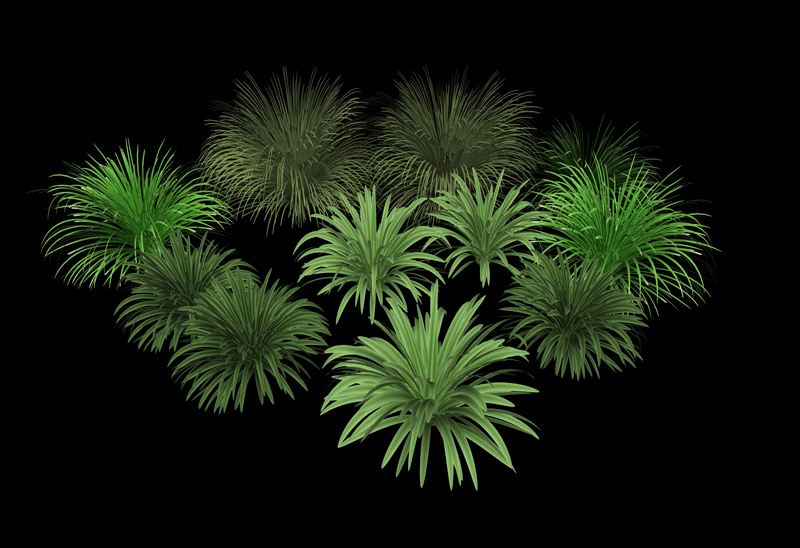
After seeing a really nicely planted garden bed in Sydney the other day I realised with some modification to one of my previous plants I could generate a few nice variations.
Here are four variations of the same theme, mostly achieved with mapping and a few geometry modifications.
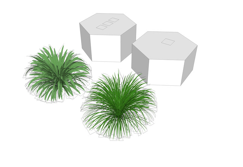
As the mapping is the bulk of the leaf blades these are fairly light. I've created proxies for each and rather than adding a colour to the Proxy I have put a few squares (1,2,3,4) on the top so I can recognise them quickly on populating with the bonus of not adding more materials to the mat browser. Each has a 4000x2000 pix map optimised for SU to keep the file sizes low 200-400kb!
Again to ensure they don't disappear when rendered at low camera angles all the planes are warped laterally which I'm finding works well.
With the geo on a "High Poly" layer (always turned off in scene) and the proxy on the "Landscape" layer copying the proxies around produces no drag on the scene. Then with instancing on man I can use a tonne!
Problem though they look CRAP in SU given they aren't full geometry! Now I've just got to test them with Maxwell's new fast SSS.
Image: Native SU export.

-
This is what I mean about coding the proxies rather than using a colour - version 1 and 3 shown.

-
Those look great, Richard.
-
Very real, Dick..... real cool!

-
Thanks guys!
Yeah now I need to get back to producing some trees, I came up with a really funky idea for really low poly mapped trees that still render as 3d, though need to get more testing done. If it works as expected it will break the back of the ongoing tree issue and allow very high poly looking trees to be used for render direct in SU.
-
Nice job...very real looking!
Robert
-
well done Richard
I thought it was 2D images at first sight
Wonderful -
Looks great richard. Look forward to seeing the SSS version. You're certainly the master of low poly stuff that looks high poly.
Interesting idea with the coding of the proxies. Why, out of curiosity, did you decide to code them as you did vs. a color coding system?
-Brodie
-
@unknownuser said:
Looks great richard. Look forward to seeing the SSS version. You're certainly the master of low poly stuff that looks high poly.
Interesting idea with the coding of the proxies. Why, out of curiosity, did you decide to code them as you did vs. a color coding system?
Hey thanks Brodes!
Mate the reason for electing a geometry mark in lieu of colours:
-
Keeps materials out of the SU browser and the plugin material list (using four colours here isn't too much an issue though seems unnecessary) I'm SO ANAL about keeping the whole environment when working streamlined.
-
I find I still need some visual reference to indicate the rotation of the proxies, so that enough variation to avoid too many orientated the same way. So the marking serves this purpose well.
In regards to the SSS version, will await a new machine early 2011, my current machine inherited from Noah once he finished his ark design just doesn't seem to like any SSS.
-
-
BTW when I say low poly, lower poly might be more correct! They are still fairly poly heavy just lower poly in the respect that a number (4-8) of leaves are mapped to a similar poly count that a true 3d version would utilise for one leaf. Infact I've used a fairly high count to gain a very smooth curve to avoid the obvious jaggardness (sp?).
So hence there is some poly saving though balanced against getting best results. A balance is also made by using high enough poly count nested components to make efficient use of instancing.
-
Yes, your analness knows no bounds
 Actually, those are pretty good reasons. I hate seeing those extras colors in my studio material list as well when they crop up. Besides, I can't knock on your anality too much (wow, that sounds dirty) ever since your tip about using bump maps to texture map brick and such. That's been quite useful.
-Brodie
Hello! It looks like you're interested in this conversation, but you don't have an account yet.
Getting fed up of having to scroll through the same posts each visit? When you register for an account, you'll always come back to exactly where you were before, and choose to be notified of new replies (either via email, or push notification). You'll also be able to save bookmarks and upvote posts to show your appreciation to other community members.
With your input, this post could be even better 💗
Register LoginAdvertisement


