New Brochure blending NPR / PR
-
Have picked up a new client for design of a range of houses, styles, presentations, range branding and marketing materials.
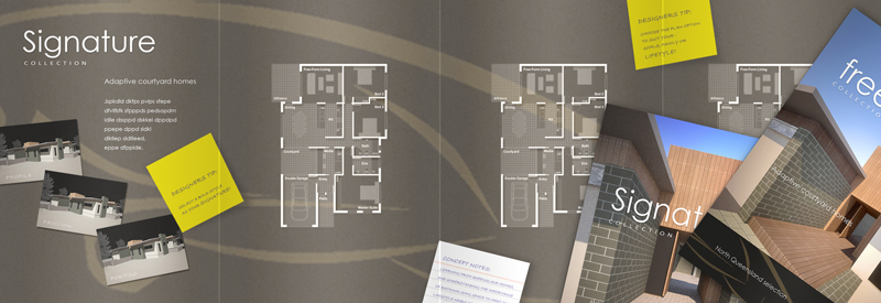
I'm trying to develop a brochure that allows use of NPR and PR images as placing them on the same page doesn't work IMHO unless for a board where space allows separation!
The brochure suite is proposed all as Gate Fold (ends fold in, then fold in half). The media matt finish coated stock with gloss laminate to the outside so the renders finish gloss. The inside then has nice matt finish to better support the NPR style.
I still haven't determined the best sketch render style or plan style though so some feedback or thoughts would be appreciated. A bit of text, logo and areas etc still to go in place.

-
Looking good Richard
Can you post a bigger image
I cant see any detail to give comments on.Cheers
-
Thanks mate!
A close up will only confuse, it's just a mess and embarrassing in fact! Very low res - even though in PS I still work low! Though now working more and more in LO to get the really early knock up it is SO fast! Though then once you need textures and shadows your lost.
I still keep the early knock up for reference later as I can drag the Layout file of the floor plan to the brochure file and scale it to the space. As the line weight and text size are maintained the exports are all same weight and text size so same in print! One feature I like about LO!
-
Oh Ok
Well the over all feel of your layout is great.

has a really nice flow. -
Looks great, Richard. I think the plan style you have shown works well with the design.
-
Hey Richard. As I've made it clear before, you know I'm a fan of your work. Your quality is always top notch, wether it is layout task, furniture design, plan solutions or buildings.
However, eventhoug I like the general layout of the folder you showing us, I'm not liking the "NPR images" on the left. I'm guessing that the blend of NPR and some of your beautiful renders, are supposed to show some sort of ability to master the process from concept to finished project? I might be wrong, but that's how I read it.
Now, I would prefer two other ways. Both ways keep the nice and clean general layout and subtle use of colours:
**1)**Go a "step back" with you your NPR images. Show the project at an earlier stage i.e. sketches/doodles, 3d linework/wireframe or even some of the very nice "fake scale model" images you once made with photoshop! To me the current images seem like they're at the step just before rendering. (3D model with a relatively high level of detail) If and if that's the case, I would prefer another one of your stunning renders.
**2)**I know it was your intention to mix the NPR and PR look from the get go. But you could also skip the NPR. I'm yet to see a bad render from you, and a folder like this would look amazing if it was packed with more of them. (I know this is also a time/money issue)
just my 2 cents, Richard
-
@2kemon said:
I'm guessing that the blend of NPR and some of your beautiful renders, are supposed to show some sort of ability to master the process from concept to finished project? I might be wrong, but that's how I read it.
Now, I would prefer two other ways. Both ways keep the nice and clean general layout and subtle use of colours:
**1)**Go a "step back" with you your NPR images. Show the project at an earlier stage i.e. sketches/doodles, 3d linework/wireframe or even some of the very nice "fake scale model" images you once made with photoshop! To me the current images seem like they're at the step just before rendering. (3D model with a relatively high level of detail) If and if that's the case, I would prefer another one of your stunning renders.
**2)**I know it was your intention to mix the NPR and PR look from the get go. But you could also skip the NPR. I'm yet to see a bad render from you, and a folder like this would look amazing if it was packed with more of them. (I know this is also a time/money issue)
Firstly thanks mate again for the vote of confidence! And you are right on a fair few accounts there! And thanks for the detailed feedback - very much a work in progress so I'm hearing you!
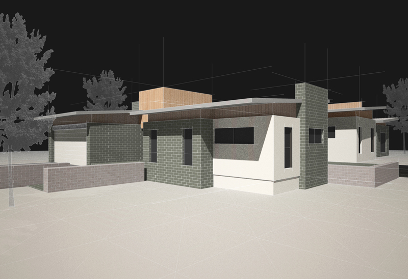
Yep! Time and money thing is certainly one big point, trying to achieve a few others at the same! For me having full scale renders of the whole house (as the norm to that general market) just doesn't create intrique! So I'm using 3 PR renders to show the same number of facade styles available yet to much more dramatic close up effect displaying the detail rather than just a show all.
The sketch style renders then demonstrate the "show all" yet maintain some sentiment that the builder works with the client to create their final package! Economy is also aimed for the further process as the style developed then as fast output on builder / client negotiated outcomes on fast turnaround that maintains consistancy and additions to a gallery of styles.
As you can see the render is quite sketchy though do also agree that it still could be "too" developed. Would love your opinion! I'm trying to get the sketch style as developed as the floor plan which I'm still styling and it aint working yet!

-
@holmes1977 said:
Looking good Richard
Can you post a bigger image
I cant see any detail to give comments on.Cheers
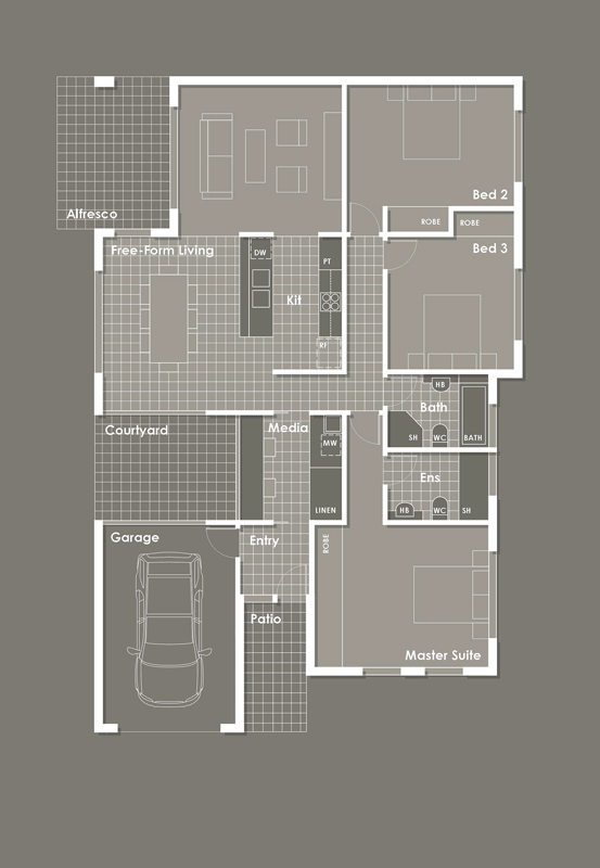
Mate here is a close up on the plan style - the orginal had be mashed up in PS from LO image exports. Then this, I hope the final, is all LO direct export.

-
I think youre floor plans are pretty damn close, Richard! Personally I would tone down the linework for your indication of tiled floors. At the moment they are similar to your furniture, and that seems a bit odd, when the kitchen tables vanishes into floor tiles.
Hmm.. Yes, they are a bit sketchy, but to me it still seems like it is something nearly finished, being converted into something sketchy.
I don't know if you agree, but a sketch can show a lot of thing a neat and pretty render can't.
It can show an immediate idea, impression, motivation and feeling, byt the way lines are drawn, ended, repeated and so on. I know I'm jabbering a bit here, but these things can be very tricky to simulate through a computer.BUT, and here's the kicker. I've seen you making some pretty good attempts at this before, Richard! I clearly remember your pavillion images from pushpullbar, and your fake scale model look, created entirely in photoshop. Have you tried any of those methods? Or, have you tried doodling a bit by hand? I've read quite a bit about what you're into, but don't know if you're into that

I guess my point is. You can show your client that they are a part of the process, as well as giving them a glance at how you transform a concept/idea into your stunning renders. (I realise that in this case it's actually not like that, but I guess the clients don't need to know that)
-
Thanks so much for the sounding board mate!
You are right on both counts the sketch style is a bit advanced, I'm not sure I'll try and incorporate your idea about the showing of development toward the render cycle. I want the full renders to be as really as photos so aka devoid to much vegetation (the realism dropper in most cases). So I guess not eluding to there 3d origin. Most wont know they are rendered.
The sketch I need to show enough to demonstrate the material allocations and tie to the renders. Should mention the sketches will all be of varied home styles, each matching the 3 full close up full renders. I was thinking earlier toward a napkin laid on the page "designers back of napkin sketch, even introducing the facade style name by a monogram on the napkin as if conceived in travels or dicussion at a high end resort or restaurant - this would fit the scheme and add some funk and maybe building some associations! As even the tagline is based on the client's expansion from a resort area to a more urban market.
Yeah like you suggest I need to get more from the sketch, I guess what's being tried with the renders - build intrigue!
The floor tiles are lower weight (0.25) than the furniture (0.5) but the furniture could still do with a beef up. Want to be careful the heavier they are the smaller the room feels. Though need to test more first as high quality printing holds the line weights much better.
Looking at about 30,000 print run over the suite so needing to get ALL sweet!
So thanks again mate! I like being told what for - makes me work harder!
Hello! It looks like you're interested in this conversation, but you don't have an account yet.
Getting fed up of having to scroll through the same posts each visit? When you register for an account, you'll always come back to exactly where you were before, and choose to be notified of new replies (either via email, or push notification). You'll also be able to save bookmarks and upvote posts to show your appreciation to other community members.
With your input, this post could be even better 💗
Register LoginAdvertisement


