Hover Competition Image
-
Just wanted to share my Hover Competition image and see what you guys think of it. The Hover Competition was hosted by Ronen Beckerman ( http://www.ronenbekerman.com ) who's been hosting some great competitions. I was one of only a few folks using SketchUp, love to see some more next time.
My general concept was to do a contemporary art museum in downtown St. Louis, Missouri USA. We have a very cool one by Tadao Ando here so there's a good precedent. I mostly used SketchUp 7 and Maxwell 2 with just a bit of 3ds Max 2011 thrown in to get those trees and the people in there.
.jpg)
-Brodie
-
Very cool. The only thing I would say is that it's kinda' bare. I'd like to see it with a bit more people. That might just be me though.
-
Nice work and good luck.
-
Ya, the amount of people was mentioned in another forum too. I think it's a good suggestion. I've gotten used to production work where I don't like too many people. But in this case, I think some liveliness may help sell the museum aspect a bit more.
Thanks,
-Brodie
-
Looks great, but have to agree with John - it would be nice to see some more life in the images, especially since it is an urban environment.
-
Nice one brodie! very... lofty
 can't decide wether that vangard sign is on the facade of the building behind, or on top of the roof of the building in front...
As for people: you might want to give a mixer for the opening of that gallery...
The shinyness of the sidewalk gives a rainy impression... is that intentional? wouldn't make good weather for that mixer
-
Pyroluna, hrm, interesting take on the sign. It's attached to the apartment building behind, but I could definitely see how that could be confusing.
Yeah, the shiny sidewalk is intentional. I originally had it much more noticeable but scaled it back based on some advice. I wanted to give the look of it having sprinkled perhaps a few hours back and also use the reflections to add a bit more visual interest in that part of the rendering.
Thanks for the comments
-Brodie
-
Looking at the high res image, I noticed a little color fringing. Since this is a color render and not a photo or printed piece, could you explain how this happened. Is someone selling a "cheap lens" plugin. It does not really detract, but it just "ages" the image by taking it back to a time before coated lenses and modern lens design.
Really masterful render.
-
Wow, very good eye. It's become pretty common (on the verge of cliche at this point) to add chromatic abberation during the post processing stage (in my case in Photoshop using the Lens Correction filter which was originally created to get rid of abberation (same goes for vignetting). In a similar fashion noise is also often added (although I used Maxwell, which is kind enough to add the noise in free of charge
).You'll get militants on both sides of the issue. Those arguing that photographers have been trying to get rid of these defects for years and renderings should just avail in their renderingness and the advantages that come along with that. And others who will strongly say that the goal is "photorealism" not necessarily realism - and what is real anyway? I'm not really militant either way and tend to go back and forth based on the situation.
In this case I was going for a slightly stylized grungy look so I put in a bit more vignette than I normally would, and added a bit more DOF blurring to the building in the background than was realistic for my camera settings. And I threw in a tinge of abberation. My take on abberation in particular is that if it's noticeable with a cursory look then it's too much. But used with a very light hand, I think it adds a touch of realism and depth that most people wouldn't be able to put their finger on. You can judge whether or not I went too far, but the fact that you noticed it without being aware of it's use in renderings is quite impressive!
-Brodie
-
Excellent work Brodie! I was looking at this before and it looked familiar with the planters and all and didn't realise it was local to the neighborhood until you metioned St. Louis. Is this a real project? If not it should be. I think it fits well in the context. The materialm and lighting are spot on. I think it may need some type of coping though, no?
Lapx
-
Lapx, are you from St. Louis? I live in South City (and work out in west county). It's not a real project in the sense that it's under consideration of being built - it was just done for a general rendering competition. However, I drew from a lot of STL sources. For the buildings on other side, I went downtown and took some photos and used those as the basis for the geometry and textures. I also based the tree planters off of some examples I saw (off of Washington Ave. I think).
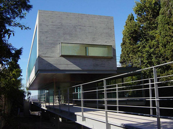
As for the main building, I wanted to style it in the same vein as Ando's Contemporary Art Museum here in town which is phenomenal architecture, imo. But I also drew from Ponce House by Mathias Klotz, which is made of the same sort of shuttered concrete, part of which has no (visible) coping (see attached image). I can't quite imagine how it's detailed, but presumably Mr. Klotz figured out a way.
-Brodie
-
Btw, the other STL giveaway is that I added a little riverfront view of the Gateway Arch to one of the paintings in the museum
-Brodie
-
ahh, yeah. Very clever use of materials and form. I'm not originally from St. Louis but I've been here long enough to say so
I'm originally from Peoria, Ill. I'm near Florissant and work down town. As for the coping. He probably has some sort of reglet and seal at the top, not visible from the ground view. Nice illusion.
Again excellent rendering! -
Ah, funny, I've only been down here for about 4 years myself. I'm originally from Champaign, IL
Yeah, those sorts of details are beyond me. I work for a company that just does hospitals, and not especially cutting edge high architecture ones at that, so no tricks like that for us
Nevertheless, I probably appreciate that sort of thing all the more...like a moron watching a magic show I guess -Brodie
-
great image, i was following this over at the hover forum, it turned out great. Just one real crit from me and thats your POV, i find if the image is taken from a human perspective it really helps with realism, floating some meters off the ground always makes things more 'CG'-ish.
I'm gutted i never got to finish my image, i shall no doubt post it here when i get chance to complete it. I guess we were some of the few using sketchup, is this vray? -
Viz, you may have a point about the perspective. I consternated an awful lot over it, having started with a much broader scheme and having to find a way to widdle it down so I could be sure and finish the project in the time I had. I know I played with the idea of a more eye level view, but I honestly can't recall why I ended up changing it to what I did. I believe originally it was because I'd considered having a car in the image and didn't want it to block the view of any of the buildings. It may also have had something to do with how much distortion it caused on the cantilevered element if I did an eye level view in 2 point perspective so the verticals were all parallel.
This was done with Maxwell Render, but I finished quite early which, along with the extended deadline, gave me a lot of time to work it over in Photoshop which is why it ended up with a slightly stylized look to it.
Look forward to seeing your completed image when you're able to finish it
-Brodie
Hello! It looks like you're interested in this conversation, but you don't have an account yet.
Getting fed up of having to scroll through the same posts each visit? When you register for an account, you'll always come back to exactly where you were before, and choose to be notified of new replies (either via email, or push notification). You'll also be able to save bookmarks and upvote posts to show your appreciation to other community members.
With your input, this post could be even better 💗
Register Login


Advertisement