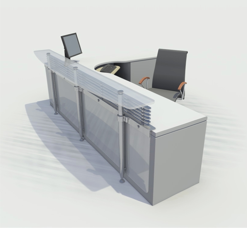
Reception Desk...
-
Rendered with the current beta of the Render[In] plugin. As you can see they fixed the smoothness issue of the first beta release.
The design is a glass & stainless steel reception desk "front" that could be attached to a standard steelcase desk. It was for an aerospace firm that had the capability to do all the stainless steel machining in-house. The intent was they would put a logo in frosted vinyl on the vertical glass panel.
Regards, Ross

-
Migthy nice

-
cool, i like the horizontal "louvers"....what are the diagonal lines fading in on the floor? is it part of the texture or something?
-
The lines on the ground are what I call a 'ground effect' created using a transparent png image placed on the ground in SketchUp. The intent is to 'ground' the drawing as I knew I'd be showing the image with a white background. I created a few different png's I use in situations like this. It works well when you have a series of views and you want to assemble a presentation that takes advantage of the white space.
The horizontal louvres are intended to both provide some screening & be indicative of the turbine blades on a jet engine. The desk was for a company that does complete overhalls on jet engines.
Regards, Ross
-
Very nice Ross. I like the ground effect as well.
Were I a receptionist I would be very happy recepting in that desk.
-
Really fine way to take a standard desk and turn it into something quite pleasing. Great stuff Ross.
Hello! It looks like you're interested in this conversation, but you don't have an account yet.
Getting fed up of having to scroll through the same posts each visit? When you register for an account, you'll always come back to exactly where you were before, and choose to be notified of new replies (either via email, or push notification). You'll also be able to save bookmarks and upvote posts to show your appreciation to other community members.
With your input, this post could be even better 💗
Register LoginAdvertisement


