Photomatch-a favour for a friend
-
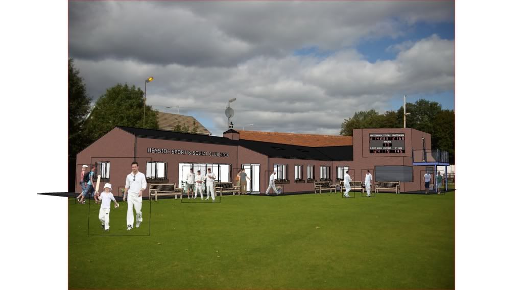
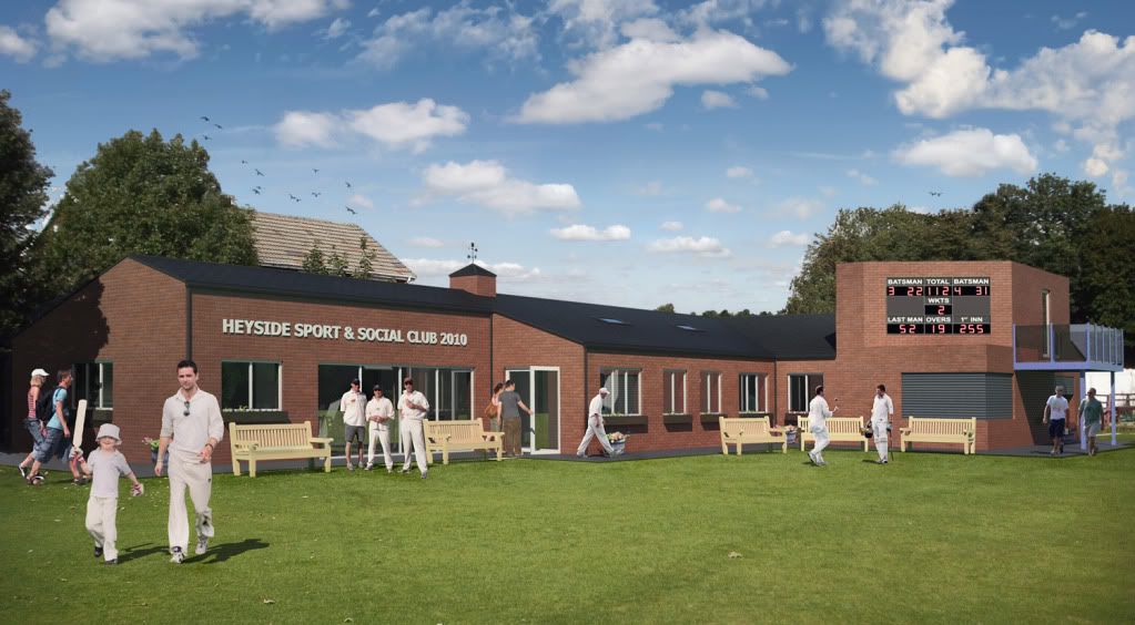
Local cricket club is trying to get lottery funding for a new clubhouse so I made this image to accompany the drawings. I'm not the designer, I just did the model and rendering. Rendered with Twilight using High biased preset at 4000 pixels wide. Photoshop to finish off.....look birds!
 had one night to complete everything, so i went to bed at 5:30 am
 oops I need to change the scoreboard, the score is impossible! and i lifted that texture off the internet! tut tut
BEFORE:
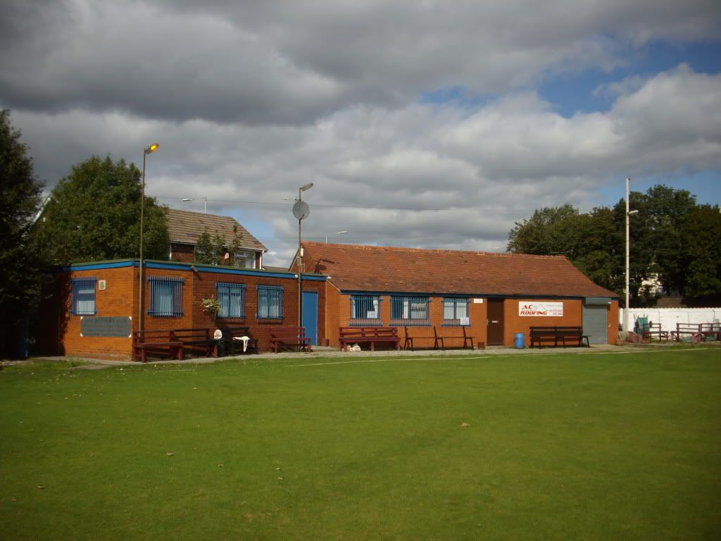
SKETCHUP:
AFTER:
-
Ah, memories of test cricket, 5 days of drinking.

Um, it's the UK right, why is it a sunny day? we all know it rains on cricket days.
can you post the image as I cannot make out what is image and what is model..

-
Solo....damn, I forgot the streaker too!
Updated the images.....desaturated final image a little bit too.
-
Nice work Oli.

The first image... just a moment, where are the spitfires?
I'm very sure that you'll find some nice models in gWH.
-
Nice one Oli, great little job for an all nighter...im impressed. I wouldnt go changing the scoreboard tho ..theres been enough allegations of match fixing this week

-
Yeah do not fiddle the results
Cool onenighter in deed. The guys look suspiciously clean though. -
Oli, I was looking at original image and noticed the whitewash lines, with the new 'tuck-shop' added it looks like it encroaches into the oval, is this right?
-
too late, the results have been fiddled!
sid:the people were a nightmare to find, had to do lots of masking, so frustrating.

Solo, the ovals huge (flexibility) and they decided to move the boundary away from their proposed building. probably a good move lol
-
Cool render, Oliver.
a few suggestions:
You might want to fix the shadows. The shadows of the people on the left don't quite match the ones on the right. Looks like you have two
 , one on the left and one on the right.
Also, play with the colors and saturation to make the people merge better with the scene.
One more thing: the shadow of the tree on the building on the left side seems a little bit too dark. Try to make it a tad lighter and maybe softer.
Best,
_KN
Hello! It looks like you're interested in this conversation, but you don't have an account yet.
Getting fed up of having to scroll through the same posts each visit? When you register for an account, you'll always come back to exactly where you were before, and choose to be notified of new replies (either via email, or push notification). You'll also be able to save bookmarks and upvote posts to show your appreciation to other community members.
With your input, this post could be even better 💗
Register Login


Advertisement