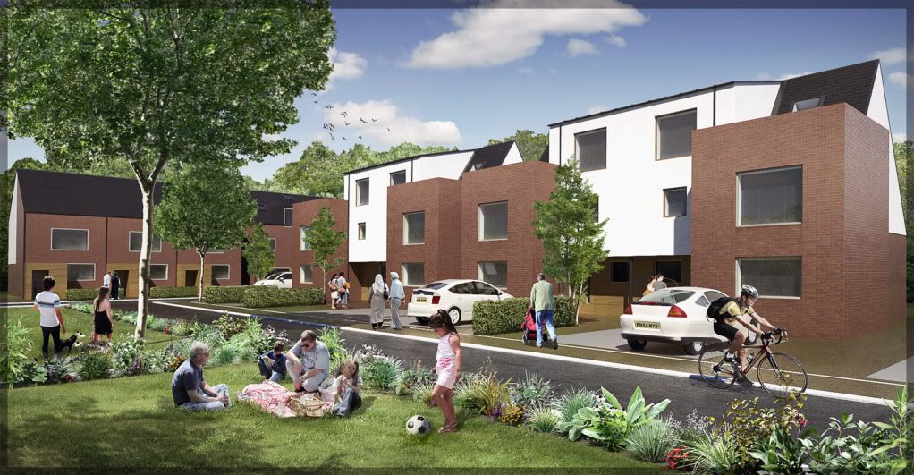
Very cheesy render
-
Thanks man, yeah they do don't they! suits plants perfectly.
I updated final render with anew one.....just RGB curves adjustments and getting rid of some jaggies.
-
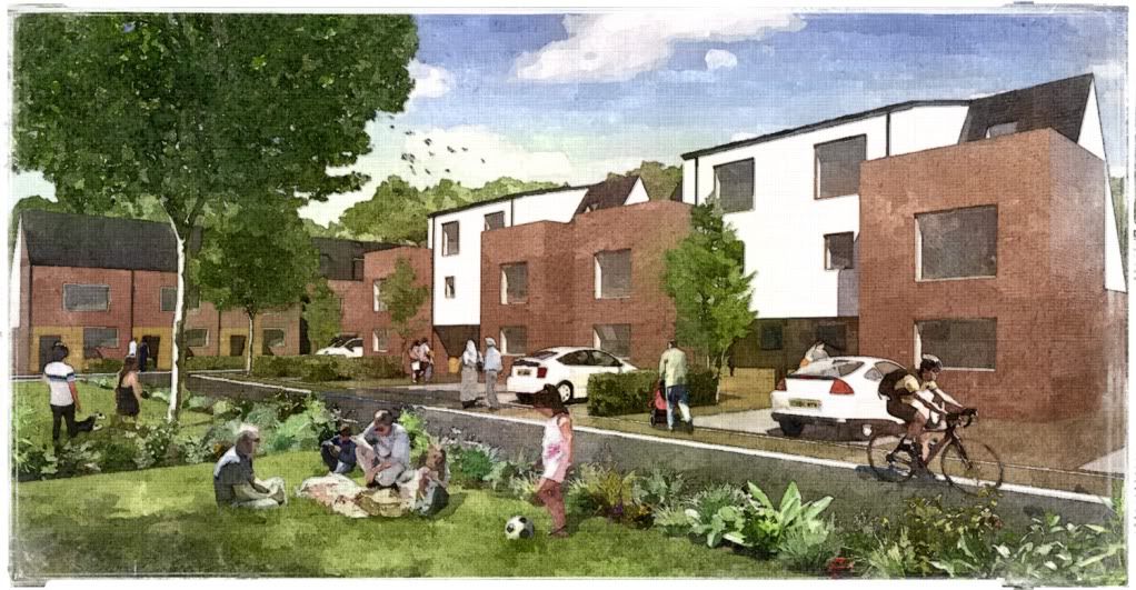
A faux watercolour image I was asked to make.
twilight + fotosketcher + photoshop

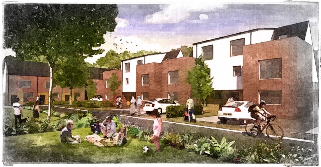
different version:

-
Yes I agree with your caption.
Like your avatar much is disguised - remove the shades at least.
In China ads for new developments show a good looking female playing a violin on a tranquil lake - totally unreal. Your tasty renders ignore how to deal with rubbish and how to clean windows. Are you sure it is right to pursue such similar fakery?
-
honolulu: I think for the purpose of this image, the people are just as important as the architecture. Remember, this is not to "sell" the scheme to a client. I normally use people to add a sense of scale, thats it.
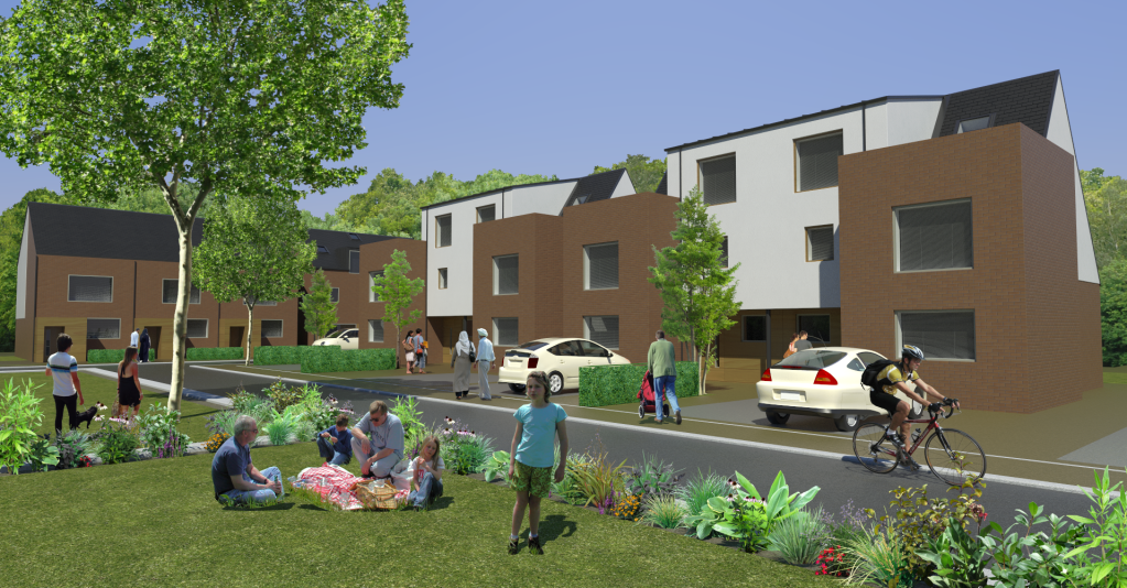
here is the raw render I promised, nothing too special but nice to work with....you can see I had to do a lot of PP work with the brick, I also replaced the unhappy girl with another one!! Ihave updated first post with a revised image.
you see the rendered hedges? they are just PNGs that I replaced with a hedge texture from cgtextures.com (I then darkened a band around the bottom of the hedges to nestle them in)
raw render

final photoshopped image

-
says you with a heavily distorted sepia photo!! and glasses....and a tache!! talk about disguise....
how to clean windows?? they are maintained by the local authority, as they are council houses.
the wheely bins are at the rear of the houses. as the plan indicates. there is no need to have bins at the front of any house.
dont waste my time with this, its actually pretty insulting. It's not an image to sell the scheme, read what I have written for gods sake!!!! The scheme is being built already! This is a poster for the housing association office reception....and they want to use it as a postcard. its supposed to be cheesy look at the bloody title....as if you would have a picnic at the side of a road
 the public won't even see this render. In fact it is almost comedy.
At the end of the day...if the client asks for this, this is what they get. If I don't do it, I don't get paid. Even the cars were specified, the people, the type of plants, type of blinds, how many clouds are in the sky, birds, prams blah blah blah. I just push the buttons.
-
@unknownuser said:
Like your avatar much is disguised
I see a friendly face there, a nice looking guy, I almost think I've met him once somehow.
Your avatar sir, reminds me some other persons I've met. Trying to avoid meetings with such persons now. Really
-
michalis i just laughed my ass off

edit, there you go i've lost my "disguise"

-
Cheers guys!
Edson: the people are in the sketchup model! Normally I use people that match the sunlight but the client was VERY specific about what people they wanted in the image so sunlight/shadows don't quite match. For example, try finding a high res image of a family eating a picnic in sunny weather.....very hard, you get what you are given!!

I may just place a high pass filter over everything except the plants/people to sharpen. Thanks, I did not notice that.
With hindsight its not epic, so i'll change the title to just "very cheesy render" lol
have a good weekend!!

-
Now I need a front and side view, no laughing etc. A more hi def of course.

-
full frontal if you really want?

Hello! It looks like you're interested in this conversation, but you don't have an account yet.
Getting fed up of having to scroll through the same posts each visit? When you register for an account, you'll always come back to exactly where you were before, and choose to be notified of new replies (either via email, or push notification). You'll also be able to save bookmarks and upvote posts to show your appreciation to other community members.
With your input, this post could be even better 💗
Register LoginAdvertisement


