Twilight baby steps
-
Hi folks,
Finally bit the bullet and purchased Twilight, great investment!
I've been reluctant to get into the rendering scene due to the intimidation factor (mainly lighting) but this program goes a long way in helping overcome the learning curve.
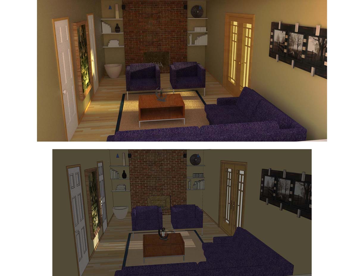
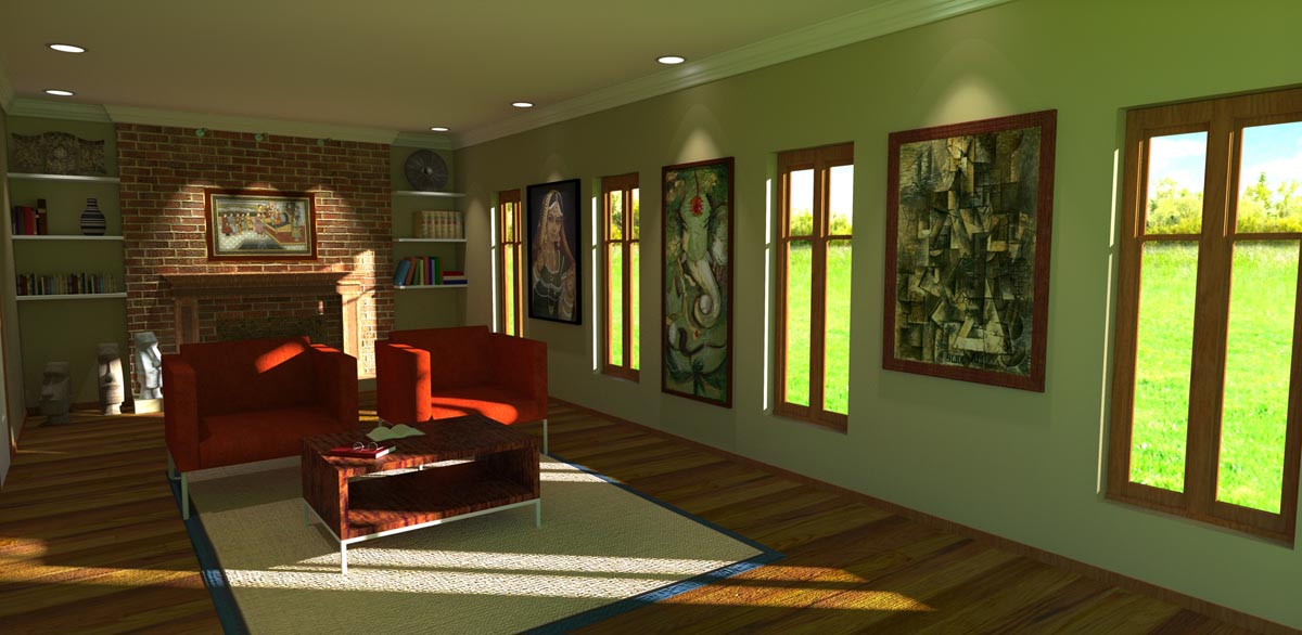
Here's my first attempt with an emphasis on materials while I still learn the lighting.I'd love some CC on this.
Thanks,
O2bwln

-
Hi 02bwin
That looks like a great first effort. I am very impressed by this. Lighting is everything in these renders and I think you maybe left it short of light in the background which is distracting from the content of the image. Great first effort though.
-
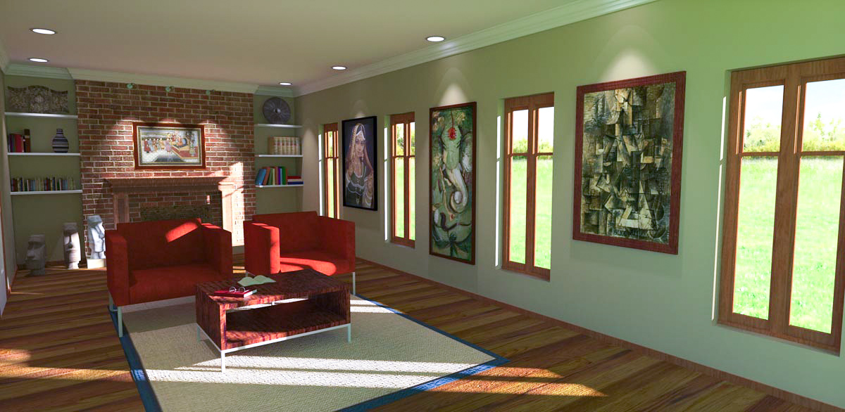
Here's an updated image per the recommendations I've received. Very simple program to use yet has great depth. In my limited time with this program its already made me very excited about the potential this program holds.
Thanks,
O2bwln

-
Excellent improvements! Keep it up and you'll be a pro in no time

Suggestions, if I may:
-The bump on the wood floor looks too strong,
-The textures on the table, windows, and base trim need work...you may need to draw a line to subdivide a face so you can rotate the textures (on the corners of the windows for example). -
Great start, but I agree with Marcus (aka d12dozr) in the points mentioned...
In particulat the very strong bump on the floor...
You'll soon learn that it actually doesn't take much to make really great looking and photo realistic renders...
Details in your model and correct material set-up is - in my personal experience - the most important part...
The background (outside the window) looks weird and another high resolution hdri- or IBL image can change A LOT in the final render...
I've taken the liberty to make a quick tone-mapping and white balance adjustment using Adobe Lightroom - hope you don't mind...

Hello! It looks like you're interested in this conversation, but you don't have an account yet.
Getting fed up of having to scroll through the same posts each visit? When you register for an account, you'll always come back to exactly where you were before, and choose to be notified of new replies (either via email, or push notification). You'll also be able to save bookmarks and upvote posts to show your appreciation to other community members.
With your input, this post could be even better 💗
Register LoginAdvertisement


