Now boarding
-
hello all,
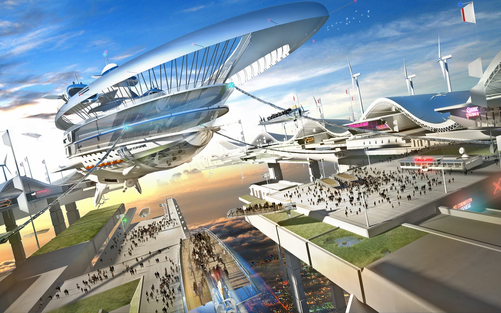
it's my entry for the wonderfull syd mead contest of cgsociety
"2094, 10 years since the nanotehnologie allowed to break free of gravity
of Skyport appeared over the big cities
accelerating the development of tourism and trade"
all c&c are welcomes
http://forums.cgsociety.org/showthread.php?f=309&t=896134
-
Another reason not to write off the gallery section. Nice stuff. Can you give us an idea of your workflow?
-
A very clean render. I like the style you've given to the image. Impressive.

-
epic!
-
epic at least.


@unknownuser said:
Your workflow must be interesting, tell us about itFantastic work and detail, though it looks like it is night time on the ground and daytime above the clouds(I like it)..love the style too.
James, this is OK, it happens in tall mountains like himalayas too. Never mind.
-
Very Cool poster stuff Meak.

Only crit is shadows do not match light source, otherwise a great image.
-
This doesn't look so tall though James,
 but, never mind.
 -
@solo said:
Very Cool poster stuff Meak.

Only crit is shadows do not match light source, otherwise a great image.
Solo, I don't understand your comment light is too the left and shadows are falling to the right. What am I missing?
-
Fantastic!!!!thanks for sharing
-
wow! thank you all
My workflow is simple: sketchup, photoshop true
solo: maybe the shadows might be longer? "
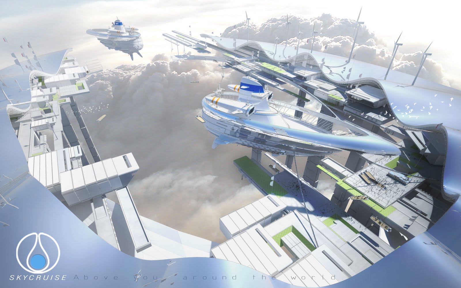
Here is another view of sky harbor more comprehensive.
comments are welcome
-
more awesome...proves bigger is BETTER

-
I have to say that this SU to Ps procedure is my favorite. A unique style. I love it.
What is right with this render matters not what's wrong.


 again
again -
hi meak
on your first pic just check the bottom image (city night background) something is not right @ end.
nice nice nice model & workflow

-
What is right with this render matters not what's wrong.


 again[/quote]
Hear hear more positive waves please!!


-
hey dolphus, I thought this was positive. If there is something wrong here, I really don't care, I just like the render.

-
@dolphus said:
What is right with this render matters not what's wrong.


 again
againHear hear more positive waves please!!


 [/quote]
I thought Meak ask for comments, it doesn't matter if there are positive or bad, I believe people here ask for c&c so we can improve our skills, am I wrong?
anyhow, best photoshop skills!!!


Hello! It looks like you're interested in this conversation, but you don't have an account yet.
Getting fed up of having to scroll through the same posts each visit? When you register for an account, you'll always come back to exactly where you were before, and choose to be notified of new replies (either via email, or push notification). You'll also be able to save bookmarks and upvote posts to show your appreciation to other community members.
With your input, this post could be even better 💗
Register LoginAdvertisement


