Lobby & meeting room need advice
-
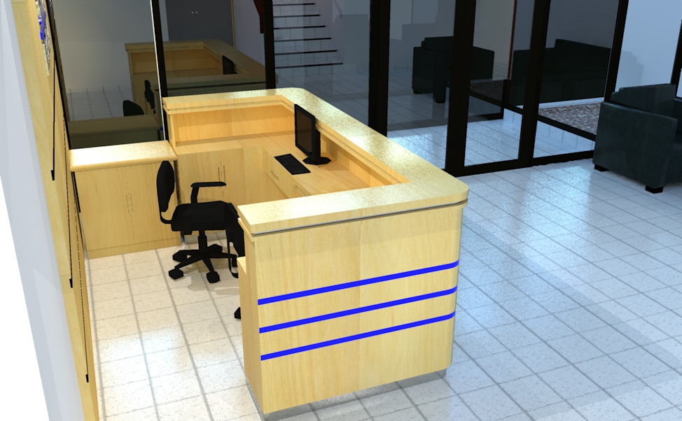
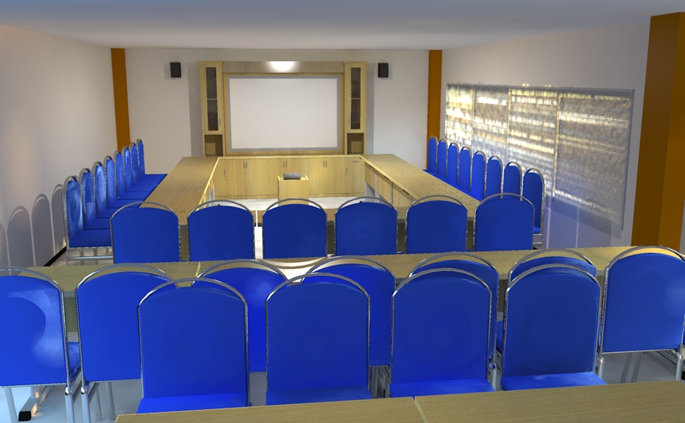
A modification project with lobby and meeting room
first post... render with kerkythea echo 2008
Critics are wellcome thanks...


-
@bahri said:
A modification project with lobby and meeting room
first post... render with kerkythea echo 2008
Critics are wellcome thanks...Hi !
Well I'm not sure what I'm about to write is of interest but here I go !
First, I find the room a bit empty and lacking life. For example I think a couple of papers and pens on the desks, some mugs on the table, paintings or posters on the wall could bring more "life" to your views. Also, the chairs pattern on your second view seem a bit too regular. Maybe a rotation or two...
I like your lighting though there seems to be an overexposed area over the backwall screen on #2.
Maybe a little more bump map could enhance the whole (like on the tiling on the first one.Final thing to me : I think you could find some better view angles.
It's all very personal and I really hope this will help you ! I'm waiting to see more !
Oh and Kerkythea is greaaaaaaaaaaaaaaaaaaaat ! Sorry but I had to sya it again... -
thanks leminilab ill try my best next time.
nice to see your gallery picture too.
thanks for the advice.. -
I think leminilab is correct. The images are lacking life and the feeling of being real. There is so much reflection in the first image it is tough to see what is geometry and what is reflection. There is some tiling on the wood station also.
Some things to work on or add:
add an image to the computer screen and have it cast light.
Zoom out a bit to get more of the scene. The current angle does not add to the image.
The blue stripes seem really saturated, maybe tone those down a bit.
The blue chairs in the second image have the same over saturated effect going on.
The chairs seem too stiff and uncomfortable.
It looks as though there is only one light source and makes the room look very small and cold.
Not sure what is on the right wall but it is distracting.
Add an image on the screen.
The camera angle does not add to the image.Scott
-
Nice try!

The render might not look good due to a couple of issues mentioned by a couple of helpful friends here.
But the bottom line is the end result, you gotta ask yourself is that what the client wants? Else you gotta make changes.
For a nicer image, try preset #19.
-
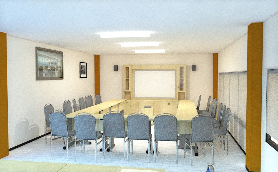
more editing... how about this ?
use kerkythea preset #19..35 phases it took about 3hr and 55 minute

-
@bahri said:
more editing... how about this ?
use kerkythea preset #19..35 phases it took about 3hr and 55 minuteHmmm... Well I think maybe a couple of things can still be improved.
I can think of :
1- adding a jpg in the Self luminance tab / Radiance of your white board material : this will create a self lluminant material like a tv screen you'd watch in the dark...
2- try to insert a global sky or some global HDRI. THis will bring some natural reflections to your scene ;
3- maybe some more work on the materials like the columns (they look a bit flat to me... I dunno...) ;
4- maybe place a plant or flower in the foreground and try to move your camera again to catch the plant and the room.OK well, I hope you'll find this more useful than annoying... And again, experiment with Kerkythea, browse their forum and even maybe post your Work in Progress on KT's forum. Lots of amazingly nice people out there too !
Waiting to see more !
Nicolas
Hello! It looks like you're interested in this conversation, but you don't have an account yet.
Getting fed up of having to scroll through the same posts each visit? When you register for an account, you'll always come back to exactly where you were before, and choose to be notified of new replies (either via email, or push notification). You'll also be able to save bookmarks and upvote posts to show your appreciation to other community members.
With your input, this post could be even better 💗
Register LoginAdvertisement


