Render for C&C
-
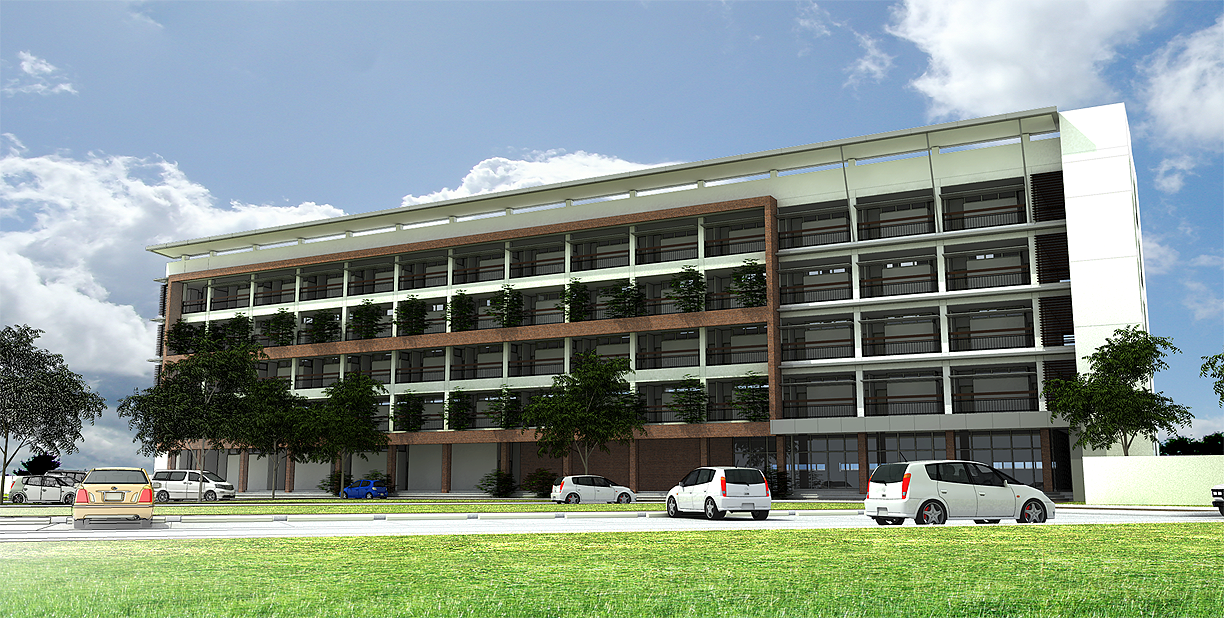
I dunno guys, it looks fantastic to me, looks like a photo actually. I'd only replace the blue car for something lighter if I had to, otherwise I really like the FOV and render.
-
Well done edmon
 Nice shadows, dark, a photorealistic render.
 -
I also like it very much and apart from the grass, I also see this as a good photorealistic render...

As always, I'm curious to know what render app. you've used for this one...
-
+1 on the grass...looks a bit dodged out?
+1++ on everything else...lovely image! -
Agree with what's been said for the most part. I'd switch out the blue car. The color seems unrealistic compared to the rest of the image. The grass, also looks too flat and bright.
As for the darkness in the shadows it doesn't both me, but it really depends on what the purpose of the rendering is. If the detail in there is important it might be worth brightening them up, otherwise I'd say leave it.
-Brodie
-
Hi, thanks for the comments, I have attached another view of the project, showing only the first building, C&C are most welcome, thanks again.

-
Guess you didn't see this...

@frederik said:
As always, I'm curious to know what render app. you've used for this one...

-
Oh, I am sorry Fred, in this image I used VRAY for SU, with the default settings of IRM to High, postpro the sky and levels in Photo shop.

-
The building part of the render looks great.

I would try to use the Random Scale and Rotate tool on the plants.
The postpro? for grass... needs the edges roughened up a bit...
Trees are repetitive as well. -
Thanks Fletch, could you point me out where I could get this random scale & rotate tool?
-
I suspect he was talking about randor from Smustard http://www.smustard.com/search/
It's $3. I've been meaning to buy it but haven't yet. Heard good things though.
-Brodie
-
the second one is very well done, the grass looks awesome too.
In the first one, the grass on the foreground should be Photoshopped a bit, but the rest looks very very good

Nice work!
Hello! It looks like you're interested in this conversation, but you don't have an account yet.
Getting fed up of having to scroll through the same posts each visit? When you register for an account, you'll always come back to exactly where you were before, and choose to be notified of new replies (either via email, or push notification). You'll also be able to save bookmarks and upvote posts to show your appreciation to other community members.
With your input, this post could be even better 💗
Register LoginAdvertisement


