SU+VRAY+PS
-
nice
-
excellent work

the images could be seen as original ran before the post -
@chango70 said:
The images are so saturated that I want to lick my screen.

I already tried to and got a nice warm buzz from it.
-
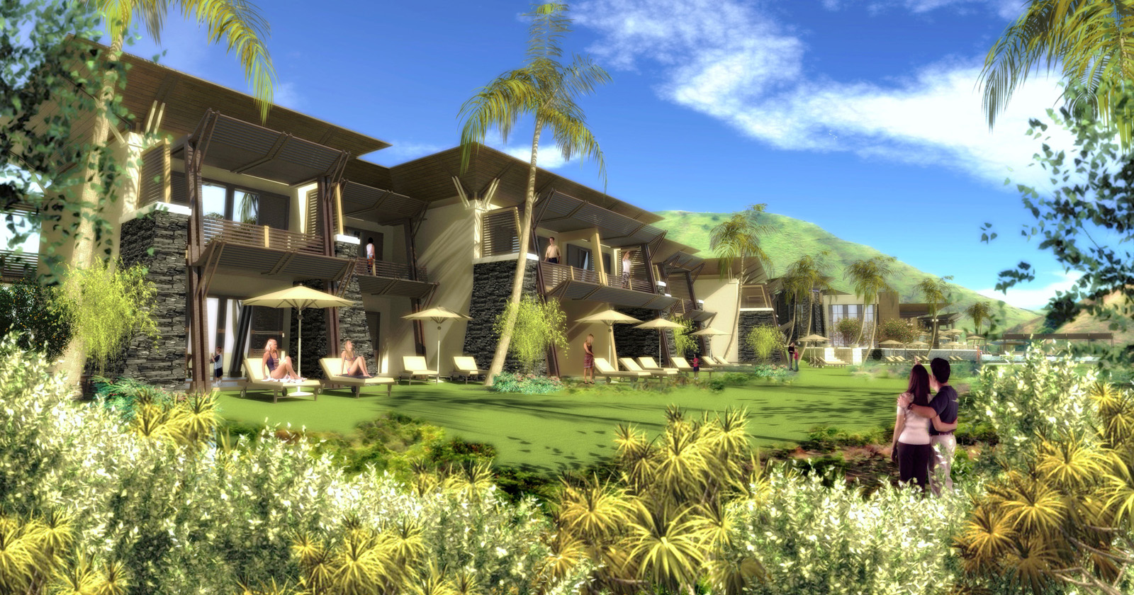
Hotel Rooms...
-
I like your style.
Not the most photoreal , but I can really appreciate the mood of those images over realism.
Very colorful and happy athmosphere.Well done.
-
I like 'em!

What is the roof material?
-
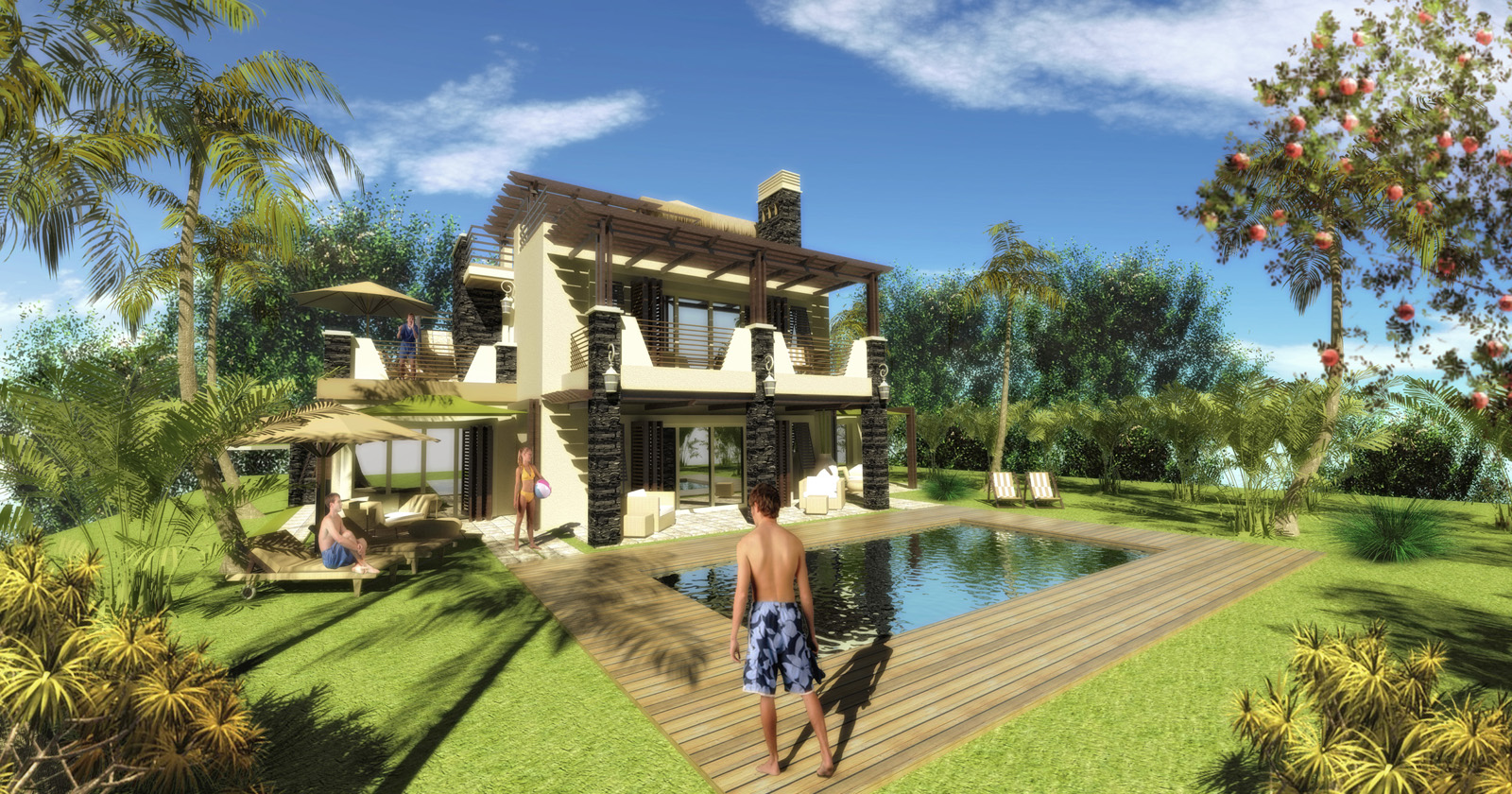
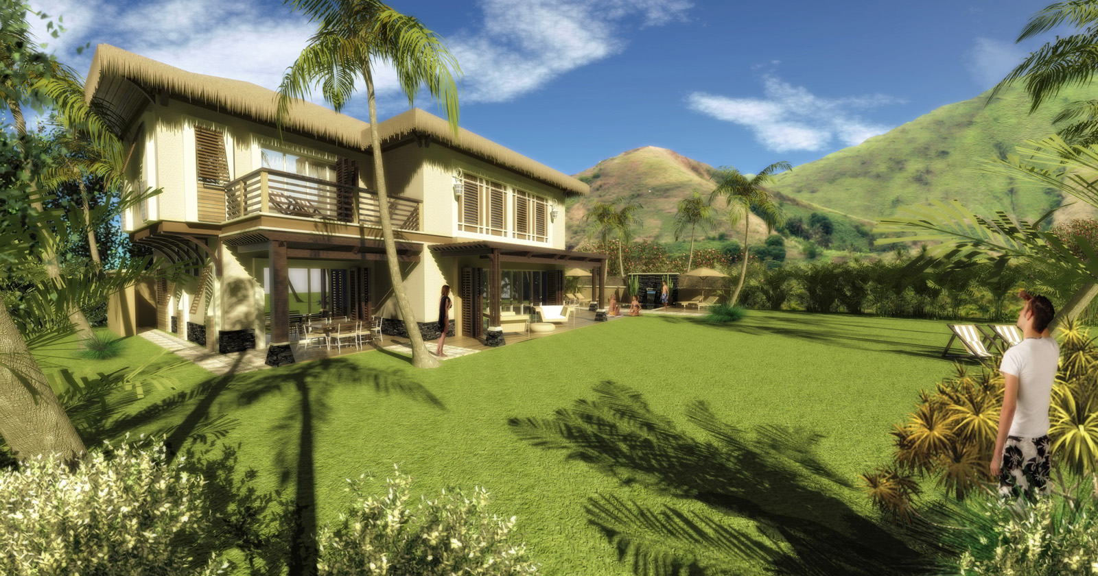
Villas...

-
Makuti & Thatch: Roof materials
-
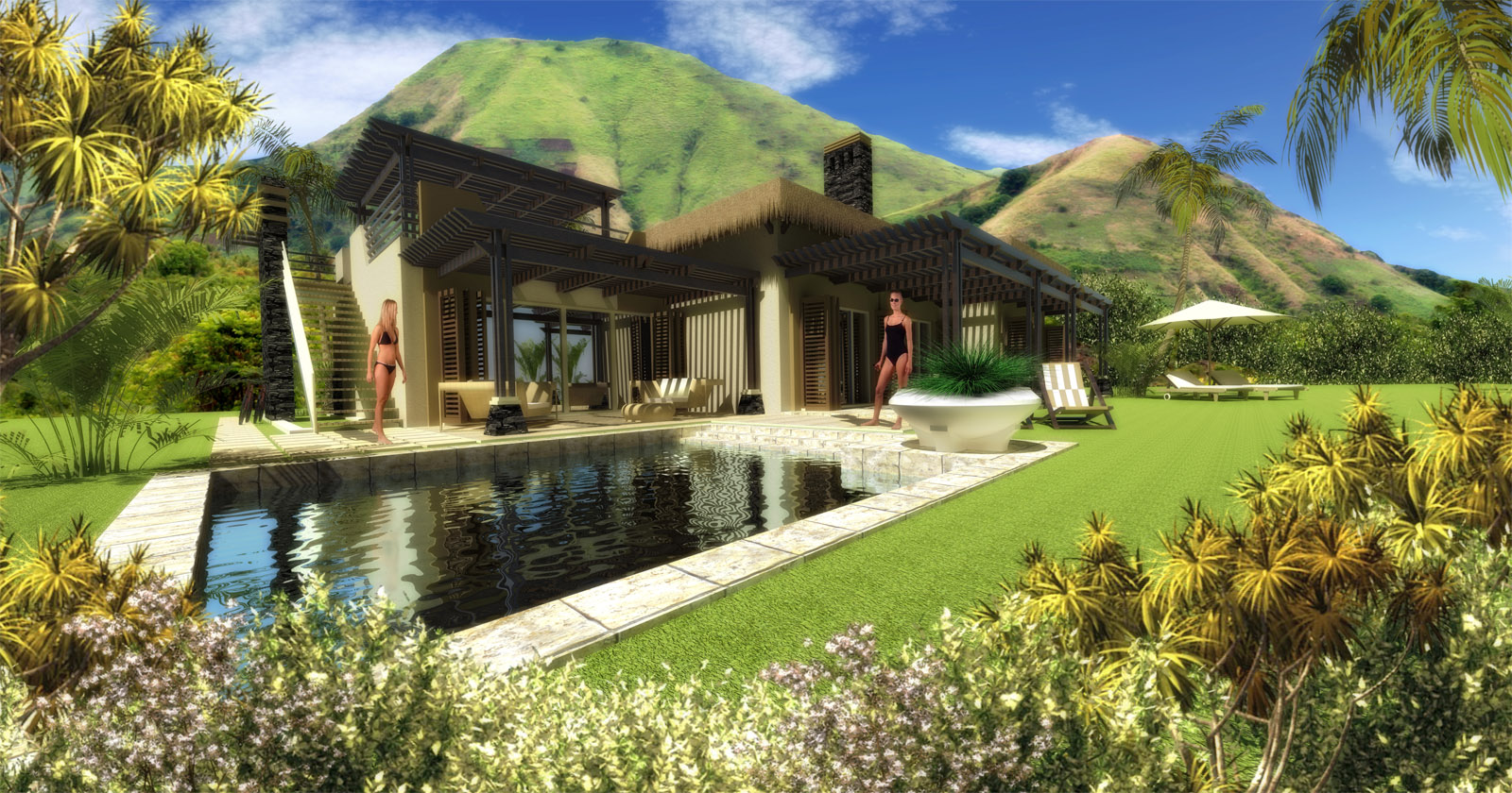
Heritage Villa...
-
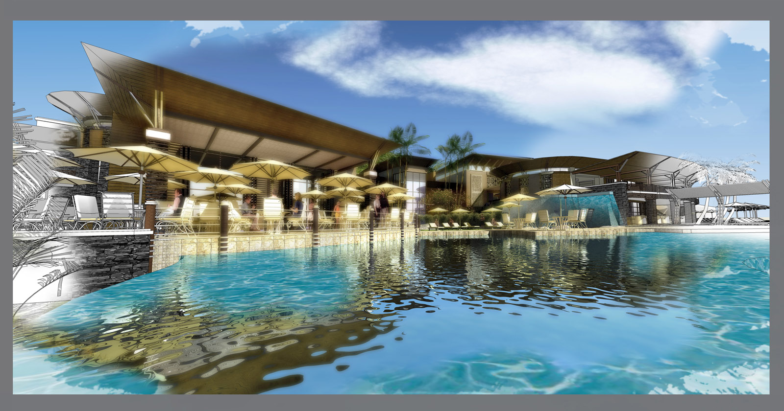
Process collage....
-
I think I like this one the best. It makes the image a little more subtle and not so overwhelming like a few of the previous ones
-
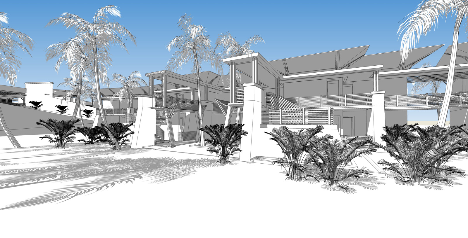
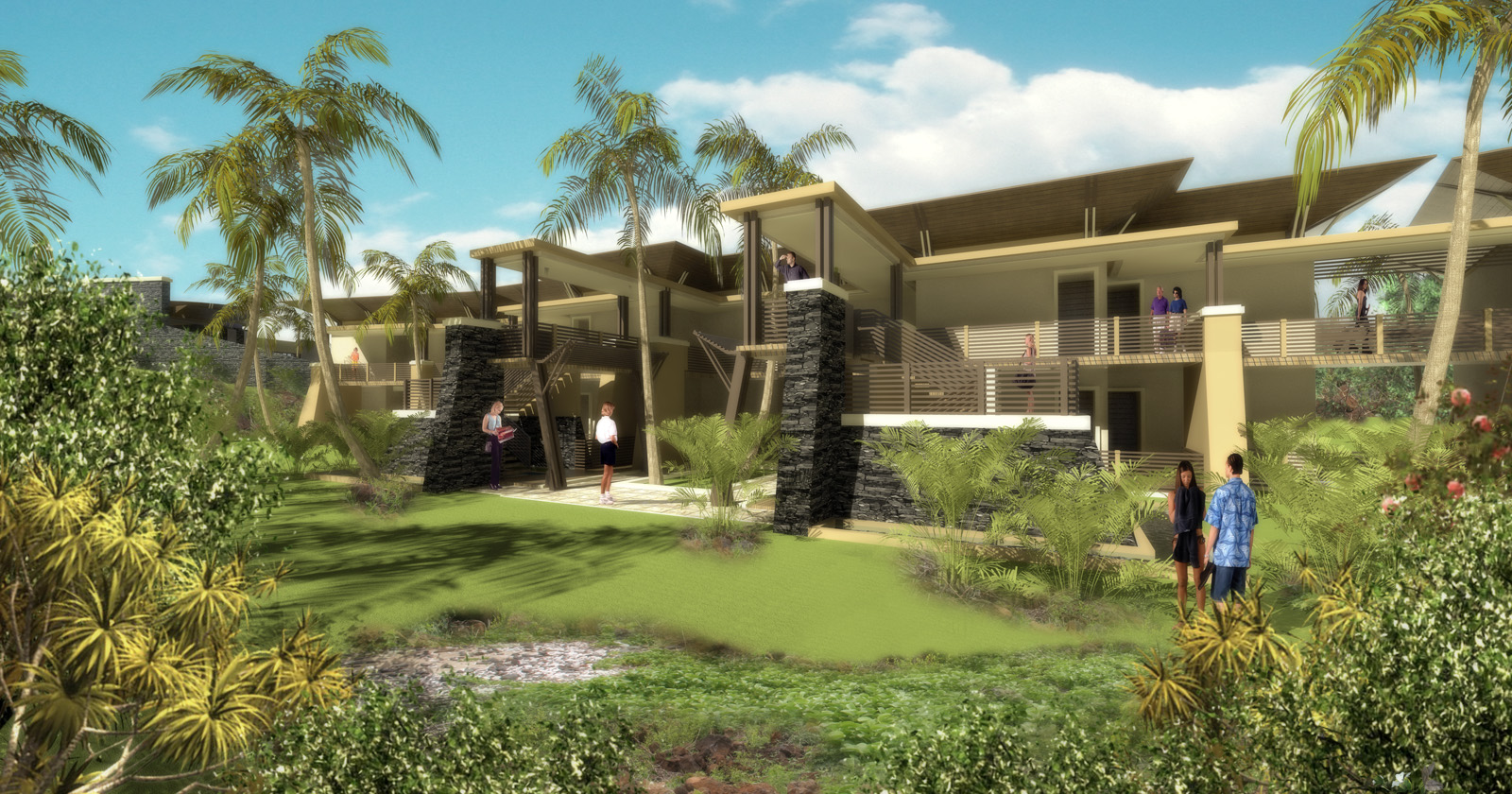
Boutique Hotel Room Units(Entrance View)
-
MORE TO COME....
-
Hi, very nice images, but it is hard for me to understand the real architecture of these projects.
For me it is too much "photoshoped", they look between watercolored images and blur render...
It is very colored but no enough contrast for me... Maybe it is my monitor or i don't know...
great works...
-
Hey all these look great! The first one especially. Are you texturing in photoshop or within SketchUp / VRay?
-
@jhuman said:
Hey all these look great! The first one especially. Are you texturing in photoshop or within SketchUp / VRay?
all in Sketchup+Vray and vray material editor....
-
Very good design but I see your image look a bit too much PS (too soft?). So the surrounding is not much deep and clouds look fake. So I like your monochrome more than color one.
But over all your image is good.
-
looking good. congrast... I wonder, ware did you find the plants ??? could you please give a link ware I can find them.
thanks
-
everything in your image is too saturated,..your background compositions seem to "overwhelm " the structure,..yet, overall, good,..
-
@jetlounge said:
Boutique Hotel Room Units(Entrance View)
Do yo have collection components trees,,,
a like your component trees tropical make it
Hello! It looks like you're interested in this conversation, but you don't have an account yet.
Getting fed up of having to scroll through the same posts each visit? When you register for an account, you'll always come back to exactly where you were before, and choose to be notified of new replies (either via email, or push notification). You'll also be able to save bookmarks and upvote posts to show your appreciation to other community members.
With your input, this post could be even better 💗
Register LoginAdvertisement


