Pool Night Lighting renders
-
For me mate the pool water illumination is a bit inconsistant from some camera angles.
Worth checking out some real examples where the water illumination tends to be carried throughout the pool. Could be worth faking it by making the inner pool surface it's self an very subtle emitter.
-
Oops forgot to say, the water bump is a great result too, though for a night shot when the air is more still I might have smoothed it a tad!
-
Great points....thanks Richard for sharing your wisdom. I was adjusting and tweaking between renders, so that's probably a lot of why the inconsistency....toning down the bump on the water is a good suggestion. I'll do that on the next one.
-
I like these renders a lot.

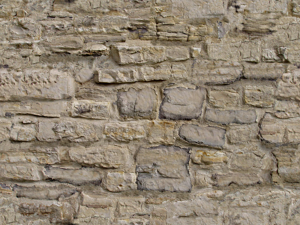
About the stone texture, well not seamless enough. Its difficult, I know. So here's my gift, seamless enough.
-
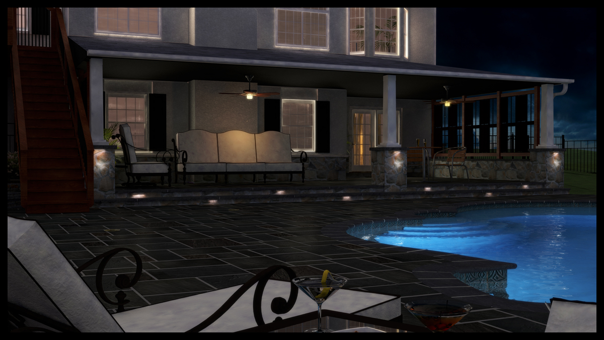
Ran this one overnight. I decided to upgrade the pool decking to a flagstone texture. Client is doing finished concrete around the pool, but I figured I'd do one for my portfolio with flagging. I rendered this on a low setting using Solid Rocks and a size of 3520x1980, which took 3.5 hours to render on a dual core laptop. I lowered the gamma a tad to darken the scene and added a slight bloom effect. That was it for PP besides adding a different background. Quite pleased with this one, although it does feel a touch too dark. I warmed the color tone on the vray lights and added some fake emitters to get more cast on the pillars. Better?
-
3rd image looks almost real, well done
-
Hmmm?
Mate I think if your gut feels it's too dark - put your bottom dollar you've got a good gut feeling I reckon!
For me you may have overly toned the lights and darkened the whole too much, in fact maybe way too much. I'd also be careful with too much bloom - around here it is a WAY overused effect. If my digital camera shot with the level of bloom I see here in most images I'd whipe the finger prints of the lense!

Glad you don't mind constructive crit, I'm a PPB regular you can get away with harsh crit there as most people beg for it to improve.
Mate I think often we all (I know I do 90% of the time) try to gain an effect, night shot, reflection, bump - what ever it is and as we feel it is what will make the image punch we tend to step over the mark of subtlety and distroy the image.
Like Olishea suggested I think your third posted image was just about spot on the mark, save a little material tweaking here and there.
-
Thanks Richard and Oli. If it weren't for constructive crit and humbly growing out of one's mistakes, we'd never grow. I've only been doing 3D for a little over a year and a half and feel I have so much to learn yet. The physical part of modeling I think can be grasped by all. The whole other side of the coin is being able to relay an emotion through composition, staging, lighting, color, etc. Modeling is a function...like turning a wrench or pushing a saw. Designing is where I have so much to learn and study and to find the place of feeling what's right. I especially appreciate the comments and criticism that comes from the design mindset. I grow so much from your comments and the time you take to express them. Thank you.
BTW- I just got word back from my client and while I already sold the patio and masonry work, these renders also sold the client on doing outdoor lighting. Myself and my two workers will be building this project in about 3 weeks.
-
@earthmover said:
...these renders also sold the client on doing outdoor lighting...
Great! That's what counts


-
@ Earthy!
Well said mate! Like myself I long for the crits we learn more from!
And congrats on selling the idea of including the exterior lighting to the client.
@ Michael
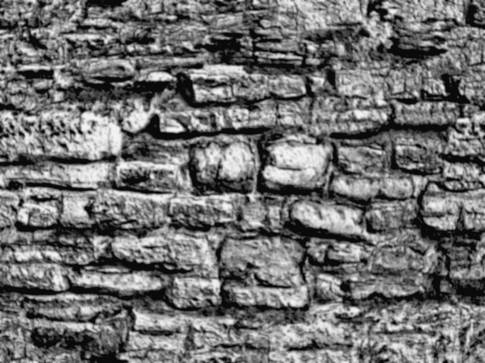
Thanks for the texture mate thats a great one - Here is a bump to go with it! Not to hijack the thread but will bring a few things up with this attachment. I'd like to know what others think if what I've done here is an improvement. I'll experiment more to see if I can improve the technique then post a tut.
I found playing with an image the other night that by using some of the functions of PS's render > lighting effects functions, down the bottom (CS) of the filter are some further texture options. When these are used for the dominant colour changes parts of the original texture become more pronounced. If the lighting is set correctly opposing that casting the shadow I'm finding it is tending to correct the norm of overly pushing only the shadowed areas into black. And also bringing out more of the 3rd dimension of the oringinal map.
Very interesting stumble upon.
-
Interesting find Richard. What light type did you use and did you desaturate the image before taking it into the lighting effects filter?
-
Your renders look great earthmother.

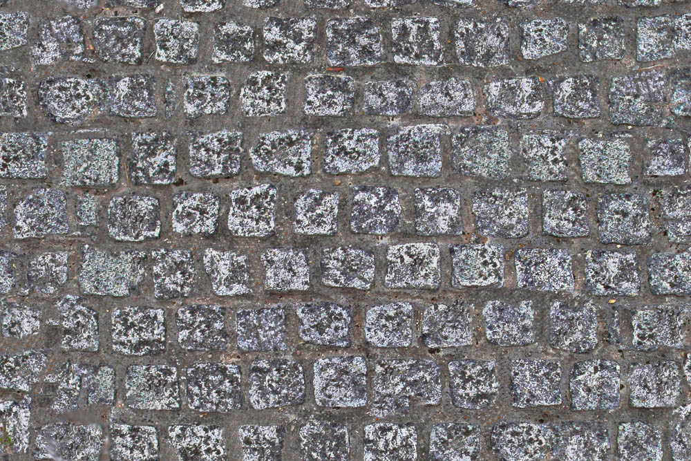
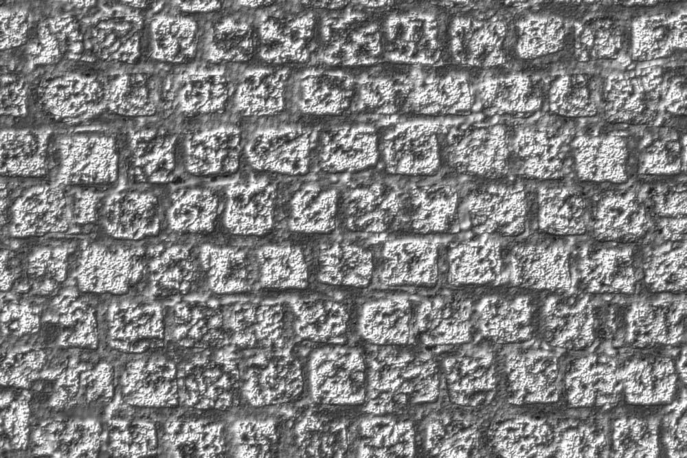
Ok its your thread but I'm posting another paving texture. Feel free to use it. Try this bumpmap too.
-
They are looking good, Earthmover, and at this point it's really an exercise in Photoshop or similar to get the right tone mapping for your image. Night images are always difficult, even with actual real world photography...
-
Great work on the pool lighting in that last image Adam.
Is that an omni light hidden from view? Very effective -
Hi >Earthmother, you render exactly the "feeling" I got last year, in September when having a dinner along a swimming pool !
 :thumb
I thought how can I share this atmosphere...
MALAISE -
yeah u got some really nice images here. They definately illustrate a mood and atmosphere that I would love to be in. Good job.
-
@earthmover said:
Interesting find Richard. What light type did you use and did you desaturate the image before taking it into the lighting effects filter?
Yeah it is interesting what you can stumble accross just when playing to see what effect something has if you haven't used it before.
Mate I just used a spotlight and played with the general setting to get a fairly even cast accross the image and not have any excessive over exposure, I used the actual colour image, haven't tried with a desat! I guess though you can effect the colour channel otherwise.
I stumbled across it when I cast a light accross an image of a catalogue sitting on a rough sawn timber and when using it the rough sawn texture JUMPED out like I had rendered it with heavy bump. And it was only a photoshop composite - not rendered at all! So I thought to myself HEY WHAT HAVE WE GOT HERE? You know those moments when you can lookup and there is a light bulb above your head, then realised I'd left my headlamp on from playing around in the garden in the dark! lol.
But seriously I think I'm on to something here! And actually wondering if doing the same on a normal map could produce an almost displacement effect, though not sure how normal maps work - they just look weird to me!
Anyway it may well be the way to get some correction into bump maps taken from the original colour map! I'll play with it more and see if I can develop an action!
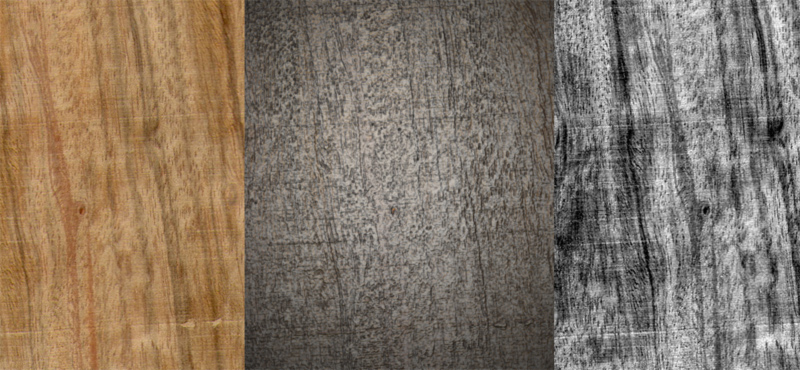
Here is playing with a quick test:
Left: oringinal / Right: Normal style of doing bump / Centre: with some playing with lights.
You can imagine the difference here, sure the centre image needs to be corrected for vignetting but thats cool. So Hmmm? think there is something to this!!
-
Normal maps look more natural than bumpmaps. Bumps are better for fine details though. To create a normal map, you need an app like zbrush, blender, maya, max etc, so to bake 2000000 polys in 10 000 or 1000 poly model. You need nice UVs of course.
-
Michael - not sure your getting the point though!
Hello! It looks like you're interested in this conversation, but you don't have an account yet.
Getting fed up of having to scroll through the same posts each visit? When you register for an account, you'll always come back to exactly where you were before, and choose to be notified of new replies (either via email, or push notification). You'll also be able to save bookmarks and upvote posts to show your appreciation to other community members.
With your input, this post could be even better 💗
Register LoginAdvertisement


