Render for C&C
-
Hi everyone, posting a work c&c's will be most welcome as always.

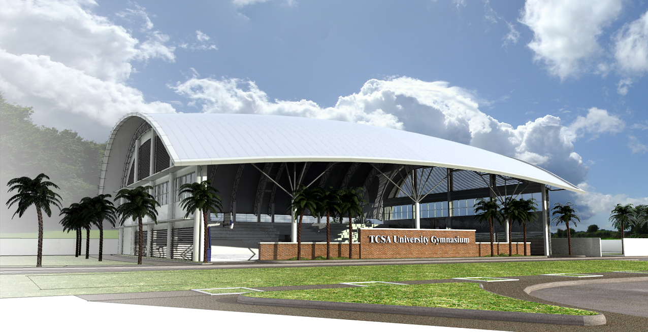
-
Wow, there is some great stuff getting posted today!
I like the overlay of render and SU linework, although maybe a little too much fog for my liking in the top left.
It's a really good looking model and the final image you have chosen is excellent.
-
I really like the fade from modeling to rendering: great presentation concept!
-
Thanks Dylan really appreciated that, heres the image without the line overlay,

-
Looking very good, but I would lower the opacity of the line overlay and use a bit less of fog.
But that's just my opinion, it's looking very good already anyways.Cheers,
Roevens Johannes -
Beautiful stuff, Edmon (design, model, rendering).
-
Thank you everyone, here are the images as per stage,
S+VRAY output
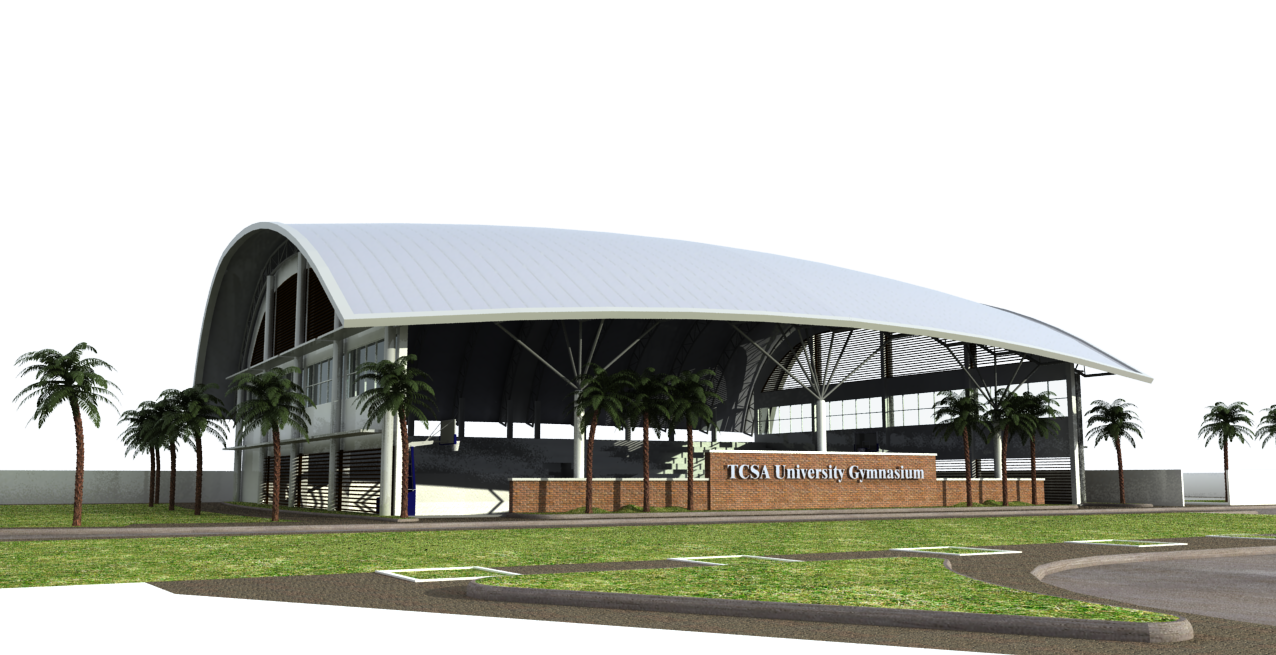
PS Sharpening and a bit of exposure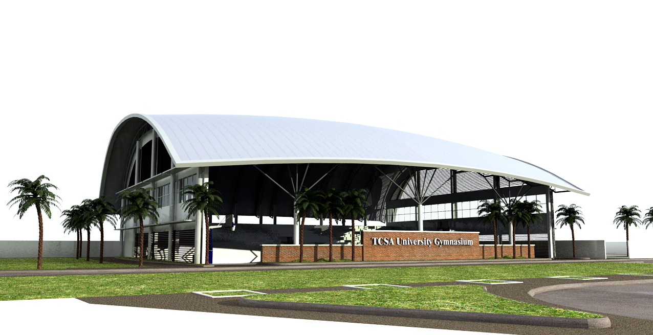
Background added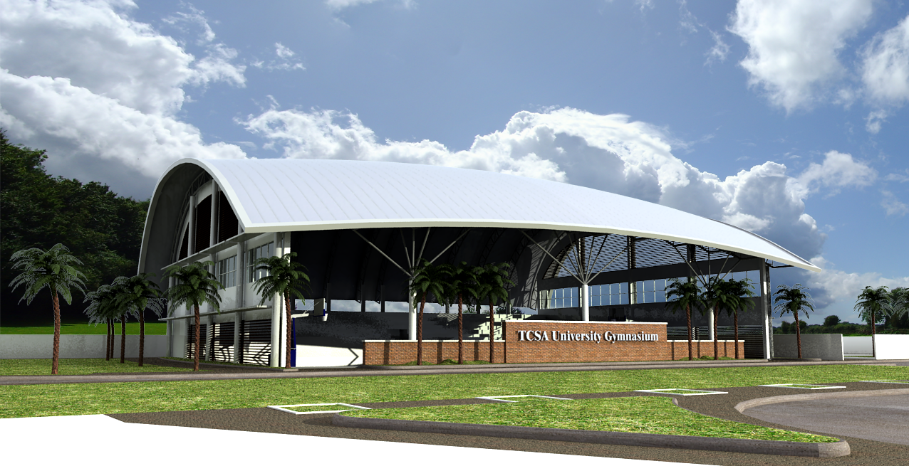
With Line Overlay
With PS Opacity layer
This is the final image I will be using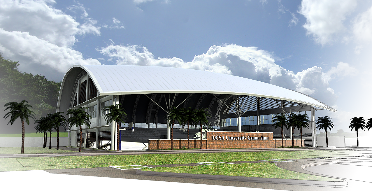
-
HI, great work. although clients don't seem to care for lines fading into renders.
I say use the 3rd to last image (with overlay) and use a vignette for focus. I find the line fade-out a bit distracting and unnecessary, it draws your eye away from the building and unbalances the image... but thats just my opinion, its still lovely work.
-
Nice work. I would pay a little attention to the scaling of the palms as they seem a tad undersized.
-
Impressive work.
Hello! It looks like you're interested in this conversation, but you don't have an account yet.
Getting fed up of having to scroll through the same posts each visit? When you register for an account, you'll always come back to exactly where you were before, and choose to be notified of new replies (either via email, or push notification). You'll also be able to save bookmarks and upvote posts to show your appreciation to other community members.
With your input, this post could be even better 💗
Register LoginAdvertisement


