From Boring to Beautiful [UPDATED 29th July]
-
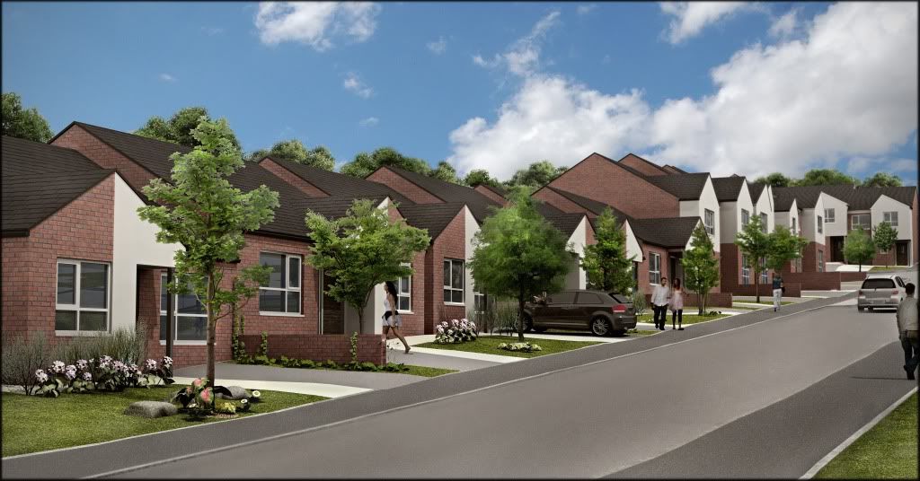
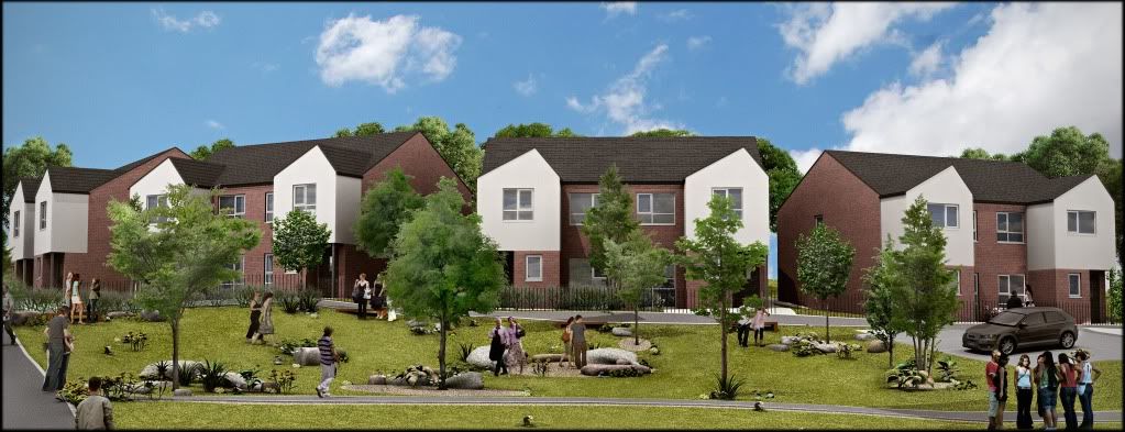
Here is my latest image on the 'boring' housing scheme I've been working on.
Had quite a bit of difficulty with the terrain, but sorted it eventually. I didn't have time to rectify the curb, maybe next time.
Thanks to Solo for the plant pack, looks great.
Please comment!
Rendered in Podium, PP in Photoshop


-
It looks good! ...nice textures, background, and plants...but I would hate to have to jump the curb just to get into the driveway
 you need an approach/apron from the street, and that would probably make the curb look better as well.
 -
Looks great Oli
Solo's garden pack looks great in that scene. The lighting and colours are spot on. But I think it would look complete if you pulled out Subdivide and smooth and created vehicle crossings (where the driveway passes through the curb to the road) -
fantastic cheers...i knew something was making it look odd!! I didn't even notice that I'd forgotten to put them in, they are on the plan too, oops. Great idea about subdivide, I'm gonna make it a gorgeous curb! Man I hate curbing my car, sends a chill down my spine!
-
picky picky picky.
The last time I was in the UK I saw cars jumping the curb all the time.
the homeowners didn't like tho' I must admit.

The curb/ Grass interface to the right by the walking man looks a tad dangerous however. Tell the kids to keep their bikes away.
-
thanks for pointing that out, im workin on the image at the moment.

-
Very nice, Oliver. You might want to adjust your masonry textures so the window weads aren't in the middle of a course.
-
damn it i didnt think anyone would notice!!

Hello! It looks like you're interested in this conversation, but you don't have an account yet.
Getting fed up of having to scroll through the same posts each visit? When you register for an account, you'll always come back to exactly where you were before, and choose to be notified of new replies (either via email, or push notification). You'll also be able to save bookmarks and upvote posts to show your appreciation to other community members.
With your input, this post could be even better 💗
Register LoginAdvertisement


