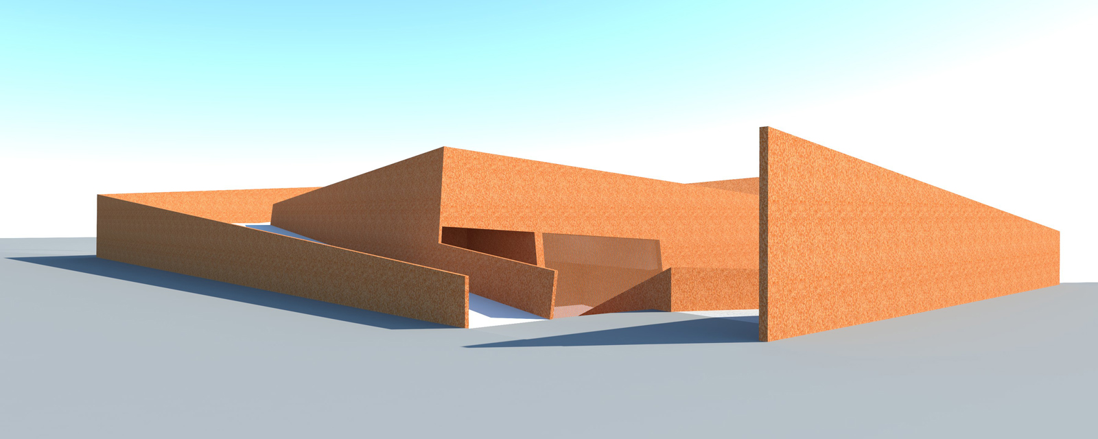
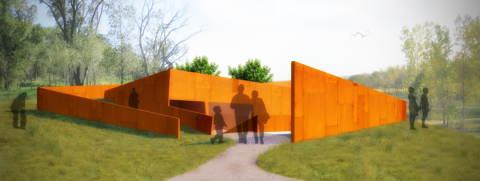
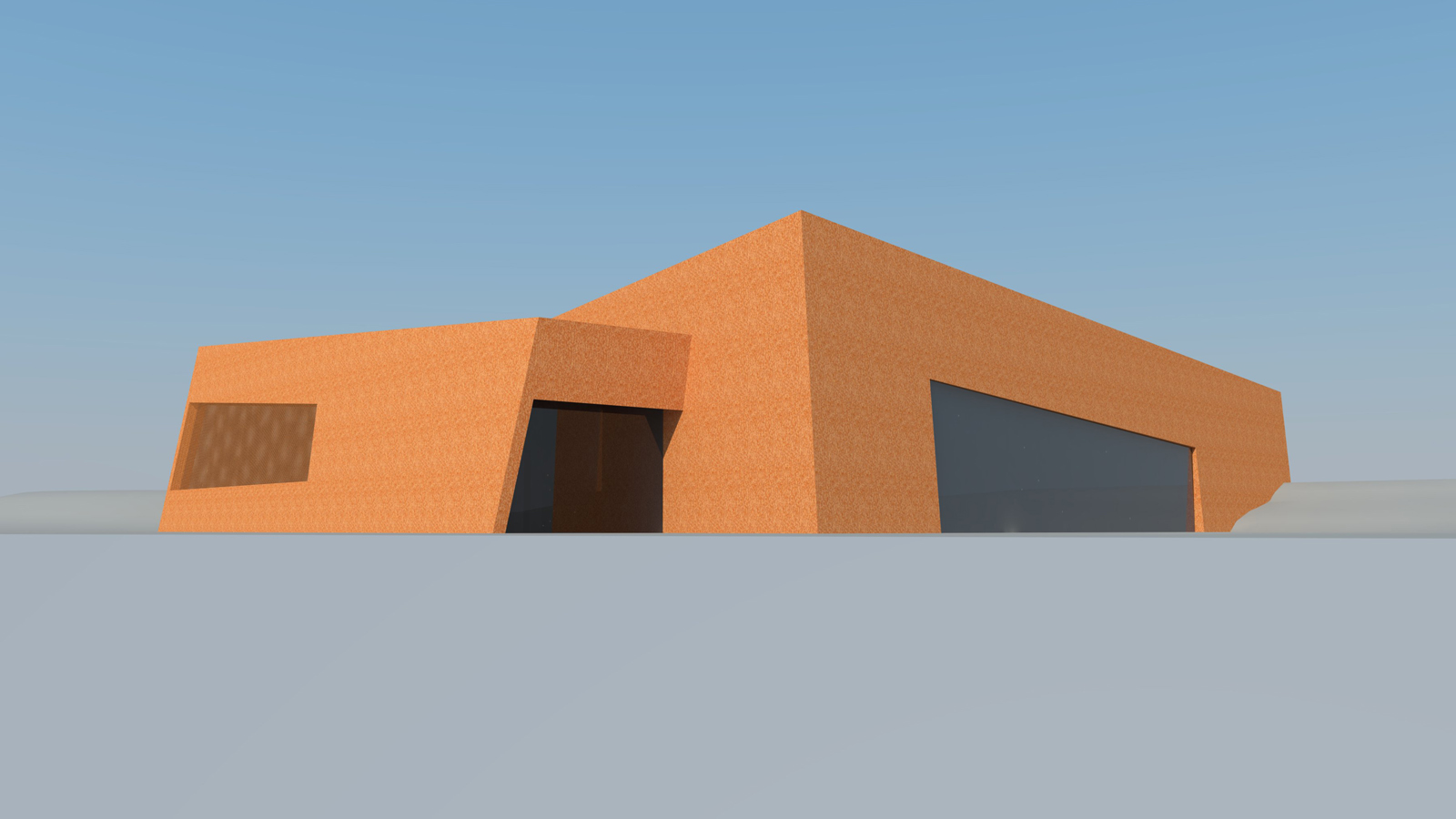
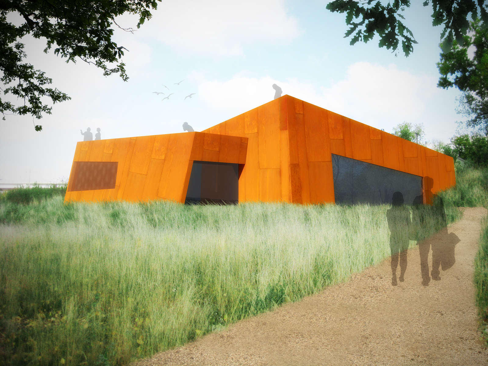
Interpretive center - a couple of views
-
I feel so guilty for abusing the resources on this forum without actually reciprocating. So I thought what the hell, I'll post some images and get people's opinions on them, contribute to this beautiful website and get that monkey off my back.
So these images are of an interpretive center for a nature sanctuary located in St. Paul, MN. One image is the entrance from the road and parking lot and the other from the existing trail system.
All the post production came from photos I scavenged off the net and photoshop brushes. It came in handy once I saw that what I intended to be corten steel came out looking like ugly stucco. I also added a bloom effect because... well because I wanted to.
 A lot of trial and error and sheer damn luck went into making these images. Plus a little vray.
I'll eventually redo these because I don't like how I handled the fenestration.


-
the second image is great...and the design. so brutal but elegant!

-
Lovely: design and presentation! You must not be a stranger from now on.
-
Thank you for the kind words. I certainly will try to be a more active participant in the forums and I'll probably display some more of my work.
The design is very brutal, but I thought the corten was appropriate given the physical and historical context of the site. It once was a major shipping yard and was for a long time left to stagnate having been polluted for so long with no oversight. Fortunately, it has undergone massive rehabilitation and is a major attraction as part of the Twin Cities trail system. The corten recalls its industrial past and is overt in its presence on a site dominated by natural surroundings. I liked the contrast it presented and rustic nature of the steel. I thought about incorporating other materials (i.e., natural stone and wood). They may make an appearance once I get around to reworking the fenestration.
-
i love the corten, appropriate choice but it seems very saturated and orange unless thats what you wanted it to look like. It needs more of a brown tone to nestle in the grass better IMO.
-
tolieolson,
Is this in the Bruce Vento Nature Sanctuary?
-
They look great, and the general photoshop work is very nice. I think they look a little out of scale though - the firs photoshop image especially. The people need to scale down a little or the building a litle bigger or something. But it appears the people will not fit into the entrance without hitting their heads
 Great work!
Chris
-
@d12dozr said:
tolieolson,
Is this in the Bruce Vento Nature Sanctuary?
Well the building is supposed to be on the edge of the sanctuary, not actually in it. I should note that this was a class assignment and for our purposes, we assumed that the warehouse that was currently occupying the site did not exist.
@chris fullmer said:
They look great, and the general photoshop work is very nice. I think they look a little out of scale though - the firs photoshop image especially. The people need to scale down a little or the building a litle bigger or something. But it appears the people will not fit into the entrance without hitting their heads
 Great work!
I really appreciate the kind words, Mr. Fullmer.
As for scale and the height of the people in the images, their scale is actually correct. Where I think some confusion may lie is that, while it's not completely discernible from the images I've shown, a visitor must go down a set of stairs or take a ramp down to the main entrance. This 'walking down' to the entrance may seem cumbersome, but it really isn't given that it's a height difference of only 5 feet. So what you're seeing in the first image is not the entire height of the building. Perhaps I should provide a floor plan and section to clear this matter.
Hello! It looks like you're interested in this conversation, but you don't have an account yet.
Getting fed up of having to scroll through the same posts each visit? When you register for an account, you'll always come back to exactly where you were before, and choose to be notified of new replies (either via email, or push notification). You'll also be able to save bookmarks and upvote posts to show your appreciation to other community members.
With your input, this post could be even better 💗
Register LoginAdvertisement


