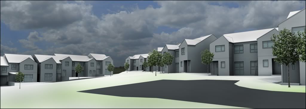
Boring Renders!
-
Hi people,
Been on a boring project recently.... large housing scheme.
So here is a prelim render, nothing special. Hard to spruce up a scheme like this.
Please don't slate the architecture because I'm not responsible for it!


-
These are looking ok, and you can always position a bush, or overhanging tree to get some life into them (or maybe a burnt out car or two!!) I think the thing to avoid is acres of grass or tarmac - never makes a good image.
David
-
yeah burnt out car sounds more appropriate!
 It's only supposed to be a massing model so I'll do the landscaping stuff later, i always tend to go over the top too early on- I'm trying to restrain myself!
 -
considering the architecture. .. I think the renders are perfect the way they are.
-
I think the renders look fine as they are.
Perhaps lighten up the sky image a bit. Clients very often prefer 'idyllic' scenes and curent sky might give the impression there is a thunderstorm on its way... -
I know, the scheme is just awful. Its really boring working on things like this!!
Thanks for the advice!
-
@olishea said:
I know, the scheme is just awful. Its really boring working on things like this!!
Thanks for the advice!
Mate that's where your job lies! To make it look good even though the designer didn't! Though yeah your work is cut out for you here!
Hello! It looks like you're interested in this conversation, but you don't have an account yet.
Getting fed up of having to scroll through the same posts each visit? When you register for an account, you'll always come back to exactly where you were before, and choose to be notified of new replies (either via email, or push notification). You'll also be able to save bookmarks and upvote posts to show your appreciation to other community members.
With your input, this post could be even better 💗
Register LoginAdvertisement


