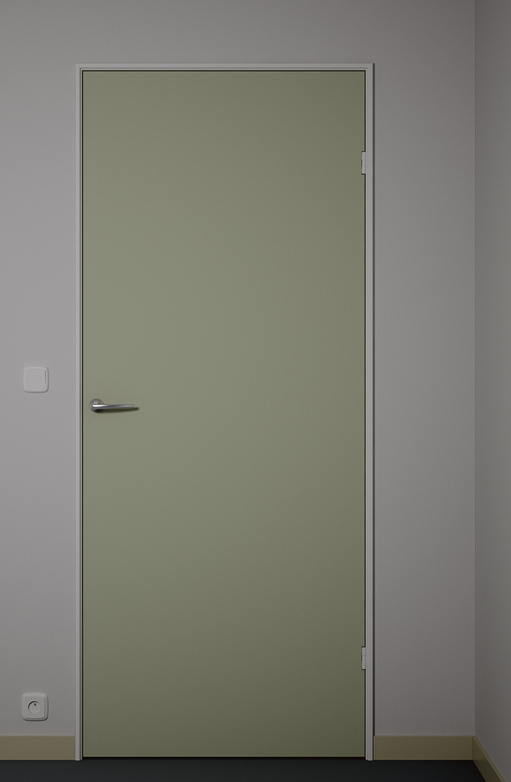
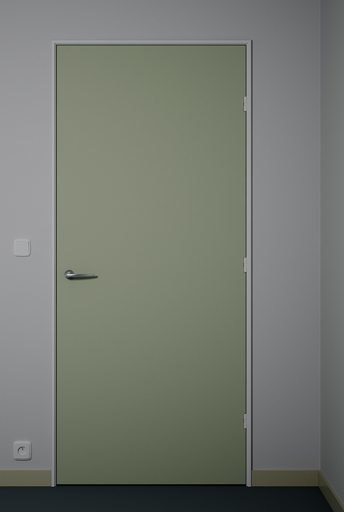
Cosy little corner
-
Not.

-
I don't mind in the least. Quite the contrary. Thanks for the info!
-
very nice
I think the door frame should be wider and the handle should be lower.. IMO
(if standard door height is 2m, the door handle should be at 90 cm ,the light switch should be at about 1m or 1.1m approximately )
And u can try 3 hinges(2 hinges are not used anymore on doors systems)
Also the light switch and electric outlet must be placed at about 20 cm from ground and door.
Hope u don t mind telling u this..
Cheers!Elisei
-
@ely862me said:
very nice
I think the door frame should be wider and the handle should be lower.. IMO
(if standard door height is 2m, the door handle should be at 90 cm ,the light switch should be at about 1m or 1.1m approximately )
And u can try 3 hinges(2 hinges are not used anymore on doors systems)
Also the light switch and electric outlet must be placed at about 20 cm from ground and door.
Hope u don t mind telling u this..
Cheers!Elisei
Can anyone direct me to a chart of "standards" like these?
I "eye it" waaay too often.

-
"Get the door, I'ts Dominoes pizza"......or is it???

There is no peephole to check.
-
Took some of Elisei's advice to heart. Not all - can't have things looking normal, now can we?
 Thanks, Elisei.

-
Now i really like it..looks almost real..

-
@ely862me said:
looks almost real..

lol. Almost real - pretty much what I'm aiming for.
 Btw, I got a little book on the sort of stuff you pointed out to me - proportions of doors, treads/risers etc. Seems like the time to actually read it. The better I know the rules, the better I can pervert them.
  Gotta be around here somewhere.
@solo said:
"Get the door, I'ts Dominoes pizza"......or is it???
Not a front door, this one. It's a bedroom door. A real one, too. The above images show a part of a curious, mildly depressing flat in Ghent, Belgium. Wish they'd deliver pizza's to my bed, though. Now that I'd call progress.
-
"Architectural Graphic Standards" by the AIA. A bit pricey, but if you can get a older used copy, for things like door's (stuff like that doesn't change too quickly), it is still one of the best design resources for Architects.
-
Nice image. A few things that I noticed:
The hinges look cut into the door. Typically not standard.
The hinges should be taller.
The handle looks a bit long.
The base molding need a radius at the top and there should be a bit of a transition to the floor.Cool image though.
Scott
-
You missed something. Take a closer peek at the wall socket.

-
wow if u wanted critisizm you came to the right place eh, my turn
 :the 2 hinges looked better, also skirting needs a gloss to it (highlight glossiness in vray - dunno what its called in these silly unbiased renderers
  ) and a nice crappy office carpet texture and bump would do well here, is that a dry wall or brick - frame width is still abit wierd. cool image though, very sterile
-
@unknownuser said:
wow if u wanted critisizm you came to the right place eh
Sigh. I know. And here I am going out of my way trying to make something pretty. Am I respected for my unselfish desire to add a spark of beauty to this dark world we live in? For my attempts to bring joy and warmth to the hearts of my brethren, and er, sisthern? No, sir, not in the least.
But that's okay. Your all entitled to your opinions. Even if they're hurtful. And mean.
Pulling yer leg.
@unknownuser said:
:the 2 hinges looked better
Will you people reach a consensus already?
@unknownuser said:
skirting needs a gloss to it
It is glossy - unintentionally, though. The lighting's ... dull. Intentionally, that one.
@unknownuser said:
(highlight glossiness in vray - dunno what its called in these silly unbiased renderers
 )
) Aw, I've must've gotten unbiased quality out of ... Vray.
@unknownuser said:
and a nice crappy office carpet texture and bump would do well here, is that a dry wall or brick
I consciously chose not to use any texture maps. Tried it, though. Took away from the image - made it less sterile. Couldn't have that - 'cause I'm European, and I'm arty, and I was trying to make a really impressive point about the human condition, or something in that very same vein, or at least, obviously, of similar magnitude and importance.
@unknownuser said:
frame width is still abit wierd.
I know. They were surprisingly thin in real life. Quite possibly not this thin, but close enough - at least according to my memory of them. Everything was thin in that place. Not a straight wall in there either.
-
Stinkie, When I first went out on my own, the contractor and I agreed how to build a no jamb door way. Well, the building moved "a little" and some of the invisible jambs opened up. Good thing that he was in on the design, as he fixed it with out cost to the owner. Today, all of my jambs have conventional trims:-)The craft of architecture still exist because of building traditions.
-
I don't think you should make it any more real than it is. It's got this clean minimal look right now, trying to make it more photographic will just detract from it.
And I like the two buildings image you posted earlier - for the same reason. The image is striking as is, making it more photoreal would seem to be a mistake.
-
@honoluludesktop said:
Stinkie, When I first went out on my own, the contractor and I agreed how to build a no jamb door way. Well, the building moved "a little" and some of the invisible jambs opened up. Good thing that he was in on the design, as he fixed it with out cost to the owner. Today, all of my jambs have conventional trims:-)The craft of architecture still exist because of building traditions.
I've actually considered going back to school and studying architecture a few years back. I didn't, as I quickly realised I could never let practical matters prevail over design-related ones. I'd be a sculptor first, and an architect second. Didn't seem like a good idea.

As for this place I used to live in, architects should visit it. It's a regular house of horrors. There's this door downstairs, and I never quite figured out what was behind it. So I asked the guy who came around to 'repair' stuff occasionally. He said: oh, that's where the elevator was supposed to go. Now, when I imagined the building in 3D, I saw that elevator would've gone straight through ... my entrance hall. How far were they thinking ahead?
@arail1 said:
And I like the two buildings image you posted earlier
Hey! Someone liked that one! Can I get you anything? Pizza? Callgirls?

-
I believe that it was Lou Kahn who said that while a sculpture could build a cannon with square wheels in order to express the futility of war, an Architect's design would consist of round ones. As I recall he also asked a brick what it wanted to be, and that was an arch, from which came the buildings of Dacca. No limitations on creativity, or art. Just find the right school, or person to study under.
-
@honoluludesktop said:
Stinkie, When I first went out on my own, the contractor and I agreed how to build a no jamb door way. Well, the building moved "a little" and some of the invisible jambs opened up. Good thing that he was in on the design, as he fixed it with out cost to the owner. Today, all of my jambs have conventional trims:-)The craft of architecture still exist because of building traditions.
looking good, stinkie...love the clean lines. the only thing that bugs me is the color of the door...and it probably wouldnt if it wasnt the default color in sketchup....haha.... i now cringe whenever i see that color in any model!
-
@marked001 said:
the only thing that bugs me is the color of the door...and it probably wouldnt if it wasnt the default color in sketchup....haha.... i now cringe whenever i see that color in any model!
lol. Comes to show how people's tastes differ: I actually made a 'real' Vray mat out of that color (so I could add reflection, as the default mat renders diffuse). Love that color!
@honoluludesktop said:
No limitations on creativity, or art. Just find the right school, or person to study under.
I see your point, I think. Still, architecture would be the wrong choice for me. I am interested in architectural forms for reasons that are solely artistic. Also, at the end of the day, there's simply not that many clients who'd allow their architect to push it as far as, say, Gregor Schneider does. Believe me, I pondered upon this prior to my studies, as well as afterwards, and while I deeply love architecture, there is simply no way I could be content being an architect.
Hello! It looks like you're interested in this conversation, but you don't have an account yet.
Getting fed up of having to scroll through the same posts each visit? When you register for an account, you'll always come back to exactly where you were before, and choose to be notified of new replies (either via email, or push notification). You'll also be able to save bookmarks and upvote posts to show your appreciation to other community members.
With your input, this post could be even better 💗
Register LoginAdvertisement


