Bar Project WIP Photo Match [UPDATED 8th July]
-
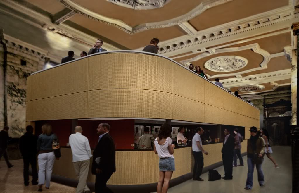
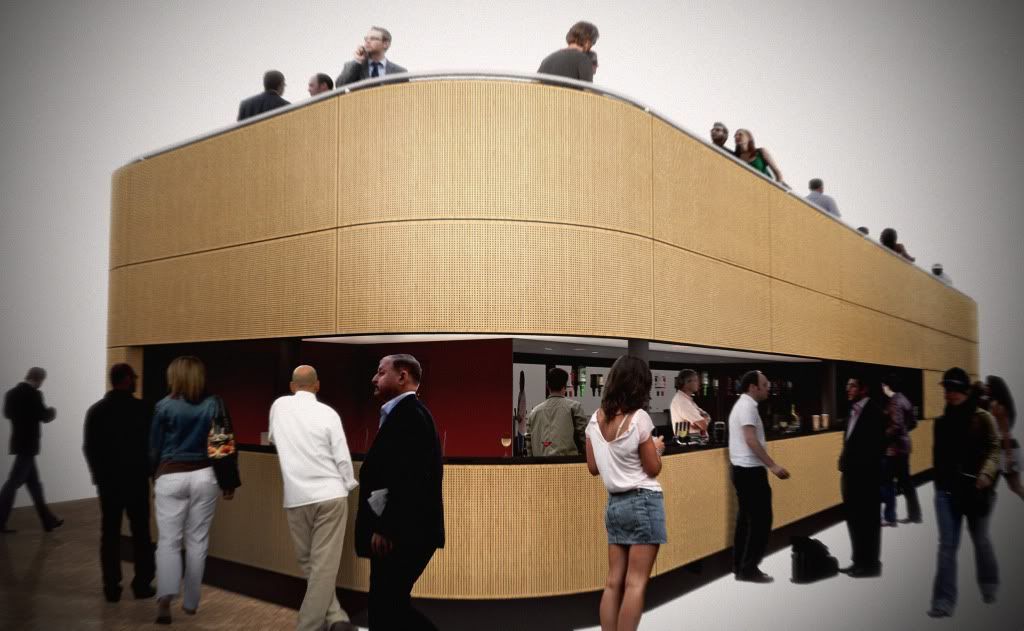
Here is a WIP of a bar I'm working on. It is due to be placed within an existing listed bank building as an intervention.
Just thought I'd share these preliminary images showing how I integrate the sketchup model into a photograph, or in this case, a series of photographs that make up a panoramic (thats why the edges are all distorted/converging)
I'm gonna be rendering and photoshopping this weekend (:() so should be posting the final images next week.
Let me know what you think!
(The cladding is Woodsorba timber acoustic panels to reduce reverberation within the banking hall)
I am not the architect for this btw, I just did these images.
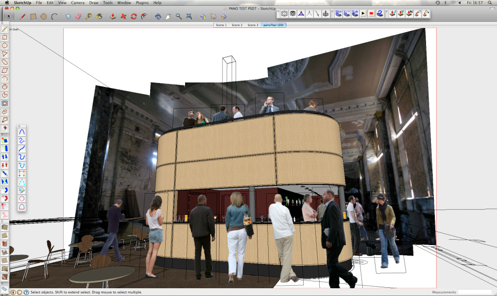
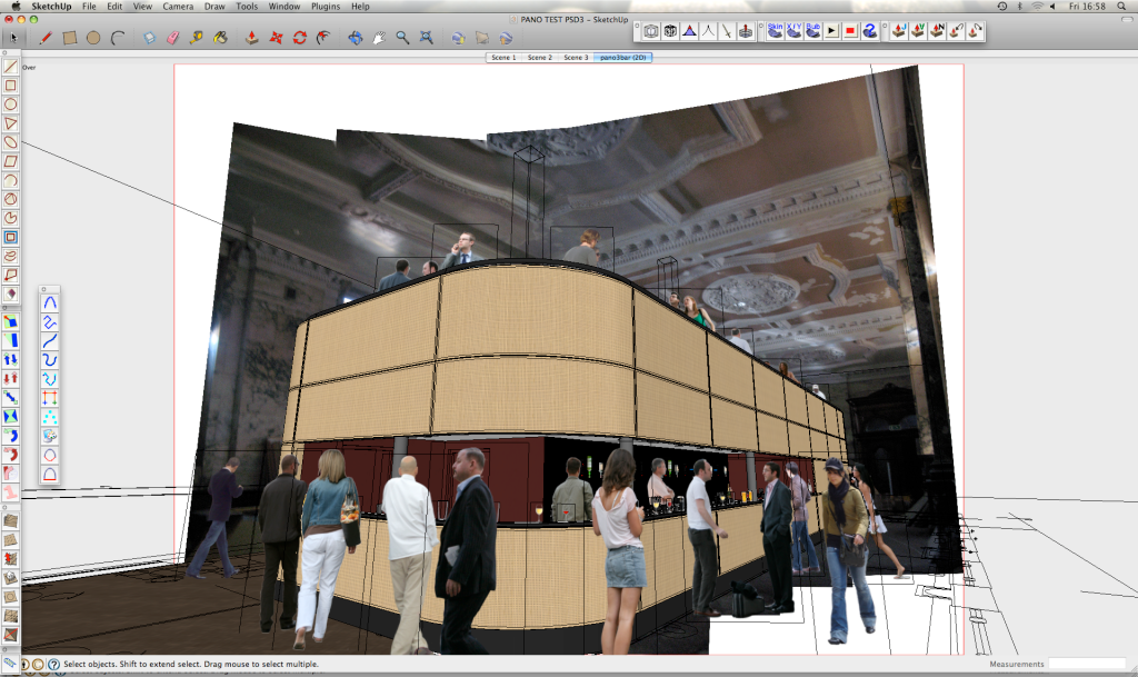
Raw renders:
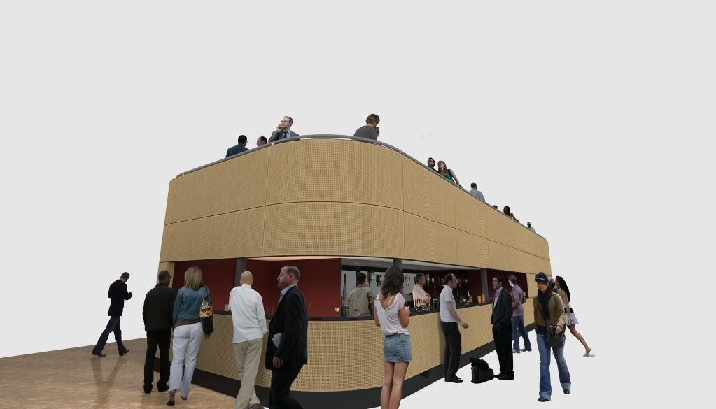
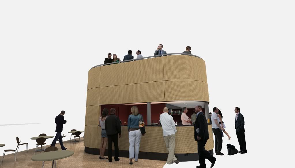
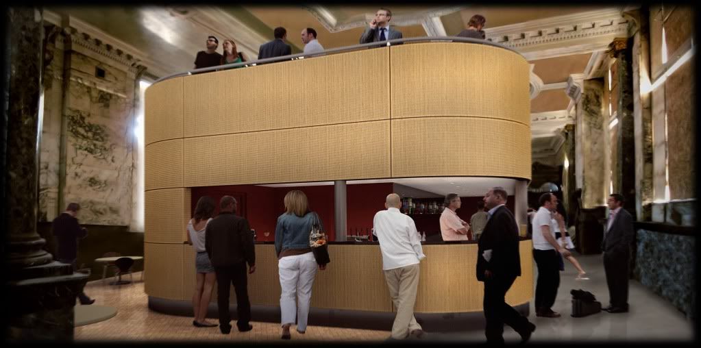
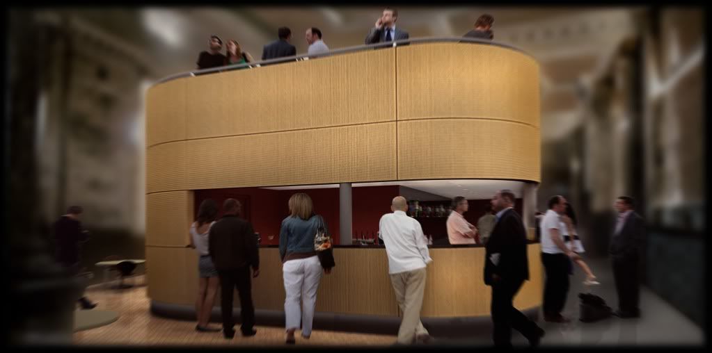
And finally in-situ:
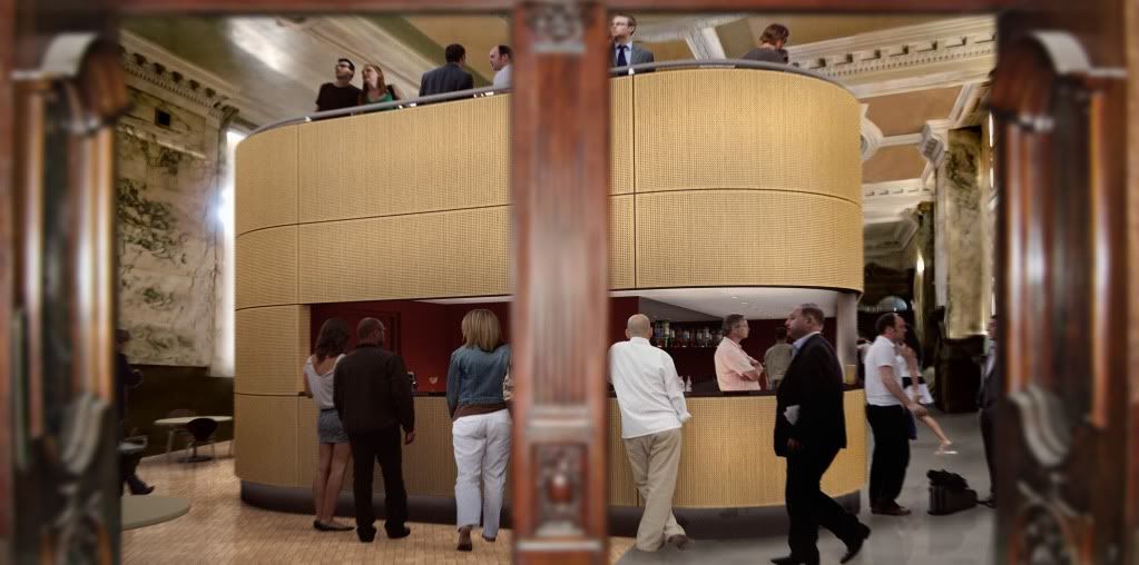
Looking through the original bank doors:
Without the door in foreground:
-
I've been to a number of meetings and conferences of late and have come across lots of internal freestanding structures like this - information points, ticket offices, bars etc.
All of them are well designed, as is yours, but I can't help feeling that almost all are very generic in style and don't seem to attempt to reflect the visual cues in their surroundings. I'm not suggesting for one moment that you make one of those awful pastiche structures that you see far to often. Just that, in some way, it would be interesting if you could see that this structure was designed for this place, not just anybar, anyplace, anytown.
As a layman maybe I'm missing something though
-
I agree somewhat. The bar is in this (island) format as to preserve the existing building's original materials and maintain they are on display. Its like an English Heritage issue.
I'm not the architect for this, personally I'm not a great fan of the cladding or the form. Its kind of boat-like. I hope the architect isn't reading this!!

-
Thanks, I thought it would be something like that.
I thought it looked more like one of those open top buses - paint it red; add some fake wheels - very English heritage -
updated the first post
-
Very nice work, an excellent use of photo match.
-
Hey Oli
Here's another reason I have to learn photo match. Are you still working on these are you posted images your final? I think you have done a fantastic job. I’m not sure if this is a photo match thing, but the photo in the back ground looks a bit folded and low res.
I think the people’s positions are fantastic. I can feel the wind down after work and the noise of chatter.
There just one thing that I feel is alittle off. You have used people that look dressed for summer and winter. There’s the girl with the short skirt in the foreground. Then there’s the girl to her left dressed in full winter attire.
I may have it completely wrong, and this is how Manchurians dress down once inside a bar in winter.
The panels on the bar you have used are amazing. Design wise, not my cup of tea. But as a texture they look very real. Well done. -
Hello olishea, that a good rendering, may I ask what did you use on those "people" ? Are those png files? thanks
-
hi thanks guys.....although I wish the background image was higher quality, it was very hard to take the photos in such dim light (the windows are all boarded up)......
The people are from http://www.vyonyx.com I just converted them to PNGs then imported into sketchup
and no these aren't the final images
-
I've updated the first post again......comments please, I want to improve!
-
Here's a quick mess about....need to sort out the background now
-
These, with the girl in the foreground are my favorites. I will have a look at the bar by time.

Hello! It looks like you're interested in this conversation, but you don't have an account yet.
Getting fed up of having to scroll through the same posts each visit? When you register for an account, you'll always come back to exactly where you were before, and choose to be notified of new replies (either via email, or push notification). You'll also be able to save bookmarks and upvote posts to show your appreciation to other community members.
With your input, this post could be even better 💗
Register LoginAdvertisement


