Scene maker
-
I first mentioned my idea for this under Mike Lucey's topic about BIM/PEN, but now I think it better to open it here, in case members are, not surprisingly, jaundiced by the acronyms. And after all, the whole thing is only possible because of ruby and its web dialog.
You may have seen this animated interface before: (sorry youTube is blocked at this time)
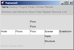
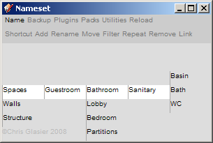
But in this context please note how a nameset is used to identify and display the scope of a scene -- a collection of the physically related (building, floors, spaces ...), a grouping of the logically related (sanitaryware, fire prevention ...) or a single component type.
Now here's the start of a proposal to use nameset animation to aggregate as much as possible to do with creating SU scenes in one small dialog window.
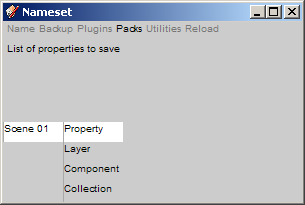
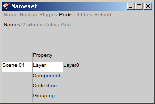
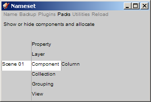
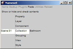
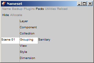
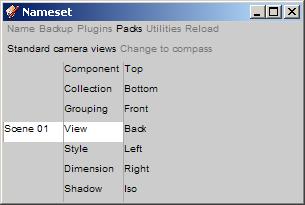
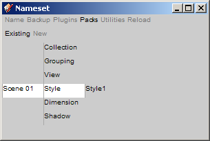
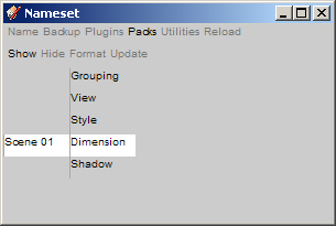
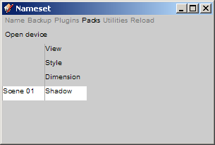
Anyone is to be able to use it to get just the graphical support information needed, in the chosen format. It also takes advantage of nameset collections and groupings identifiers, reserving layers for modelling aspects like layer0, dimensioning and such.
As some members may know I first discovered Sketchup a year ago but only recently started to get to grips scenes, layers, styles and all that.(example). I could use some help! At this stage I have called this development a scene maker, but my intention is to expand it into a packs maker to include scenes, preferences, text, diary, progress monitor, exploded diagrams, animations and so on that are pertinent to the individuals who are responsible for actually carrying out the work.
I would be very interested to discuss the potential and of course the ifs and buts ... thanks
Chris
-
Chris, I'll be the first to admit that I still have very little idea what on earth a name-set is. I don't connect to the name of it very well. But I'm hoping that little by little I'll catch on! (And I understand them better in this context than I do in the components placement and animation context).
But I do understand scene/layer/style manager conversations. And its a plugin I'd love to see developed. Here is a thread where it was discussed and I made a mock up what I thought it should look like.
It doesn't have to look like that if that doesn't fit the nameset visual style, but some of the ideas of what it should include are still the same.
Chris
-
@chris fullmer said:
It doesn't have to look like that if that doesn't fit the nameset visual style, but some of the ideas of what it should include are still the same.
It is not the visual style that is important it is nameset functionality (associative indexing - or namesetting if you like - and animation) that allows the interface to be very small. If your example looks more like a spreadsheet, mine is more like a slot machine. What appears on the line (or white stripe) is the focus, the rest is what you missed (slots) or what you could have (nameset) - more like a combination lock perhaps.
My concern is how all sorts of people can work the machine and what gets output. What goes in the middle is your expertise, and that's where I would appreciate help.
I feel quite despondent that I continue to fail to explain namesets adequately but I will soldier on with a good old British stiff upper lip!
Chris
-
@chrisglasier said:
I feel quite despondent that I continue to fail to explain namesets adequately but I will soldier on with a good old British stiff upper lip!
Chris
A couple of members told me privately that taking a look at "Operative content" helped.
Thanks ... Chris
Hello! It looks like you're interested in this conversation, but you don't have an account yet.
Getting fed up of having to scroll through the same posts each visit? When you register for an account, you'll always come back to exactly where you were before, and choose to be notified of new replies (either via email, or push notification). You'll also be able to save bookmarks and upvote posts to show your appreciation to other community members.
With your input, this post could be even better 💗
Register LoginAdvertisement


