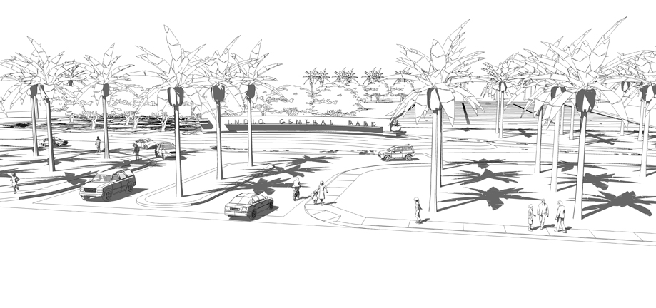
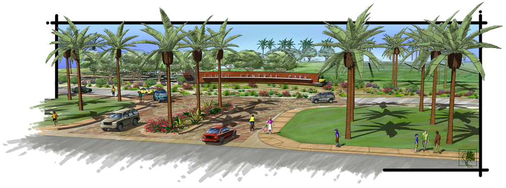
Entry Sign and landscape model
-
I have not posted in a long time so I thought I would throw this up on the forum, here is my latest project output, I have included a very low res line drawing version and the finished painting. I created all of the hardscape and trees in SU, bnased on the clients initial design, and then "painted" it in PS CS4. I have also been working with Painter X to create other rendering styles (color pencil, water color and enhanced SU) to give my clients a choice of different rendering techniques for there designs. Let me know what you think.
Thanks.
Bob


-
that's very cool.... like that alot..
-
Marked - thank you for the comments glad you liked the image.
-
Bob, this is a nice image indeed.
-
great work !!!

-
Nice work Bob. I like the marker style. It turned out really well!
-
thank you for all of your comments, I must give credit where credit is due the border and the image "breaking" the border is directly inspired by Tinanne's beautiful work, I have done a few of these stylized borders and my clients love this look, glad you all like it.
Bob
-
@rdluther said:
thank you for all of your comments, I must give credit where credit is due the border and the image "breaking" the border is directly inspired by Tinanne's beautiful work, I have done a few of these stylized borders and my clients love this look, glad you all like it.
Bob
Wow, Bob, thank you for the compliment. I wish I could give credit to whom I discovered this "border breaking" from. It's from a much older illustrator/architect that someone had introduced to me from a class at ASAI, but sadly I can't remember his name. All I know is that I fell in love with it!

OT, I grew up in OC. I graduated from JFK in La Palma, but lived all over OC as we moved a lot when we were kids.

-
BTW, if I could give one crit it would be to vary the sized, shapes, and rotation of your landscaping. It will help with that "cookie cutter" look even though your are using the same component all over your model.
Did you use Piranesi?
-
Coen - my client totally agrees with you and made similar comments.
Tinanne - I agree that the palms need to be rotated, I started to do it on the left side of the image and failed to continue it to the right side. I did not use piranesi, just hand colored with a wacom tablet and Photoshop CS4.
Bob
Hello! It looks like you're interested in this conversation, but you don't have an account yet.
Getting fed up of having to scroll through the same posts each visit? When you register for an account, you'll always come back to exactly where you were before, and choose to be notified of new replies (either via email, or push notification). You'll also be able to save bookmarks and upvote posts to show your appreciation to other community members.
With your input, this post could be even better 💗
Register LoginAdvertisement


