First post...
-
Hello everybody,
I am seeing so much talent here it seems like the right place to look for ideas and just learn new things.First off, thank you everyone for sharing your knowledge and I hope I can give back as much I could so please ask me if anything.
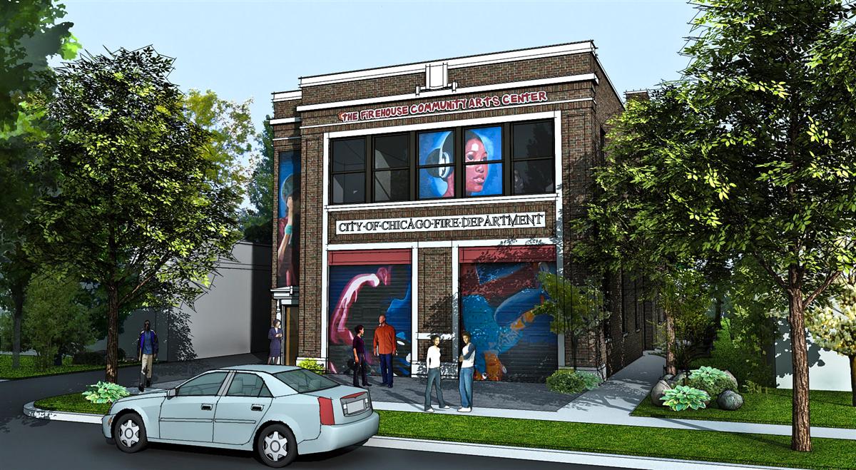
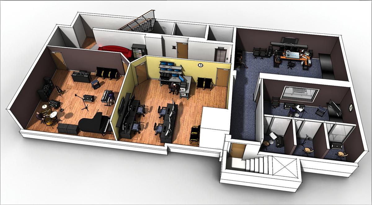
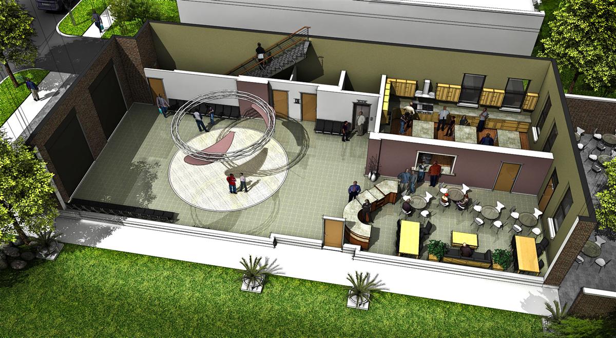
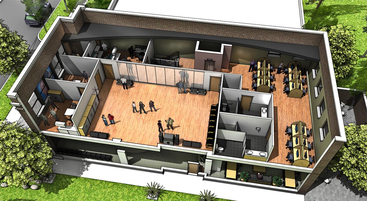
I wanted to introduce myself by posting a few images that I just finished.This job is a community center (used to be an old firehouse)in the south side of Chicago and the character of the renderings was inspired by Solo, whose images I stumbled upon once browsing the internet and this is how i found this website. He must be one of the very best talented people you have on this forum.
So thank you solo!Would love to get your comments and suggestions.
Also if anybody has found some different lo-poly people that look good let me know. The 2d ones just don't look right from a birds-eye view.


-
Nice i really like those shots of each floor. What did you use for rendering? Dont really like the first image the car and some elements of the building stand out as very cartoony contrasted with all the rendered trees etc?
(in the first image only I mean the other shots are spot on!) -
Liam, I used podium with some hidden line overlay and a little tweak in lightroom.
I see what you mean about the rough car in the front. I thought that the mix between sketch and podium will look interesting and it did in the other shots. It's just that maybe this car became a little too prevalent. I actually like the cartoony feeling overall and that's why I overlaid the lines (in PS with a multiply) so it feels a little less rigid.
Thanks for your comment... -
Hi Orlin,
Welcome to the forum and thanks for sharing your work.
I had a look at your nice looking website and found some really
good projects on it and some great presentations.
As far as these images are concerned I tend to agree with Liam.
There doesn't seem to be an overall consistency in your images.
Some parts are too sketchy while the others are too realistic.
Also I think there is somewhat too much line work still present
in them.
Anyway apart from that great work overall.
Cheers,
Mateo -
That is a great and informative floor plan! My only crit would be that it might need more restrooms, but that is really just nitpicking. Looks very professional, good work.
-
I really like your style and way of communicating the project.
A lot to take inspiration from, thanks!
-
your floor plan sections are very informative - gets the idea across very quickly. Your basement level looks like it is floating in comparison to the other two floors which are set in the site - maybe you have to model some earth around it??
-
Nice combo of podium renders and overlay. It would be nice if you post these at Podium forum as well. BTW I like those 3d trees . Could you please tell what they are.
-
Thanks for your comments...
I actually meant these images to be more on the sketchy side but the people cutouts really didn't help that as they bring a photo touch to it that competes with the sketch.
Otherwise I like the mix between the sketchy feel and some GI/irradiance effects.sepo, the trees I think you are talking about are actually a component I got from the warehouse. It is the "arvore 3" by Gabriel Felin. I think this is one of the best trees out there for fill in trees at a small memory footprint. All I did is explode the leaves and make them cast shadows, podium follows the transparency for a nice detailed shadow (unlike SU). I love the way these trees render.
Hello! It looks like you're interested in this conversation, but you don't have an account yet.
Getting fed up of having to scroll through the same posts each visit? When you register for an account, you'll always come back to exactly where you were before, and choose to be notified of new replies (either via email, or push notification). You'll also be able to save bookmarks and upvote posts to show your appreciation to other community members.
With your input, this post could be even better 💗
Register LoginAdvertisement


