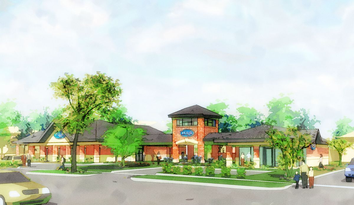
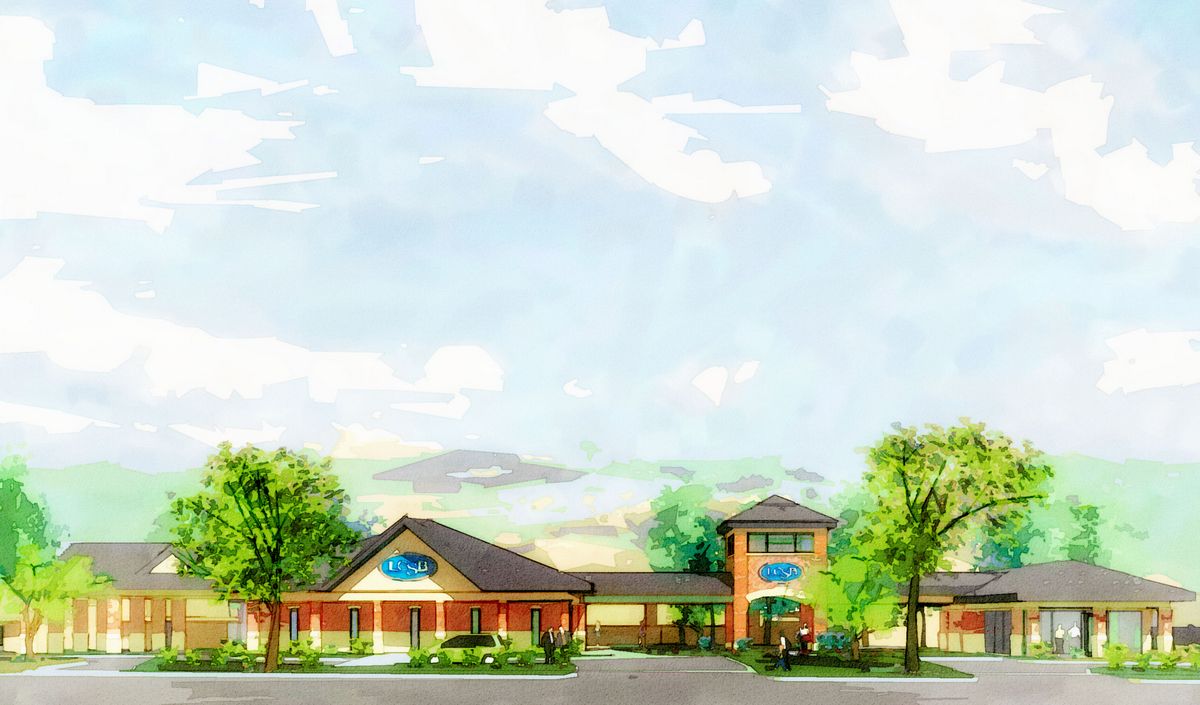
New renders...(redux+new)
-
...with new tech's and new growies:
-
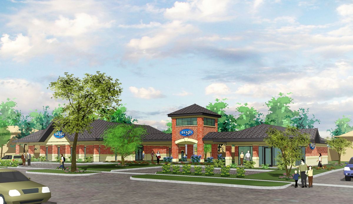
a couple more to help formulate your C&C's please:
-
Personally I like #2 of each ... I prefer to see a little more definition for a rendering and not as much bleed.
Overall, though, Tom, you are one great renderer whatever you work on!
-
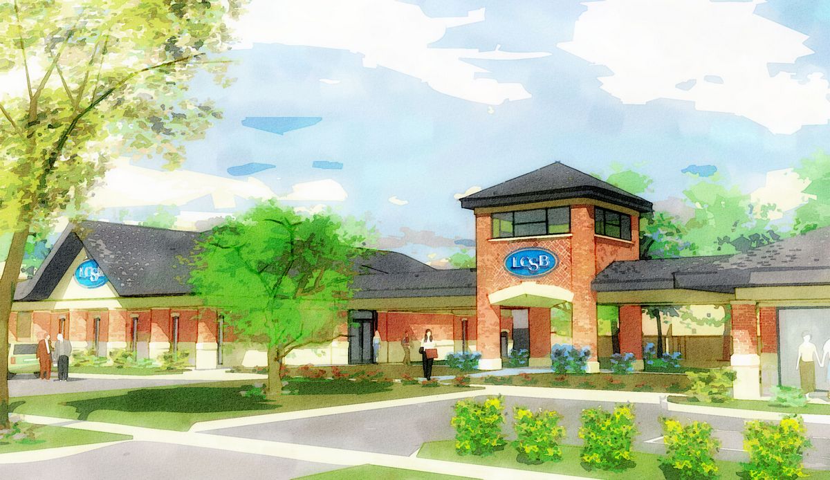
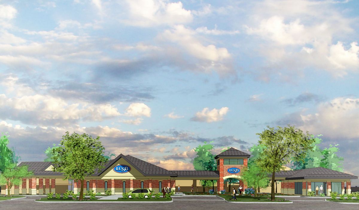
Okay, last two for the day...personally, I'm lovin' these new tech's: what do you all think? What would make them better?
-
Thanks Alan...yeah, you're right in line with one of my clients, but for another who finds PR renders "creepy" I keep searching for the right wet tech to get him reaching for his wallet. (Personally, I fall in line with the later...obviously :`)
-
That last one is great. What would make it better? If the clouds matched your sketchy growies. Just a thought.
-
Eric, I was thinking the same thing when I checked my late night work first thing this morning. This one is better there and all around, I think.
-

-
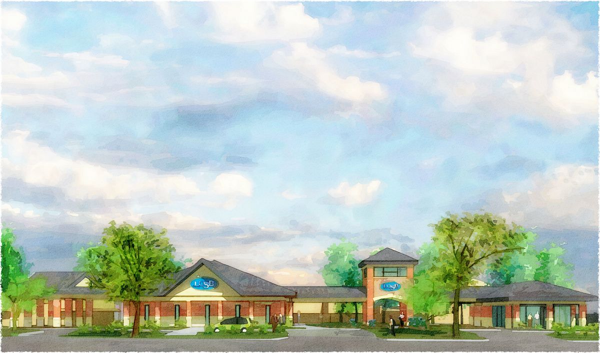
Looks good, i like them all.
-
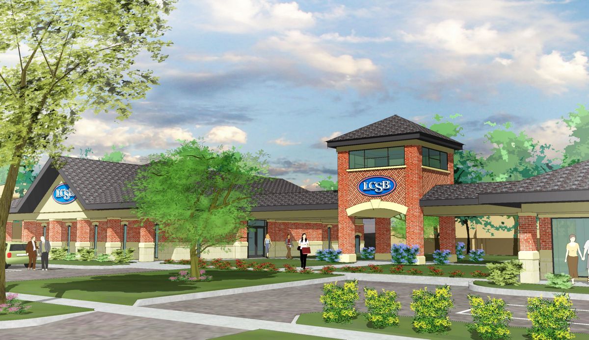
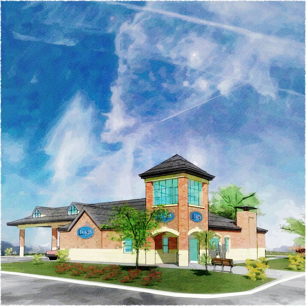
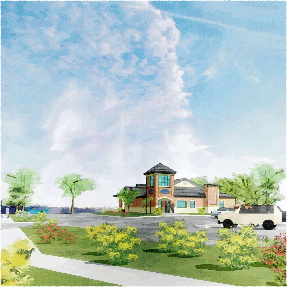
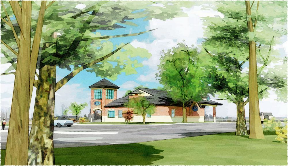
Made some revisions based on comments here and in CT, also a couple new trying to make better use of a big sky:
-
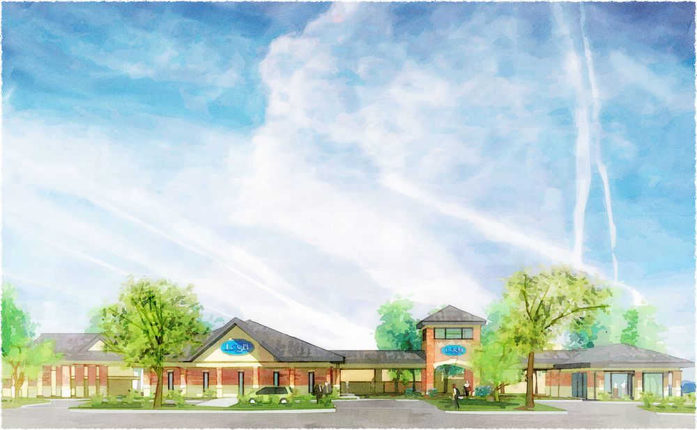
And one more before bedtime...
-
@tomsdesk said:
Made some revisions based on comments here and in CT, also a couple new trying to make better use of a big sky:
i think the sky draws your attention too much in these images.... im sure the client wants to see the building rather than a pretty sky

-
would love to see the original exports. I like the colors and texture in the closeup, but have to agree that the sky is very intense!
-
Tom,
All your renderings are beautiful, but I always look at things through an architect's eyes and what is best for illustrating the building. I have to agree with Alan that #2 in the first set are better in that regards (IMHO) as they are cleaner. And in the last two, there is too much foreground with too much happening in it; the only reason I could a rendering from that perspective is if client specifically asked for it. I don't think your clouds are too distracting; in fact, the one in the middle witha vertical cloud formation over the corner tower enhances the architecture.
Daniel
Hello! It looks like you're interested in this conversation, but you don't have an account yet.
Getting fed up of having to scroll through the same posts each visit? When you register for an account, you'll always come back to exactly where you were before, and choose to be notified of new replies (either via email, or push notification). You'll also be able to save bookmarks and upvote posts to show your appreciation to other community members.
With your input, this post could be even better 💗
Register Login


Advertisement