Few new renders for a museum project
-
Leave comments, they'll be appreciated.
-
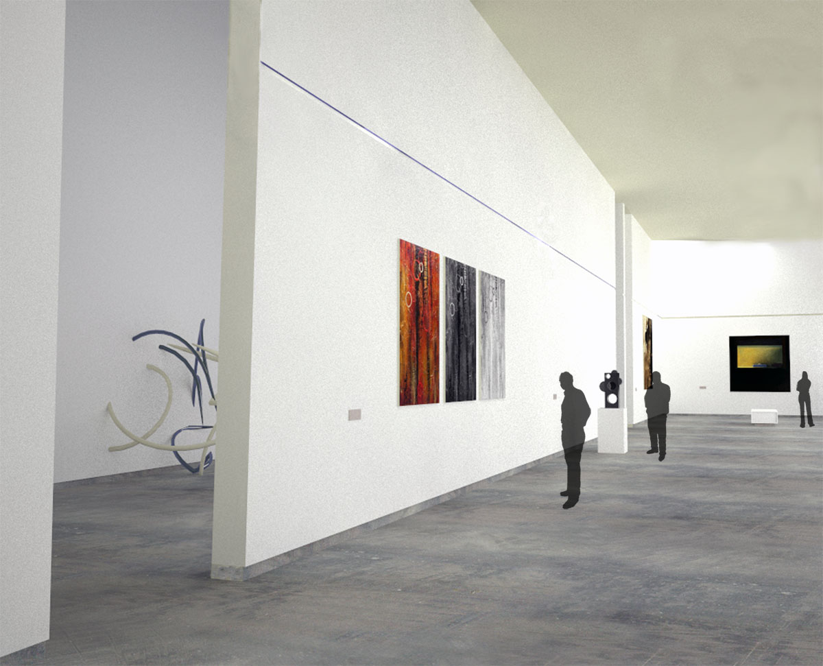
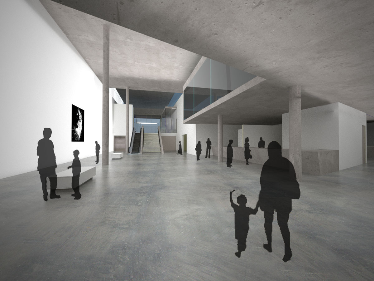
the first render tooks eye to right part of the image and the there is no other move for eye to comeback to image,
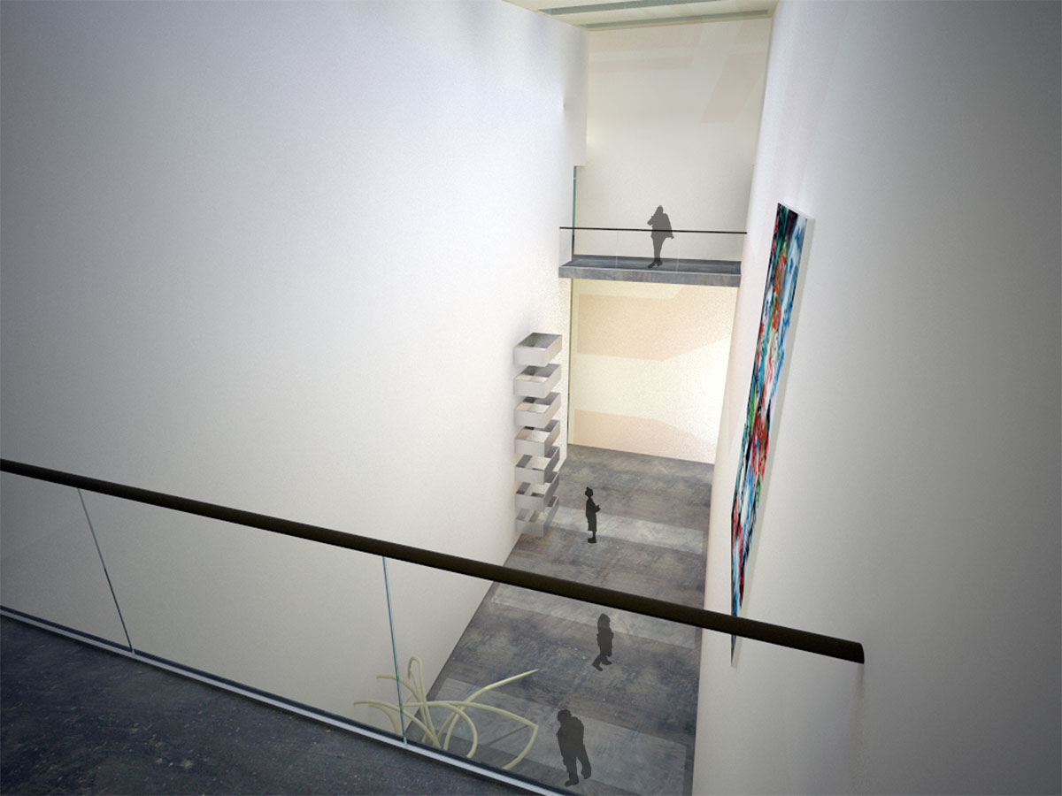
the 2nd one: i don't think anybody see the huge size painting from too clse distance, and so it seems ther is a strange view..
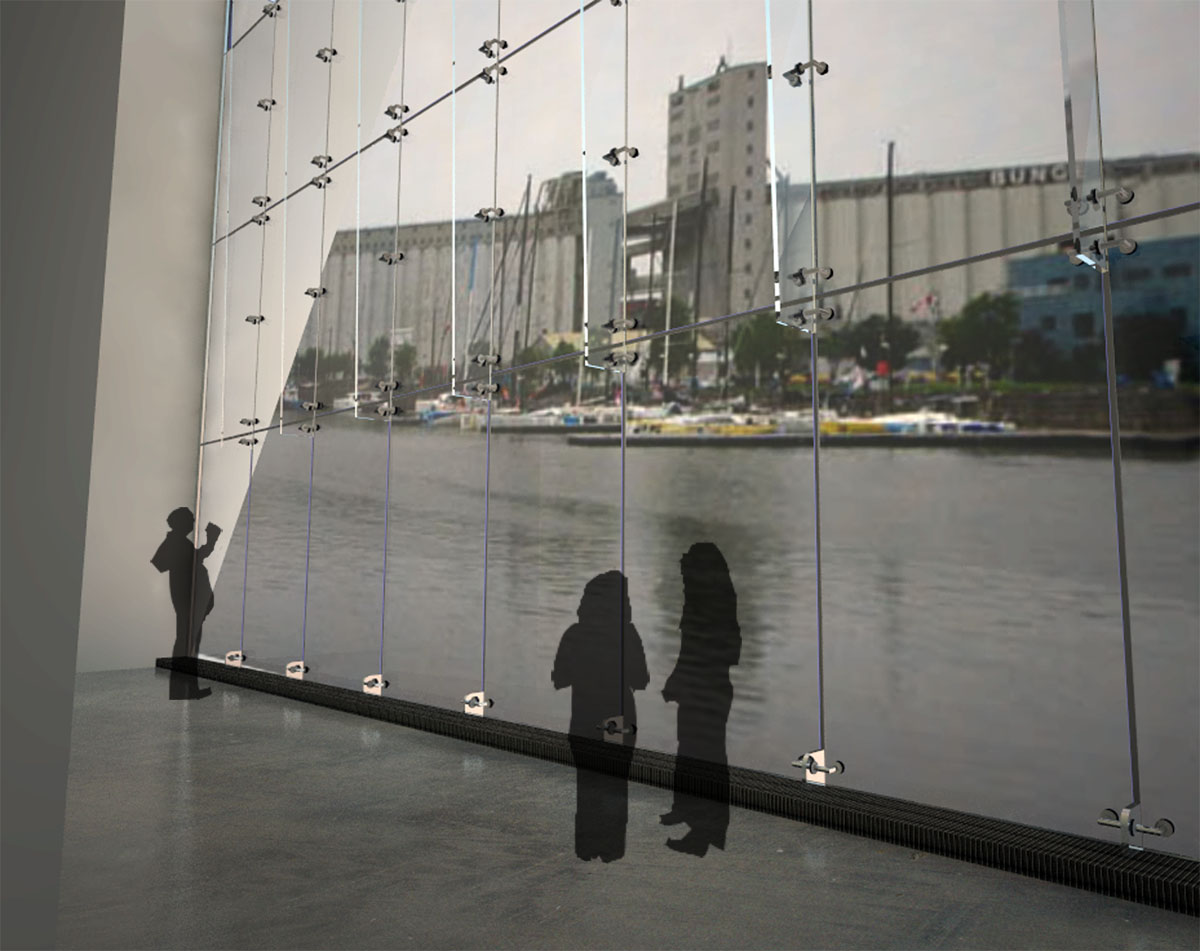
3rd one , your vanishing point is not matched whit the hdri background image , and it makes the rende confusing ( kt gives you a good controll on hdri situation)
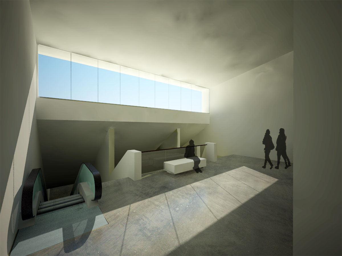
4th one:adding more reflection to floor and more reflection and transparency to glass ( beside the steps) would make ur rende better in my sight.
and about the 5th : it is your best render in my sight.
your persons are a bit jiggy...
thanx for sharing , seeing forward to see more (and better) renders
-
Very nice architectural model. Got here from the link you put for Peterbuilt.
If you blur, and lighten the pictures on the wall, it would make them blend into the render better. The scene in the window can be rendered (darker or lighter) to give it a sense of depth. The first, and last render should be cropped to eliminate the emptiness at the edges of the render. Light the escalator way, looks gloomy.
I really like the floor texture.
-
along with honolulu's comments above about the view outside the window, the perspective is off as well. The left side should be scrunched down quite a bit (sort of like how the glass butt glazing converges on the left side.
-brodie
-
These are really nice. I don't care for the style of people but that is just personal preference. Your floor and wall textures are great. Care to share?
-
Reminds me of the tate modern in london, all those big clean spaces.
Very nice renders as well, although as someone mentioned the background in the 3rd image is a bit skew.
-
I quite like these renders, apart from the mixed perspective on the background across the water ... and the people.
I understand why people are included in renders in this style - I used the technique myself until the fateful day that my wife looked at a render and said "is it haunted?"
What!?
"Well", she said, "why are there all those ghosts?"
We forget that the untrained eye does not see the same that we do. And most people will be viewing renders with an untrained eye. Since she made those comments, I have several architects and interior designers ask me not to use this style of people as they find that most people are distracted by the figures and focus on the curious representation rather than on the scene itself.
Just something to keep in mind.
-
I was wondering, do you know a good place where I can get 3d people for free?
Thanx for the comments
Hello! It looks like you're interested in this conversation, but you don't have an account yet.
Getting fed up of having to scroll through the same posts each visit? When you register for an account, you'll always come back to exactly where you were before, and choose to be notified of new replies (either via email, or push notification). You'll also be able to save bookmarks and upvote posts to show your appreciation to other community members.
With your input, this post could be even better 💗
Register LoginAdvertisement


