Is it just me...
-
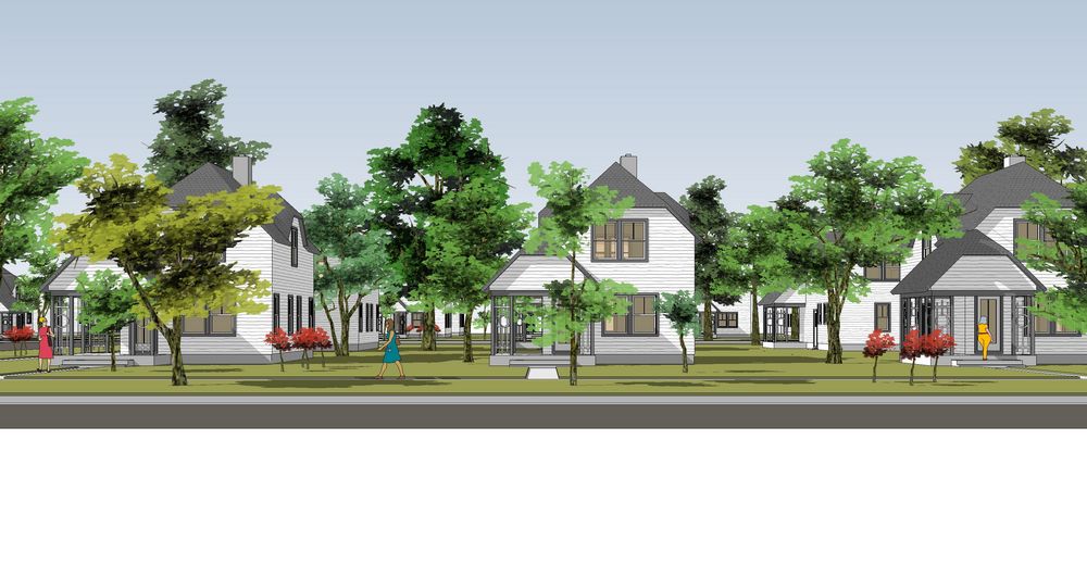
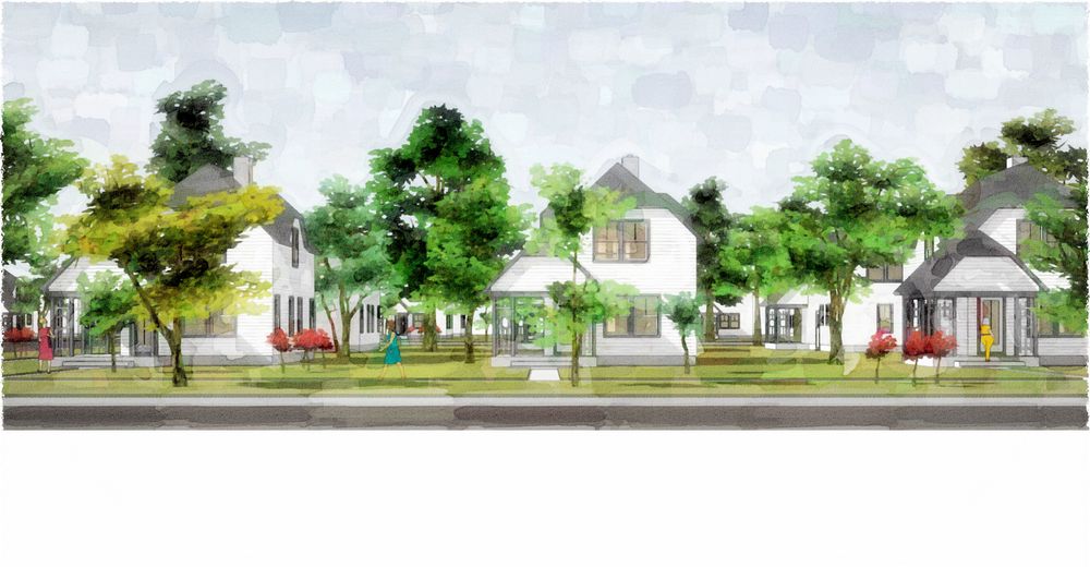
...proud of my own work, or does it really help this image that I can subtly change the hue and tint of green in the trees? I pretty much think it does...you?
-
I think it does mate though possibly too harsh a contrast considering the shadows on the rest of the model.
-
Tom, I think it always looks more natural when you can have some subtle differences int he hues of the trees, but the one one the left (yellow-green) stands out too much, IMHO. It might help if some of the other trees were the same shade. That one tree is also blocking most of the house on the left. I always look at renderings from an architect's perspective - the goal is to illustrate the building(s), and the entourage, no matter how nice, is meant merely to compliment the architecture and give it some context.
-
Wow...sorry: forgot to get back to this :`(
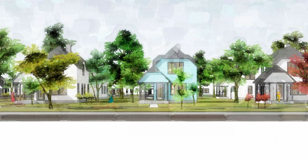
Daniel, played around with the composition (and my little joke) and think the yellow tree works a little better now with the red one added...you? (Does it help you knowing the neighborhood is focus (besides the trees :`) not the buildings?)
-
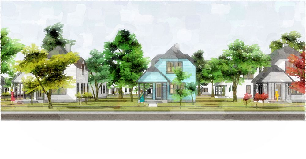
Tom, that's better; just a little tweaking to get the balance correct, I think. I change the small tree to the left of the large yellow-green tree to red, then switch the ladies i the red and blue dresses (so the red lady isn't next to a red tree, and the blue lady isn't so close to the blue house).
-
Daniel, thanks: you were right about the little green tree behind the yellow one...but I couldn't let loose of my little joke, so went a different way with it and still got better. (IMO :`)
-
Looks great tom.
-
 print it. frame it. enjoy it.
 -
Very nice Tom, very convincing

Darren
-
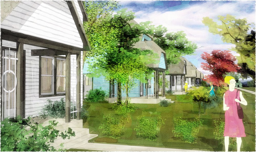
Thanks for the help, Guys...here's another composition of the same subject (with some of the newer trees added in). I think nice, but...?
-
Great work Tom.

These are some of the best images so far.
Hello! It looks like you're interested in this conversation, but you don't have an account yet.
Getting fed up of having to scroll through the same posts each visit? When you register for an account, you'll always come back to exactly where you were before, and choose to be notified of new replies (either via email, or push notification). You'll also be able to save bookmarks and upvote posts to show your appreciation to other community members.
With your input, this post could be even better 💗
Register LoginAdvertisement


