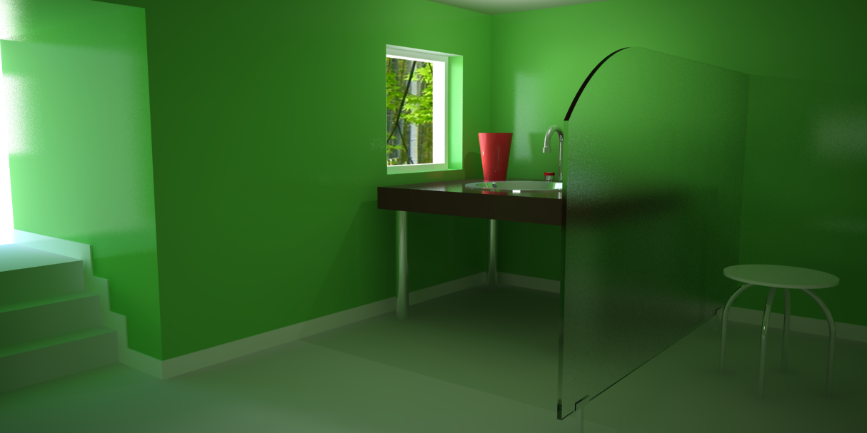
Bath room (wip)
-
Hi everybody,
At the beginning, this scene has been made only to do some tests with lights.
This scene has been rendered with V(Ray for Sketchup.
I must add more details and (maybe) reduce the size of the stool. It seems disproportionate.
I used two rectangular lights ouside in front of each opening (window and door), one more inside to clear some shadows...and one omni-directional near the table.All objects are own made. Only one texture imported (Metal).
What do you think about the lighting ? If you have some tips, don't hesitate.
Best Regards,
Luis(click for a bigger image)

-
lightings great, except the shadow from the tabe, probably the omni light. dosn't look like it should be there, if you can make the omni not cast shadows (not sure about vray)it would be much better.
love that glass.
-
The lighting and glass is great, good render.

One crit, the color, I'll be puking every morning if my bathroom was that color.

-
Yes xrok1, the shadows wan be turned off on the onmi lights in Vray for Sketchup.
We can also turned off "Affect Specular" (what I did) in this render.
I will try a render without this light.I like the green..but you are right solo. I agree, this color is not suitable for a bathroom.

The glass was simply made with a refraction white and a Glossiness value of 0.7. Thats'all.
-
The lighting and overall render is very good, my only crit is the proportion of the lavatory to the scene, I think it's out of scale...I can see the ceiling back there which is very low or the lavatory is very big.
allanx
-
Good render and I like that green color!
-
THnak you all.
Yes allanx, there is something wrong with the proportions. I will fix it.
I will try to render this scene again, but with differents colors.Regards,
Luis -
Good day everybody,
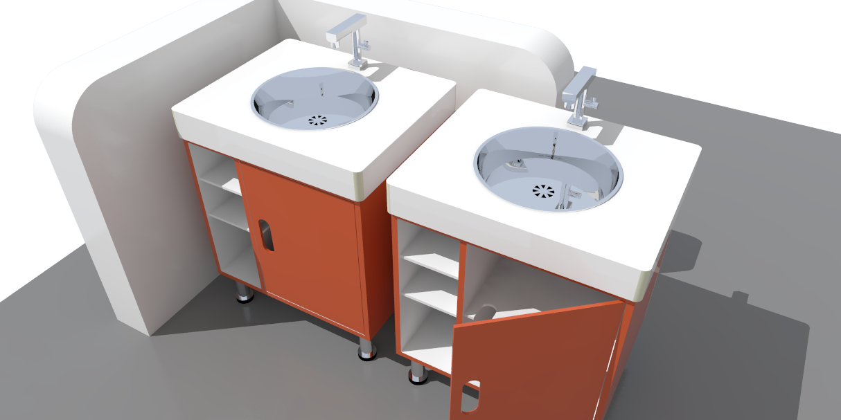
Ok, my last lavatory was not proportional to the scene (walls). So, I decided to create a new one.
Here is the new ones (maybe I'll put two lavatories side by side).I think I must create another robinet, because this one looks like a gun !

Regards,
Luis

-
what is the material you used for the glass?
can you share the setting of the glass material? -
@moghamdi said:
what is the material you used for the glass?
can you share the setting of the glass material?Hi,
I didn't import material for the glass.
The glass was simply made with a refraction white and a Glossiness value of 0.7. Thats'all....but you adjust your own settings according to your scene (lights).Regards,
Luis -
I really like the result of the wall material (apart from colour, but I kinda like it

Could you share the settings for that wall finish? It would help me a lot, I am just starting to learn vray
-
@broomstick said:
I really like the result of the wall material (apart from colour, but I kinda like it

Could you share the settings for that wall finish? It would help me a lot, I am just starting to learn vray
Hi Broomstick,
I didn't import any texture for the wall. It's only a green color with reflexion and glossiness. I don't think that the wall is so beautifoul as you are saying, thank you anyway. The secret to have a nice surface is...... The light. But, it's difficult to give you a recipe, each scene is different. You still can download the SKP file in the previous post.
Regards,
Luis m -
 My daughter's bathroom is that exact shade of green.
 -
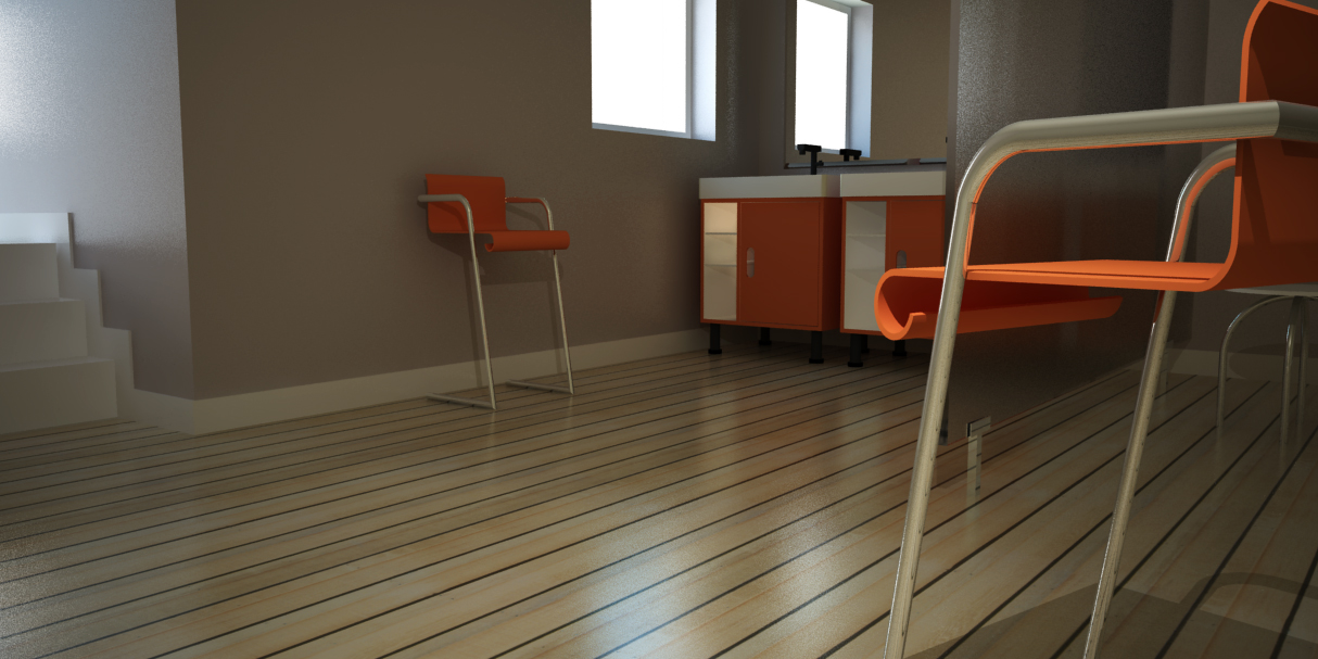
Hi everybody,
Here is my last render of the same scene (with somme changes).

Hello! It looks like you're interested in this conversation, but you don't have an account yet.
Getting fed up of having to scroll through the same posts each visit? When you register for an account, you'll always come back to exactly where you were before, and choose to be notified of new replies (either via email, or push notification). You'll also be able to save bookmarks and upvote posts to show your appreciation to other community members.
With your input, this post could be even better 💗
Register LoginAdvertisement


